
No more centre focus options? Never fear!
Updates to apps that we know and love can be a bittersweet affair. There are shiny new toys to play with and (hopefully) interface improvements to enjoy but also the possibility of the loss of a favourite filter, a much-used short-cut, or a really useful feature.
I was excited for the new and updated version of Snapseed that Google began to roll-out this week, but when I downloaded it onto my tablet, I was disappointed to discover that the centre focus effects have been retired. There is, however, a perverse advantage to running out-dated operating systems on your mobile devices: Snapseed 2.0 isn't available on my ageing iPhone. Centre focus is still with me.
Thus for the benefit of anyone who might also be feeling their loss, and in preparation for the day when I might well upgrade my phone and therefore my version of Snapseed, I sat down to replicate the centre focus effects using the new Snapseed tools. These are the fruits of a morning's labours.
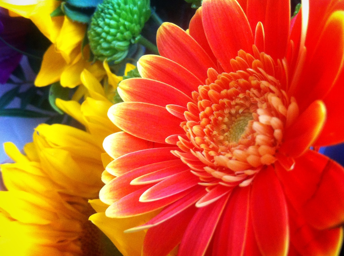
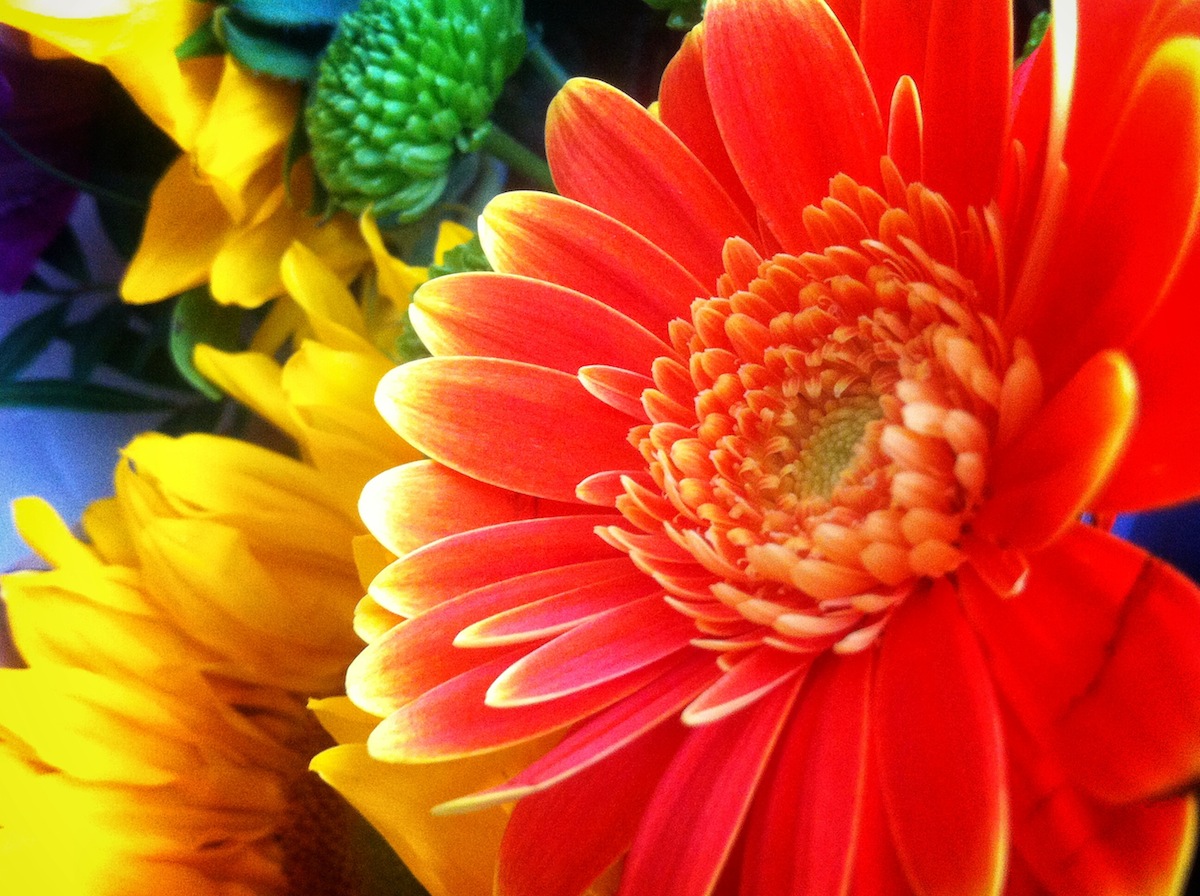
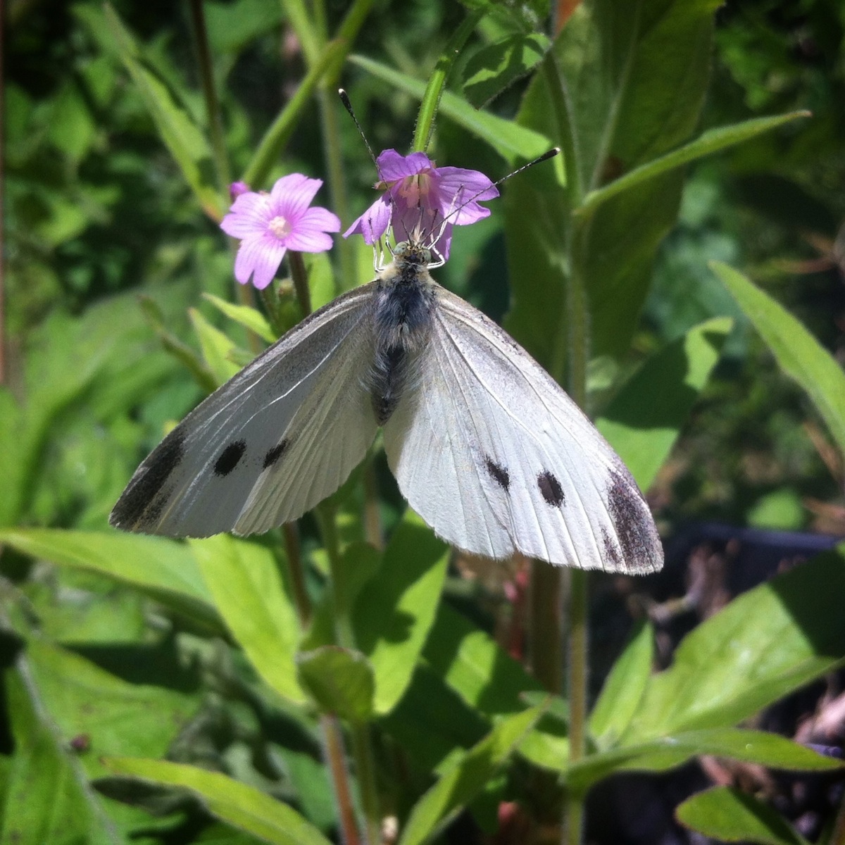
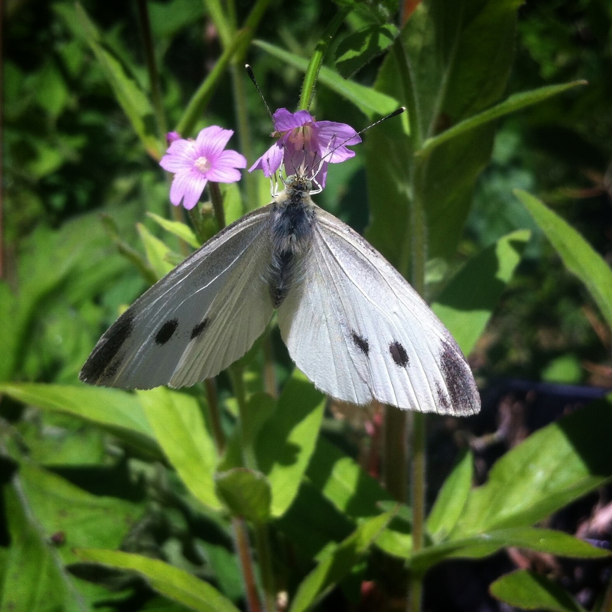
Portrait 1
The Portrait 1 effect uses a small-ish vignette to darken the edges but also brightens the centre of the image deliberately. It doesn't rely on the contrast of the darkened edges of the photo to make the centre appear lighter. The highlights also appear more pronounced.
To recreate the Portrait 1 effect, you'll need to use a combination of the vignette function and the highlights slider under the tune image tab.
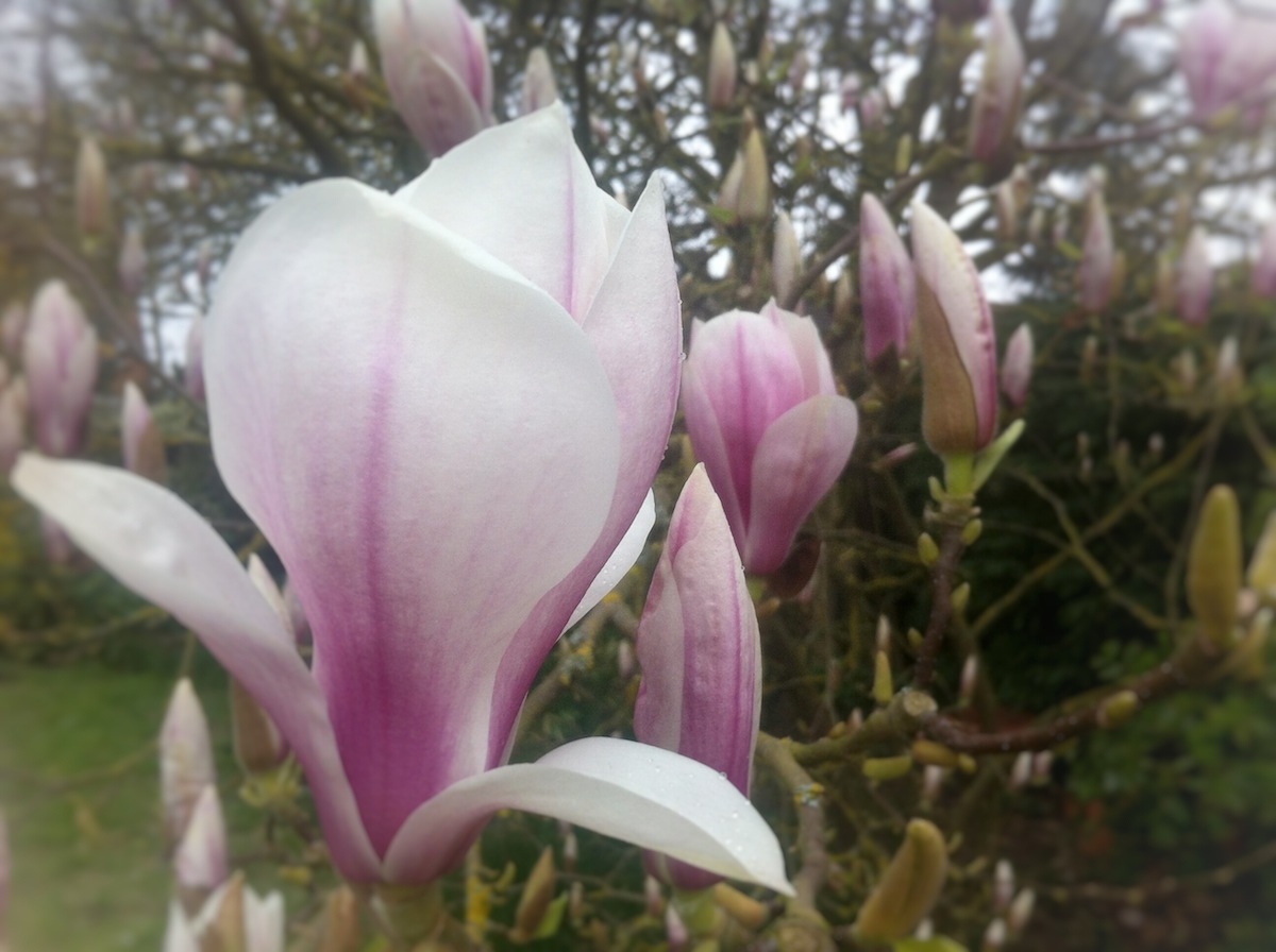
Snapseed's own version is on the left; mine is on the right.
In the vignette tab, reduce the outer brightness value by sliding it the left. In this case, I moved it to -75 points. The inner brightness value was increased, moving to the right, by 25 points. I didn't adjust the size of the vignette from the default.
I nudged the highlights up by 10 points, but toyed with just 5 and as many as 15. You might want to experiment here to see what you prefer or what your image needs.
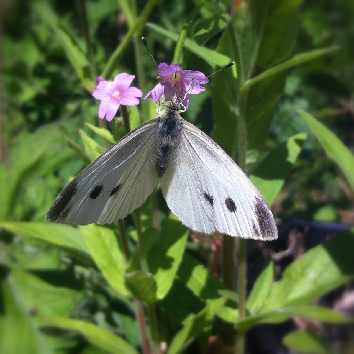
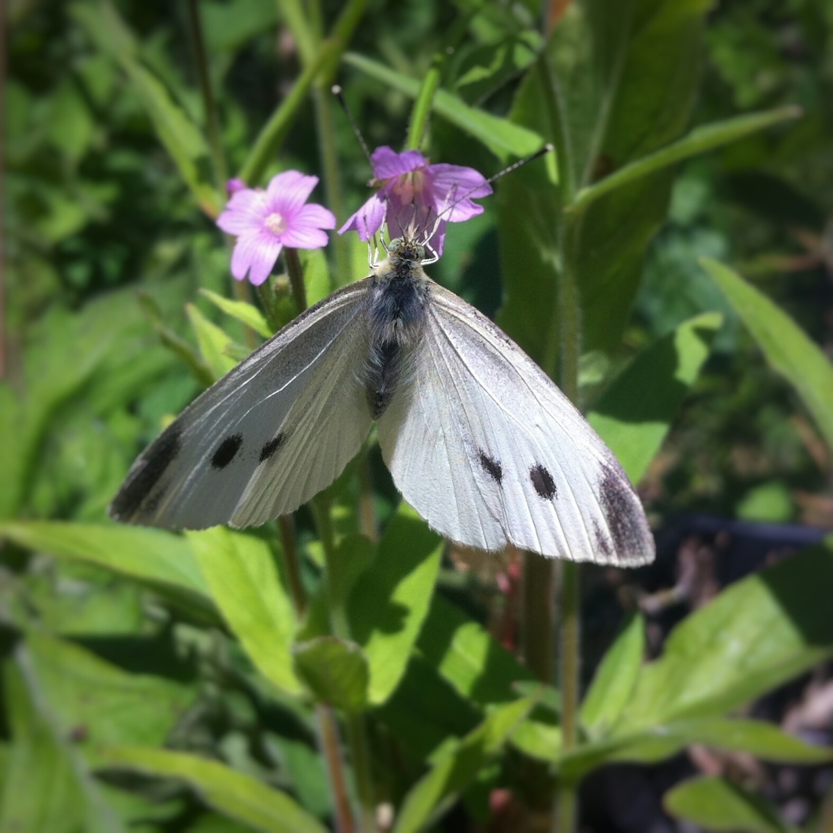
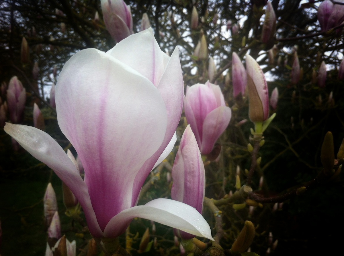
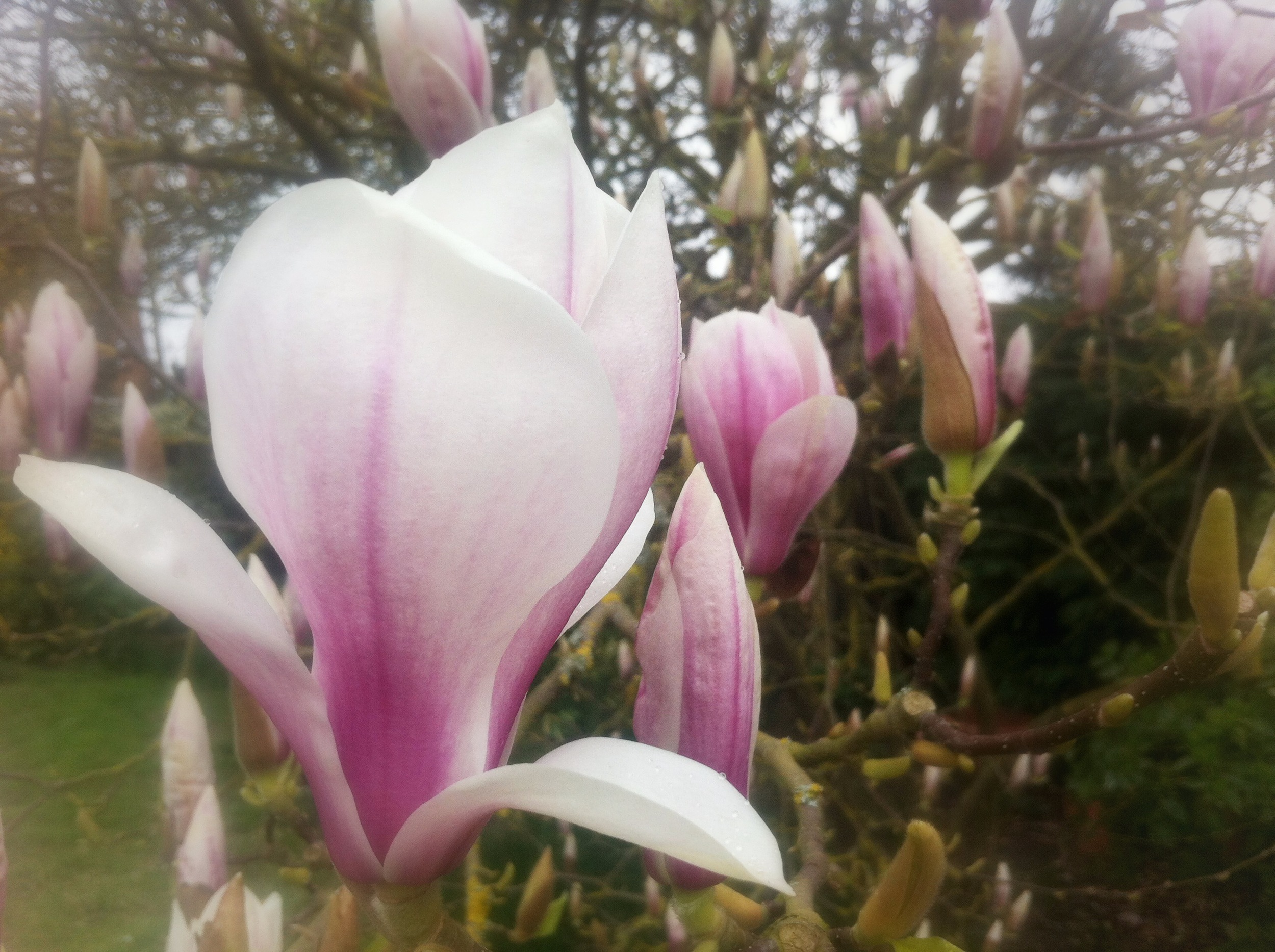
Portrait 2
Portrait 2 is similar to Portrait 1, but the vignette is more pronounced, being both deeper and darker. The inner ring of brightness is similarly more intense, but there appears to be something a little sharper, too.
Again, you will need to use the vignette function, but also the detail tab, too.
The Snapseed effect is on the left; my replication of it is on the right.
The outer brightness was adjusted to -80 points, the inner brightness to +30 points. Adjust the size of the vignette, making it slightly larger than for Portrait 1. (Pinch together your fingers to increase the size of the vignette.)
Under the details tab, the structure was increased to +20 points and the sharpness to +15 points, which helped to define the flowers more.
Vignette and Blur
Snapseed 2.0 has lost its tilt-shift function and instead there's a lens blur tool. There's also the new vignette tool which we've already encountered. You can use these to recreate the vignette and blur effects without much ado.
Blur above; vignette below. Snapseed to the left; my versions to the right.
Unfortunately, we'll need to look elsewhere for a tilt-shift replacement.
Old Lens
With the old lens effect, you're looking for a very pronounced vignette. It needs to be deep and dark, which will give the impression of saturating the colours a little more.

Again, the Snapseed version is on the left; my recreation is on the right.
You can take the settings that you used for Portrait 2 and increase the size of the vignette–so pinch your fingers together, making the inner circle of brightness smaller–to create a similar effect.
Foggy
Foggy was the trickiest effect to recreate. It has a dreamy, ethereal feel to it, with a light, blurry look which is far too easy to over-do. You will need to blur the image almost, but not quite, all the way to the centre of the frame, and not too heavily. The very edges of the frame are fuzzy, not completely indistinct.
Try:
- Blur strength +30
- Transition +65
- Vignette strength 0
When you have blurred the image, you will need to apply a vignette that lightens, rather than darkens, the edges of the frame, as well as lightening the centre of the image.
Try:
- Outer brightness +30
- Inner brightness +40
You can see how this isn't quite the same, but sufficiently similar
All is not then lost. It just takes a little perseverance. And perhaps a weaning off of the reliance on easy-to-use effects.