monochrome

Thoughts on the Sony World Photography exhibition

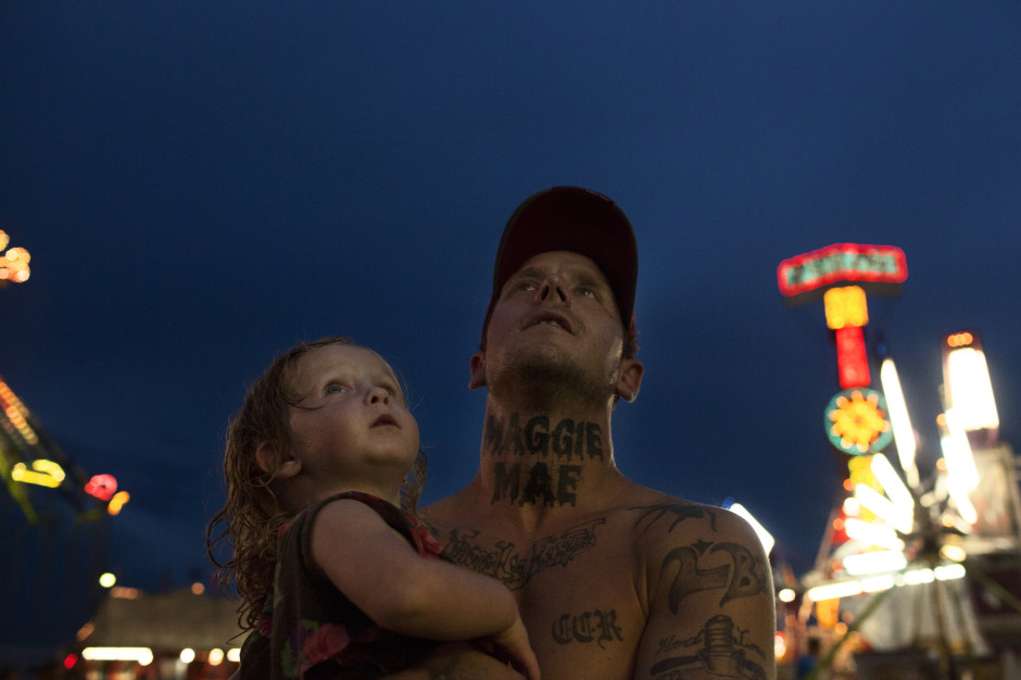
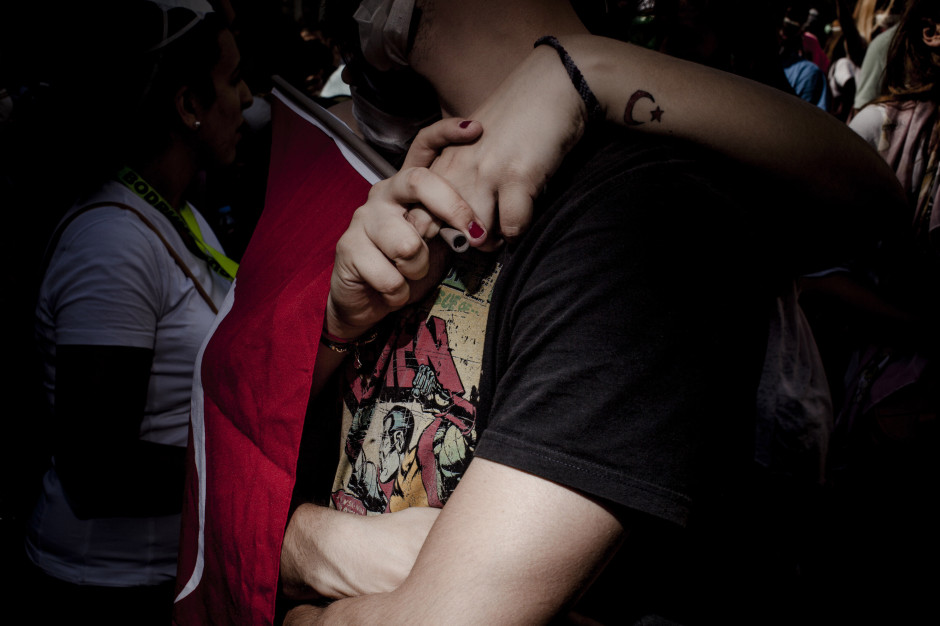
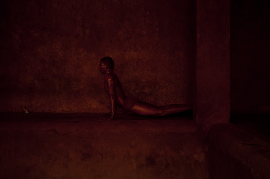
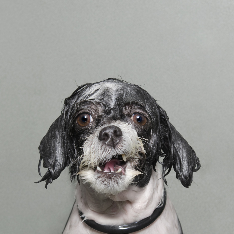
After my slightly disappointing press view of the Sony World Photography Awards exhibition, when I didn't have the opportunity to take in the photos, I made a return trip to Somerset House yesterday to rectify this situation. I had much more time to wander through both the East and West Wings, admiring the images and pontificating on the judges' choices. Visiting an exhibition that has cherry-picked from vast numbers of photos submitted from across the globe by both amateur and professional photographers gives you the chance to look for trends and fashions, garner some inspiration, and importantly, look through a window into other people's worlds. I enjoyed my saunter through the rooms and Sara Naomi Lewkowicz's l'Irs d'Or winning series Shane and Maggie stands out a mile. I loved Sophie Gamand's wet dogs, which won the portrait prize, Guy Martin's photos from the Gezi Square protests told a defiant story, and I was drawn to the deep and dark photos in Salvatore Di Gregorio's series An Old Fight, which won the sport prize.

Winner of l'Iris d'Or: Sara Naomi Lewkowicz for her series 'Shane and Maggie'. 'Shane and Maggie' attempts to show domestic vilence as a process, as opposed to a single incident.  (Sara Naomi Lewkowicz (USA) Finalist, Contemporary Issues Professional Competition 2014 Sony World Photography Awards)

What, though, were my overwhelming thoughts and questions as I left the exhibition?

The professional category was dominated by black and white images. That is a comment made as neither praise nor criticism, merely as an observation. It is worth noting, however, that l'Iris d'Or winning series comprised colour images and that the photos that have stuck with me are those shot in colour. Maybe it is because they were my preferred shots, or perhaps it is because their colour makes them stand out amongst the monochrome, but it does pay to be different.

Protesters against the government of Tayip Erdogan and his plans for a shopping mall and pedestrianised area in the centre of Instanbul - Guy Martin (UK) Current Affairs Professional Competition, 2014 Sony World Photography Awards

Writing of daring to be different, I think I might've reached Indonesian cow-racing photo saturation point. It's a stunning spectacle that produces stunning images, but there have been examples in the professional or open categories for at least the last three years. It's almost as if their inclusion has become obligatory. I'd appreciate being able to gaze upon something new in future years.

Salvatore Di Gregorio, Italy, Winner, Sport, Professional Competition, 2014 Sony World Photography Awards

Finally, I was surprised by the profusion of manipulated images in the open category. From HDR, to composites, to painterly-type blending, it had it all, and this extended beyond the 'Enhanced' division, which is devoted to manipulated images. As the author of a book on surreal photography, this might be regarded as an unusual comment, but it does present some important questions. First, how much manipulation is too much manipulation? Second, to what degree is photo-manipulation now regarded as an acceptable element of photography? And consequently, at which point does a comeptition become one of photo-manipulation rather than photography? All of these are questions for another day, but ones to ponder.

Wet Dog 2, Sophie Gamand (France) Portraiture Competition, 2014 Sony World Photography Awards

The exhibition runs until Sunday (18 May), and if you have to be in London or its environs, it's worth an hour or so to take it in. I'd love to know what you think.

Sony World Photography Awards exhibition, Somerset House, London, until 18 May 2014.

If you think that photos all in one colour are boring, think again!

No, we don't mean black and white here. We mean all one colour. All red, all green, all yellow. All anything. Colour is one of the most powerful tools in your compositional arsenal and it can be easy to forget how striking images composed of all one colour can be; we get caught up in the idea of complementary colours and of our images having to contain enough to satisfy and intrigue their viewers. And monochromatic images can do that: the key is to have as many different varieties of one colour within an image so that it becomes an exercise in naming the different shades, tones, and tints of one hue. Colours are able to elicit strong emotions in people. It might sound terribly airy-fairy, but there are introverted—blues, greens, and some purples—colours that give a calm, even subdued feeling and there are extroverted colours, such as reds, oranges, and some yellows, that are positive and energetic. You can prompt particular responses from your audience by using particular colours in your photos.

Red

Red is regarded as the 'strongest' colour; certainly, if you've a multi-colour image that contains just a speck of red, people's eyes will automatically be drawn to that red dot. But if you choose a monochromatic red image, be prepared for something that feels passionate, energetic, and vital. A strong colour will incite a strong response.

Orange

It shouldn't come as any great surprise that I have a particular fondness for orange: I'm Dutch. Daniela rather likes it, too, if how often she wears it is anything to go by. Hardly surprising, then, that we chose it as the Photocritic theme colour. There's something very inviting and reliable about it. Maybe that's because it's the colour of sunrise and sunset. You know it'll happen every day, and that you have the the chance the start over and then to put everything beind you.

Yellow

Yellow is cheerful, optimistic, uplifting, vigorous: anything positive, really. And it's easy to grasp the association with the sun, with good weather, with the opposite of darkness.

Green

It's spring here in the UK, and we're being presented with a riot of green. It is abundant, youthful, verdant, and symbolic of growth and renewal.

Blue

Ever since I can remember, my parents have painted their bedroom blue. They do it precisely because of blue's qualities: it's calming, contemplative, and restful.

Violet

You don't find that many purply tones in nature. Of course there are some, especially amongst flora, but it's rarity means that violet tends to have a mysterious and superstitious quality to it. The expense of dying fabric purple in Roman times (the dye came from murex shells) meant that it was reserved for only the highest echelons of power, which contributes to the regal and superior feeling purple has, too.

So, don't be afraid of the monochrome: embrace and experiment with it!