closer look

Best thing about iOS 7? The camera is bloody fast.

We already took a quick peek at the new camera app in iOS 7, but then I was able to borrow an iPhone 5 running iOS 7 off a friend, to see what changes Apple may have been making to the camera. There are lots of little improvements, but the #1 thing that strikes me about it is how incredibly, incredibly fast it is. The camera in general was one of the things I disliked the most about iOS 6, but in the newest version of the operating system, Apple have completely knocked it out of the ballpark.

Gone is the skeuomorphic "shutter closing" animation that made the camera feel horribly laggy. In the new camera app, you can take photos as quickly as you can press the shutter button. No, seriously - if your subject is bright enough, and your thumb is fast enough, you can practically record video, that's how incredibly fast it is.

It's not just really quick at taking pictures, either - you can swipe from the lock screen to launch the camera, and the code boffins at Apple must have done some serious re-coding of the camera app: It launches in fractions of a second, and and you're immediately ready to take photos.

Let's take a closer look.

At the beginning of the video below, I'm just showing how easy it is to go straight to the camera (Drag from the bottom right of the screen). Then, I'm launching the camera, then going straight into taking a load of photos in rapid succession, followed by showing off the pictures I've just taken in the camera roll:

Really impressive stuff - and that doesn't even touch on any of the other improvements on the photography side of things.

Suffice to say that I think Apple have finally created some software that's worthy of the extremely capable cameras that are finding their ways into the iPhone 5 and new iPod Touch devices. Way to go, guys, and keep up the great work for photographers!

My week with Q


Small, very small

When you read the specs for the Pentax Q, you know intellectually that it's small, but it doesn't really hit home until you see it for yourself. It really is tiny. In fact, it's so dinky you'd be forgiven for thinking that it's a toy… before you hold it in your hand (just the one).

It definitely doesn't feel like a toy. There's a decent heft to it and nothing about its build feels tinny or plasticy. It's a camera that's been made to do business, despite its diminutive size. Fitted with the standard 8.5mm (47mm equivalent in 35mm format) f/1.9 lens, it slipped into my handbag or coat pocket, but not my jeans pocket.

So it came with me everywhere for almost a week, including a visit to my brother over the weekend, a walk in the park to photograph some wildlife, and a Christmas party where it generated plenty of oohs and aahs. It's these experiences on which I've based my review, so there aren't any painstakingly photographed charts to test white balance. But I'll admit to setting up a shot to test the filters when I felt a bit creative, and I wanted to take a closer look at the ISO, so I messed around doing that for a bit.

Hands on

I got used to the layout and menu system fairly quickly. Sure, it was unfamiliar initially, but that was to be expected. You choose your mode, from fully manual to fully auto, using the dial on the top of the camera, where there's also the wheel to adjust aperture or shutter speed. There's a dial on the front that can accommodate your favourite filters and a green button on the back that you can customise to access your most-needed function.

The four-way controller on the back covers white balance, ISO, flash, and the timer. There are also the information and menu buttons to take you down into the guts of the camera. Seeing as the camera's so small, it's hardly a surprise that its buttons are, too. I coped fine with them, but anyone who's a touch bigger than me or has finger nails a sliver shorter than mine might struggle, let alone if you're a body-builder in your spare time.

The flash has a pop-up facility, which I found suitably amusing and of course is useful for preventing the curse of red-eye and ensuring that your extra light won't just bounce off of a longer lens. I was slightly concerned that it might take out my eye if I were to deploy it in a hurry, though.

The response time between switching on and being able to take a photo was good, and navigating between and adjusting shutter speed, aperture, and ISO was intuitive. But when I began taking photos, I ran into a couple of problems.

Frustrations with focusing; irritability with exposure

First, I kept running into arguments with the autofocus. There would be occasions when it simply focused where it thought it should be focusing, not where I wanted it to focus. If I'd had it on auto mode, that might be just about understandable, but in fully manual, it's beyond comprehension and terribly frustrating. You don't get many second chances in photography and seeing them float by because of a tipsy autofocus was disappointing.

Second, every now and again the metering would seem to waltz away and have a party of its own, leaving my images wildly under-exposed. This wasn't nearly so prevalent as the autofocusing issue, but it did mean that I was more exasperated with a camera than was exactly healthy.

Post-processing fixes

So what of the images? I've taken some photos that I really like and my favourites are up there for you to see. The colours weren't muddy or washed-out, although the white balance was occasionally off by a quarter country mile - so much so that my poor brother looked green in a few portraits - but that was nothing that a bit of post-processing couldn't fix. The noise levels didn't want to make me scratch out my eyes until at least ISO 800 or 1000, which is entirely reasonable.

When I compared the RAW and jpeg images straight from the camera, what struck me the most was the barrel distortion from the lens. The warped horizons on landscape shots was very noticeable, and I found the bent look in my office floor almost alarming. Sure, the jpeg option straight from the camera does correct it, and it's something that you can fix yourself in the RAW file in post-processing, but it's rather significant.

Fun with filters

There are more filters and options to do crazy things with colour and processing in the Q than I think I've had hot dinners this year. At first it was almost overwhelming, but as soon as you surrender to your childish desires to combine posterising with bleach-bypassing, or grimace at just how hideous you can make a perfectly decent picture look with selective colour, it's a lot of fun.

Verdict?

When it came to packing the Q into its box and sending it back, I was a lot more reluctant to do so than I thought I'd be. Despite the odd temper tantrum involving autofocusing or exposure, I've enjoyed playing with this camera over the past week or so, and doubtless I'd continue to if I had it for longer. But I've a sneaking suspicion that a great deal of this fun is reliant on knowing that I've a proper optical viewfinder and a much better sensor waiting for me in my dSLR, and my S95 slips into my jeans pocket, has a lens that's far more versatile than the 8.5mm standard lens on the Q, and produces images of about the same quality. If the Q were my only camera, I think I'd spend a fair chunk of my time feeling frustrated.

There's no denying that Pentax, Nikon, Olympus, they're all on to something with teeny-tiny interchangeable lens cameras. These are a significant development in the photographic world, but they're not there yet. So I can't recommend that you buy a Pentax Q when for less you could pick up a Canon S100, a Nikon P300, or an Olympus XZ-1 that delivers just about the same image quality with greater versatility and in a more compact package. One day, maybe; but not today.

Darkening a room by adding light


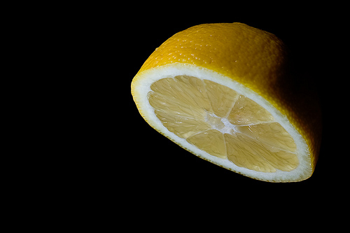
The Revenge of SpaceLemon (29/365)

I was doing a photo shoot a few days ago, where I was photographing a lemon suspended from a piece of thread. I wanted to make it look as if it was hovering in pitch darkness.

Upon seeing the results, someone asked me an interesting question: Isn’t it difficult to focus your camera in the dark? Well, no, because the photo was taken in the daytime, with my lights on. So, how come does it look like it was taken at night?

That, my friends, is the power of contrast in lighting. You have to remember that you don’t need a dark room in order to make a background completely dark – you just need to ensure that your foreground is significantly brighter than the ambient light. Here’s how and why… 

It’s all about relative brightness

To take the lemon photograph, I used a pretty simple set-up: A couple of flashguns aimed at the lemon, from a very close distance. Because the flashes were so close to the subject (they are just out of frame, in fact), it adds a lot of light. If you’re curious why that is, check out the inverse-square law on Wikipedia.

Say 'bonjour' to the magical space-lemon. It's citrus powered, awesome, and magical. Oh, and it hovers in space, clearly. That's what makes it awesome. If you want to take a closer look, click on the photo!

The reason why the photo came out as it did, is because of the camera settings: The camera was set to ISO 100, with f/9.0 aperture and 1/200 second shutter time. If you can’t visualise what those settings would do in the circumstances described, I welcome you to try that right now. Don’t worry, we’ll wait. Set your camera to precisely those settings, and take a photo indoors, without using a flash.

If you can’t be bothered to do the experiment: Even in a relatively well-lit room, that will result in a very dark photo indeed.

So, as far as the camera is concerned, it is taking a horribly underexposed photo. Which is perfectly fine, because I want a dark background. It’s the foreground that is important, and that is where my flashes come in.

Let me get this straight, you’re taking photos that look like darkness in a well-lit room?

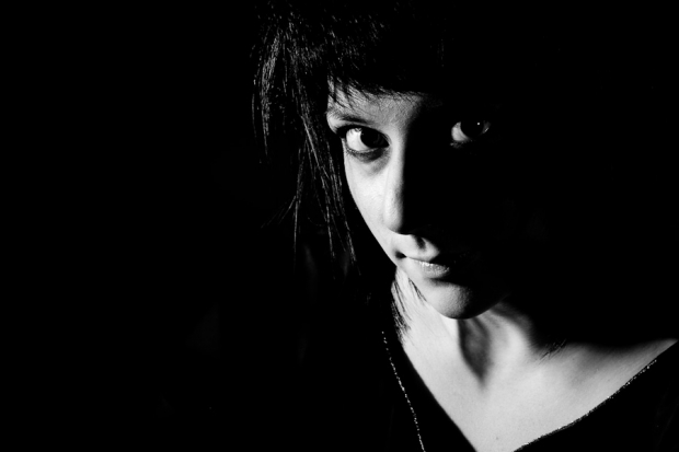
4332652944_7eaaf93a40_o.jpg

This portrait was also taken in a relatively well-lit room - but again, because of the high flash output and the fast shutter time (in this case, f/8.0 and 1/500 second at ISO 100), it looks like it's taken in pitch darkness. Groovy. Clicky for bigger.

Short answer: Yup.

Slightly longer answer: Yup. You can do this by settin your camera to manual, and use an exposure which results in a dark room (by choosing a fast shutter time). The next step is to use your flashes to light the subject.

Of course, this doesn’t work if the light from your flashguns spill onto the background (you’re trying to keep that as dark as possible, remember?) so it is a good idea to use a snoot or a honeycomb grid to ensure that the flash light isn’t accidentally re-lighting your background, because then you’re back to square one.

Can this be used for anything else?

Well of course. Always remember that it’s all about the contrast in lighting: If your flashes are more powerful than the light you are photographing in, then you can ‘darken the room’ with your camera settings, and use the flashes to light your scene.

Hell, if you’ve got enough flashes, you can turn even broad daylight into night. Don’t believe me? Check out this article on ganging flashes, and scroll down to “Turning Noon Into Night With High-Speed Sync”. Pretty impressive stuff, but there’s a pretty ridiculous amount of money in flash equipment being used right there.

You don’t have to go to those extremes, though – using flash outdoors on a shady day can give great effects, because when done well, your subjects look as if they are brighter than the surroundings. When done subtly, it can look bloody fantastic – your eyes are automatically and subconsciously drawn to the main subject – always a good sign in a photograph.

A Closer Look: Rania Matar

RM3

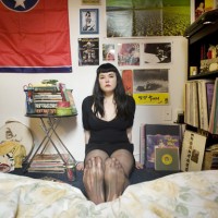
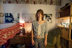
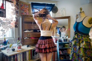
As of late, I’ve become more and more drawn to portraiture which makes extensive use of the surrounding environment to tell us more about the subject themselves, to the extent that it is now creeping into my own work. Although I love the intensity that an intimate close up portrait can bring, the creative freedom that is afforded to you in an environmental portrait allows you to tell a story, to show more of the subject and who they are. This, amongst other reasons I will explore in this Closer Look, is what drew me to Rania Matar’s beautiful portrait series “A Girl and Her Room”.

Last week, I looked at Anastasia Taylor-Lind’s Women of the Cossack Resurgence – a look at a female-dominated society, photographed by a female photographer. I wanted to further explore this area with Rania’s work. Much of Rania’s work is focused on women and women’s issues, “A Girl and Her Room” being one such project. The project examines those difficult teenage years, looking at the strains associated with the transition from childhood into adulthood and the various pressures experienced by girls growing up in today’s society. One the one hand, they are children. On the other, there is pressure from peers, media and popular culture to move into adulthood.

Geneva, 22, Brookline MA, 2010

The series is excellent at exploring that confusing period of your life, where half of you desperately wants to grow up and be taken seriously as an adult and the other half doesn’t want to fully let go of childhood. Rania often portrays this in the series by juxtaposing themes of adulthood with themes of childhood. This is sometimes reflected in the subject’s choice of clothing, which indicate physical and social maturity – “going out” dresses, evening gowns and the like. Sometimes, it is reflected in their surroundings – a shelf full of various make-up, bags, shoes and posters of models and bands. In the same glance across the image, you notice paraphernalia associated with childhood: stuffed toys, bunk beds, colourful drawings and photos of themselves as a younger girl.

The very first image you encounter in the series – “Siena 17, Brookline MA, 2009″ – implements this juxtaposition extremely well. Siena’s wall is plastered with posters of models in bikinis and adverts for fragrance and cars, whereas her bedsheets are patterned with pictures of farmyard animals and a large stuffed teddy rests in front of her.

Siena 17, Brookline MA, 2009

There’s just so much to talk about here, I’m finding it hard to be concise (surprise surprise), but what I find really wonderful about the images is the different degrees of maturity and each girl’s unique response to growing up. Girls the ages of 12 through to 21 and 22 are photographed and it’s fascinating to see what items incrementally change in the room – a sort of battle for room space between objects of the past and objects of the future. It’s also interesting to note that there is no hard and fast rule to what stage of maturity a girl is at relative to her age – everyone goes through that change at their own pace, and this is demonstrated by the incredibly diverse personalities on display.

There are many themes running through the images: the extensive inclusion of the mirror and how it reflects the subject’s preoccupation and concerns with self-image: the inclusion of pregnant girls and the even greater gulf between being forced to grow up and accept responsibility and the desire to remain a child: the subjects who live in other countries whose rooms, although initially seemingly different, follow the same patterns and reflect the same anxieties, concerns and desires as those of the North American girls.

Aside from being rich in thematic detail, the individual images are also rich in physical detail. Rania includes dozens of little touches in each image. Initially, I consider the subject and her expression, then my eyes move around the room at every little detail, then back to the subject again. What is truly magic about Rania’s work is her composition – some of the rooms are absolutely packed with bits and pieces yet Rania manages to include all this without losing the subject herself in the background. That incredibly clever use of space is the master stroke that sets these portraits apart, as it would be all too easy for them to feel too busy and overloaded.

Shannon 21, Boston, MA, 2010

The series has inspired me to really look at and develop my own environmental portraiture, paying very careful attention to use of space. I urge you to go and look at the “A Girl and Her Room” project as a whole – it’s important to view the featured images here as part of the whole series, because not only is a story told in each picture, but a story is told as you progress through each image. Plus, they’re great, so why wouldn’t you go and look at them all?

http://www.raniamatar.com/portfolio/recent/girl-room.php#girl-room/1-01.jpg

A Closer Look: Anastasia Taylor-Lind

Anya Romanova (centre) and her Year 8 friends at Ataman Platov Cossack Cadet School. This image was featured in the Taylor Wessing Photo Prize 2010.

To continue my Closer Looks this week, I’m looking at the absolutely beautiful work of Anastasia Taylor-Lind. It’s important to look at a female photographer and her work because I personally feel that women are a little under-represented in photography. To follow through with this theme, then, I will be looking at Anastasia’s series “Women of the Cossack Resurgence” – a fascinating look at Cossack revivalism.

I won’t get too far into the ins and outs of the story and background of the series, for fear of making myself look a bit stupid and publishing inaccuracies. It would be much better if you scooted over to Anastasia’s site and had a look at the flavour text to fully acquaint yourself with the background behind the series. What I want to do with this article, as a portrait photographer, is attempt to get a bearing on just how she achieves such beautiful images.
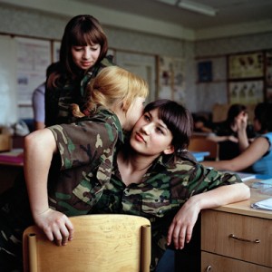
Anya Romanova (centre) and her Year 8 friends at Ataman Platov Cossack Cadet School. This image was featured in the Taylor Wessing Photo Prize 2010.

With portraiture (and photography in general) preparation is key. The image is not just the click of the shutter, it is all kinds of preparation approaching that moment. For these images, Anastasia spent a week in the school with the girls, attending their classes, sleeping in one of the dormitories, being one of them. The benefits of this were twofold. First, it would allow her to connect, identify with and get to know the girls, so that the resulting images more accurately portrayed their character. Second, it would mean her subjects would relax and be used to the camera.

Another preparation that was important here was kit preparation. Anastasia used a 6X6 Bronica with a waist-level viewfinder. Compared to your normal DSLR, this allowed Anastasia to take the camera away from the front of her face: now they were talking to her and not to a camera with someone hiding behind it.

Recently, I have often felt there is something of a barrier between myself and my subject when I raise the camera to take a shot. My own approach to alleviating this problem is to practice being able to effectively compose more quickly, making sure I take the camera away from my face as often as possible, to let my subject know I’m still there and haven’t been taken over by a large metal facehugger. That human connection is very important, in my opinion.

Many of the shots in the series explore the bond between the girls in the school. There are images of the girls dressing each other’s hair, embracing, spending time together in the dormitory at bedtime and, in one of my favourites of the series, possibly whispering secrets to each other. I feel as if these images have been included because they resonate with Anastasia as a woman.

I’m not saying that a male photographer wouldn’t have noticed this connection between the girls, but I wonder whether the moments would have been captured as intimately. Maybe I’m wrong, but I do think there is something to the idea that your best work is borne of an emotional connection of some form with the subject. Again, this reinforces the importance for me of Anastasia staying with the subjects of her portraiture for several days – it’s as much to prepare her for the images as it is to prepare them.

Galina Prokopenko, 75 year old great-grandmother and black-belt karate instructor.

To finish with, I want to look at an individual portrait from the series and tell you what I like about it. I honestly feel like going through every portrait in the series, because they’re all beautiful, but we all know how much of a waffle fiend I am (imagine having to sit and listen to me waffle – at least you can just close your browser when you get bored), so I’ll limit myself to one.

By which I mean two. I was torn between the image of Galina Prokopenko, the 75 year old Karate instructor and the basket-weaving class image. Aside from being allergic to concision, I chose these two images because they are stylistically similar and hold qualities that I, whilst not wishing to be overly gushing, find absolutely wonderful. Putting aside the fact that the subjects are both totally relaxed, natural and bursting with character, they share a compositional style that I am very interested in at the moment.

Anastasia manages to balance the image of the subject in the frame with background detail, without taking focus away from the subjects themselves. If we look at Galina first, there is a beautiful balance between her pose and positioning in the frame with the floral wallpaper. The table tells us a little more about Galina without being an intrusive object in the scene. The lighting appears to be natural window light and the gentle vignetting draws us to Galina (who is a striking enough character to be drawn to in the first place, to be fair to her).

There are similar elements at work in the basket weaving portrait. The positioning of the girl in the frame, combined with the angle of the basket and its outreaching strands, the bottom of a plant creeping in on the image and the small wooden ornament make for an interesting composition. The lighting is again quite beautiful, the face being the most prominently lit feature in the image, focusing our attention on her expression of concentration. There is just enough of a hint of attention in her expression to suggest to us that she is listening to instructions from a teacher to the right of the camera.

A basket weaving class at the Ataman Platov Cossack Cadet School

Although the qualities described above would be enough to class these two images as excellent examples of portraiture, the true magic for me comes from the way everything is subtly visually linked. In the portrait of Galina, the pink of the floral wallpaper links to Galina’s pink lipstick. Similarly, the floral pattern on the wall links through to the floral pattern on the teapot and to the one on the tablecloth. I love how this is contrasted by her military appearance: it shows us that the personas of great-grandmother and soldier can both exist in one person.

Similarly, there is a very strong visual theme of flora and nature running through the basket weaving image: the hanging leaves link to the leafy pattern on the wallpaper, which is linked to the floral ornament on the wall, which is wooden, linking us to the basket itself, linking us to the camouflage pattern of the girl sitting, which is of course intended to mimic colours found in nature.

These are the qualities that take these portraits to the next level. I will cease my trademark waffling now, I hope you have enjoyed looking at these portraits in depth as much as I have.

To wrap up on a personal note – I’m really very glad I’ve written these two “Closer Looks” on a couple of my favourite portrait photographers. My intention was to get you lovely readers geared up about portraiture but, as it happens, I’ve also reinvigorated myself on the subject. It can be all too easy to fall into the trap of only taking photos when you’ve been commissioned to do so: this is a mistake. I don’t know about you, but I’m off to set up some portrait sessions just for the love of it. I suggest you do the same.

The Great Migration - in time-lapse

Wildebeest Stampede

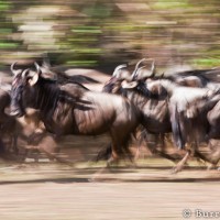
The Great Migration. It’s one of Africa’s most impressive, perilous, and at times chaotic mass animal movements. 1.5 million wildebeest make the epic journey from the Serengeti in Tanzania to the Masai Mara in Kenya (and back again) every year in search of greener pastures. Of course, being so impressive, perilous, and sometimes chaotic, it’s been documented thousands of times. But Will and Matt Burrard-Lucas, intrepid wildlife photographers extraordinaire reckon that they’ve captured it in way that’s original. It’s also mightily impressive.

They’ve created Migration, which uses a combination of telephoto video clips and time-lapse sequences, to show the giant herd’s encounter with the Mara river. Over 10,000 animals take on the river, its crocodiles, and its cliffs in one go. It’s astonishing. Take a look for yourself:

Migration from Will & Matt Burrard-Lucas on Vimeo.

There’s also a superb panorama image of 30 stitched-together stills. You can zoom in for a closer look!

Head over to Will and Matt’s website to read more about the migration, and of course to see lots more photos!

10 brill black and whites

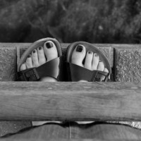
Toes b&w edited

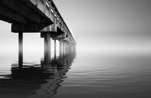
Black and white prints might do wonders for skin tones and therefore be a godsend for portrait photography, but that, and low-light photography, aren’t all that they’re good for. Back when I still used to shoot on film, I’d often get a roll developed in black and white just because I could. Anyway, I had a poke about the Flickr-verse to see what caught my eye in black and white. These are a few of them.

1 – Black and White Shimmer

Black and White Shimmer, by blently

2 – Cuba Gallery: Black and White

Cuba Gallery: Black and White, by Cuba Gallery

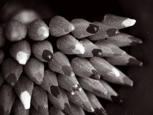
3 – Pencil Crayons Black & White

Pencil Crayons Black & White, by El Struthio

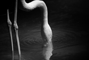
4 -Drinking Flamingo

Drinking Flamingo, by dogwatcher

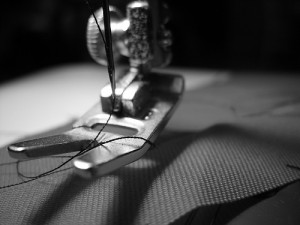
5 – Sewing in Black and White

Sewing in Black and White, by riverwatcher09

6 – Black and White

Black and White, by Digit_AL

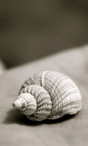
7 – Shell found on the beach

Shell found on the beach, by ianrobins

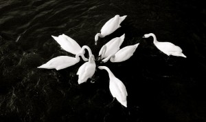
8 – Coeur de Cygne

Coeur de Cygne, by Visions photographiques

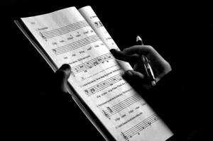
9 – Orchestration (Black and White)

Orchestration (Black and White), by steve xavier

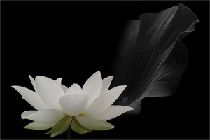
10 – White lotus flower

White lotus flower, by Bahman Farzad

All photos used in this article are used as ‘fair dealing‘. If you have strong reservations against your photos appearing on Small Aperture, please contact us, and we’ll get them taken down. Please support the artists creating these photos by clicking on the photos to take a closer look at their work!

Digital Foci aims itself at the European market

photobook

How do you like your pictures stored? Small and neat? Easily viewable? Well, Digital Foci, a digital photography accessories company, recently announced the expansion of three of its leading products into the European market in 2011. They’ve three offerings, which they hope will cover the various needs of anyone who takes photos. Let’s have a closer look.

Picture Porter 35

The Picture Porter 35 is a portable photo manager that comes in 250GB and 500GB capacities. Marketed as a portable hard drive for use during vacations or on photo shoots, this 5.4 inch storage device features a memory card reader with a 1GB per 90 seconds transfer rate and a 3.5 inch color LCD screen to view your photos on. It also supports RAW images as well as various music and video formats.

While it may have two features that most portable drives do not (LCD screen and memory card reader), the availability of countless other drives with twice the capacity (1TB) at one third of the price ($170) **cough** Western Digital **cough** makes me wonder if those features are really needed. If it does float your boat, though, expect to pay somewhere around $399 for a 250GB one and $499 for 500GB. (There aren’t any European prices yet.)

Photo Safe II

The Photo Safe, at $159 or $219

Okay, so the Picture Porter 35 may be a little pricey for what you get. Well then, the Photo Safe II is your solution. Also available in 250GB ($159) and 500GB ($219) capacities, the Photo Safe II can be seen as the Picture Porter’s little brother with a length of only 4.6 inches. It also supports most memory card types and transfers 1GB in 3.5 minutes. But again, with many other competitors offering more storage capacity for cheaper, price is something to consider here.

Photo Book

Can the iPad do this better?

One of Digital Foci’s hottest sellers in the U.S. for 2009, the Photo Book is a digital portfolio album for photographers to showcase their photos. The Photo Book comes with 4GB of memory, available in two different versions: a “Wedding” version (Pearl White) or a “Professional” version (Black). All for $189.

The device is ideal for wedding photographers (or other professionals) to display their portfolios to potential clients, or for non-professionals to simply show off their vacation pics to friends and family. While the Photo Book may be suitable for such purposes, the success of Apple’s iPad combined with the future release of upcoming touch tablets may make photographers think twice before buying this glorified digital frame. For just a few hundred more dollars, you could buy an iPad with no ugly buttons and a beautiful 10-inch touch display, not to mention the bajillion other things (video, music, apps, email, time-traveling) it can do.

What do you think then? It seems as if you’ve got to be able to offer something really special to be able to crack this market.

10 resplendent reflections

IMG_0447

I’m not entirely sure why, but I’ve always loved photos that make use of reflection. I could go all philosophical and say that it’s about capturing the image of the image, but I’ve never thought about it that deeply. Quite simply: they are the kinds of pictures that I find appealing and would happily hang on my walls. So when I was recently surfing the Flickr-webs, these are the reflective beauties that caught my eye.
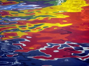
1 – A Reflection of Hope

A Reflection of Hope, by ecotist

2 – City Refraction, City Reflection

City Refraction, City Reflection, by lrargerich (Luis Rargerich)

3 – Reflections

Reflections, by kevindooley (Kevin Dooley)

4 – Reflections of Glasgow (1)

Reflections of Glasgow (1), by Shuggie!! (Karl Williams)

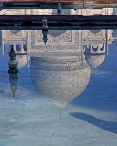
5 – Reflection of Taj Mahal

Reflection of Taj Mahal, by Ze Eduardo (Jose Eduardo Silva)

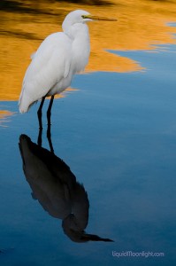
6 – Shy Reflections – Snowy White Egret (aka Heron)

Shy Reflections, by Darvin Atkeson

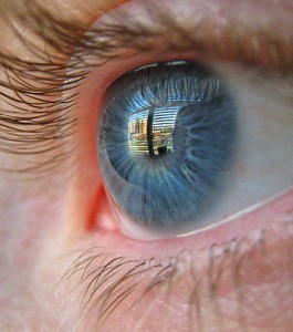
7 – Eye Reflection

Eye Reflection, by PicturePurrfect685

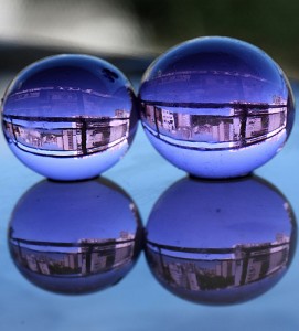
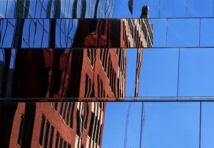
8 – Glass reflection

Glass reflection, by mirellawognum (Mirella Wognum)

9 – Regent’s reflection #1

Regent's reflection #1, by Brian Negus

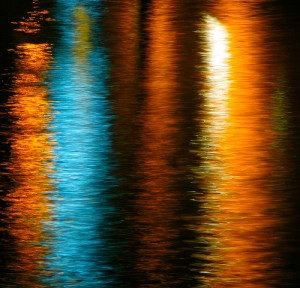
10 – another funky reflection

another funky reflection, by annpar (Ann P)

All photos used in this article are used as ‘fair dealing‘. If you have strong reservations against your photos appearing on Small Aperture, please contact us, and we’ll get them taken down. Please support the artists creating these photos by clicking on the photos to take a closer look at their work!