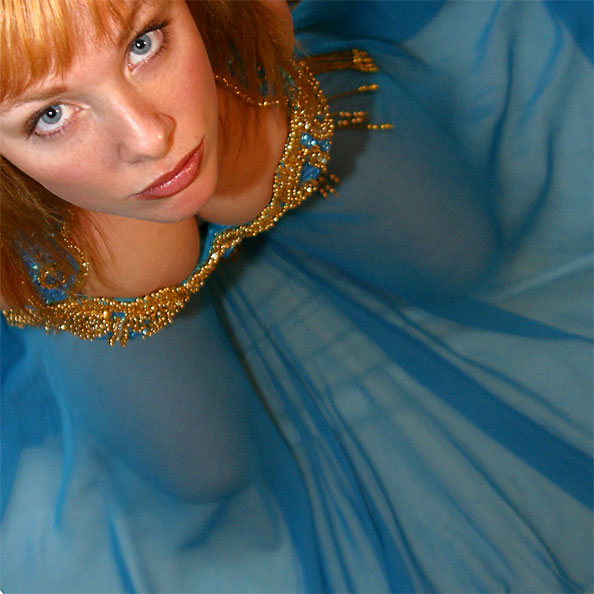
In a recent photo critique, I went off on one about the aspect ratios I prefer, when I look at photos. But have you ever thought about why you would prefer a particular image ratio? Is there a rule about what size photos should be, and if so – who decides the rules?
I’m just sharing my own thoughts here, but I’d love to hear your opinions on the matter as well!
 There are a lot of ideas around regarding what size things should be. ISO 7810, for example, specifies the size and shape of a credit card, the aspect ratio of which many people find is a comfortable, conceivably because its official size (85.60 × 53.98 mm) is pretty close to the aspect ratio of a golden rectangle (related, of course, to the golden ratio. See also the silver ratio, which is used, among other things, to determine the shape of an A4 sheet of paper).
So why do most photographers operate with 3:2, 4:3 or 1:1? Well, truth be told, it’s a historical thing: The modern 135 film (also known as 35mm – referring to the width of the film – or 36mm – referring to the width of a negative frame – film) was 36mm by 24mm in size. The past 80 years or so, we have become so accustomed to the 36×24 (that is to say, 3:2 aspect ratio) photos, that it just looks… right.
 4:3 is the aspect ratio of a normal television, which is of course another size we have become used to over time, and it is the aspect ratio used by most computer monitors. Some digital camera manufacturers took to – including Canon: my Digital Ixus / Elph takes photos in the 4:3 aspect ratio. Some cameras – including the Canon Powershot G7 – even support both image ratios, selectable in the menu system. If you are curious which cameras use which aspect ratio, check out Digital Photo Review. Since the dawn of time (well, since Phil Askey has had the the stats on his site), they’ve kept track of which camera uses which.
The last aspect ratio that is popular is 16:9, because it is used in cinemas as ‘wide screen’, but there are dozens of others in use, too.
So, err, do you use a calculator when you crop your photos?
Oh, not at all! The marquee tool in Photoshop has a powerful function which is called ‘fixed aspect ratio’. As you probably know, if you use the marquee tool and hold the shift key, the selected area is forced to be a perfect square. You can also select your own aspect ratio, however, in the tool menu that shows up when you select the marquee tool:

Here, you can type in whatever aspect ratio you prefer, and the select tool will lock on to it. If you want to switch between 3:2 and 2:3 (for example, if you want to crop portrait instead of landscape photos), you can just click the button with the two little arrows: It swaps the numbers over for you.
Nifty, yes?
 What makes you choose an aspect ratio over another?
So, why do I refuse to crop images to anything other than either 3:2? It’s an odd one, I’m fully aware of that, but to me, there’s something almost holy about 3:2. I like my photos to be photo-shaped, and to me, the 3:2 shape just looks the most right. I find it peaceful to look at, and there is something exciting about working to the arbitrary and dated restraint of 3:2.
At the same time, I did a photo shoot about 4 years ago which opened my eyes to shooting square photos. I had a few photographs that were very successful, but that just didn’t quite want to work out as photos. In the end, I spotted that perhaps it would work if it was square, and this was the result:

Ultimately, I can’t tell why I decided to stick to those two formats. Perhaps it looks tidier. Perhaps it saves time if and when I decide to have the photos printed. Or perhaps I’m just an old-fashioned has-been, who refuses to let the fact that you can crop your image to whatever the hell you want to break on through.
So… What about you? Do you have hang-ups about aspect ratios of your images? Leave a comment!
(can you spot what all the aspect ratios in this post were? The girl is 1:1, the glasses and sleepy person is 3:2, the flower is 4:3, and the brown stuff, which actually is tobacco from a cigarette, magnified 6x, is 16:9)
Do you enjoy a smattering of random photography links? Well, squire, I welcome thee to join me on Twitter - Follow @Photocritic
© Kamps Consulting Ltd. This article is licenced for use on Pixiq only. Please do not reproduce wholly or in part without a license. More info.


