There's an assumption that high-contrast images are more dynamic, more compelling, more inviting. Have a go at some low-contrast photography. You might surprise yourself with the results.
The winner of Self-portrait September is...

Coo-ee you made it tough for us to settle on a self-portraitastic winner for September! We saw so many different elements that we liked, finding a picture that we could agree on was an exercise in endurance!
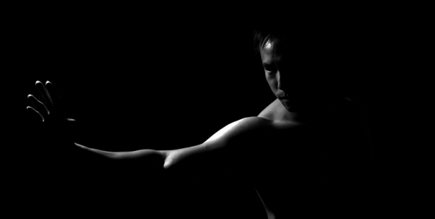
Eventually, though, we came to a decision. It was Milo Sees who walked away with the spoils for his Training in the Dark. Haje and I were both captivated by the lighting, and there was something about the juxtaposition of the sleek, smooth skin, the poise of the body, and oppressive darkness that made it my winner.

Congratulations, Milo! You've won a 12" Fracture!
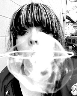
Our runner up was Bubble Blastage by Kathleen Cassidy. Gareth thought that the idea was neat and he loved the high contrast look. It was the sassy attitude that blasted straight through my screen that I adored. Great stuff, Kathleen!

Thank you to everyone who entered. The theme for this month's competition is round. You can check out the details here. We're looking forward to seeing your pictures!


