 For this issue of the Photocritic Photo Critique, we’re going far afield! Joel Legassie is a Canadian who is currently living in Japan, and is an avid photographer. His photos are sharp, stylish, and striking… So can we offer him any advice?
Joel uses a I use a 6.3 megapixel Canon Kiss Digital (that’s the Digital Rebel / Canon EOS 300D to the rest of us), with the standard 18-55mm lens.
Photo 1:

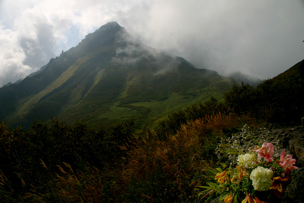
Water flowers always make for amazing photography, and these Lillies are no different. Initially, the slightly damaged leaves to the left and top of the photo bothered me, but they actually grew on me – the autumnal colours combined with the deel greens and browns of the leaves make a very nice contrast to the strong reds and pinks offered up by the flowers.
The photo seems ever-so-slightly over-exposed: some of the leaves of the flower are a bit whiter than I woul dhave expected. This could be reflected sunshine (i.e the same problem as in our last critique), but I do expect this is a plain overexposure problem. It isn’t overly disturbing in this photo, but nevertheless it would be worth keeping an eye out for in the future.
From the EXIF information embedded in the file, I can see you shot the image at f/8 (a good idea, this is the aperture whee your lens is sharpest) and 1/50 sec shutter time. Personally, I think I would have liked that same photo seen shot with a 50mm prime lens, wide open. If you manage to get close enough to the flowers, that should actually blur out the background ever so slightly, bringing more of the focus on the flowers themselves.
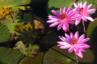 The main beef I have with this photo is that it is a little haphazardly framed. I can’t work out why you decided to put the flowers in the middle of the frame, with the ‘broken’ leaves towards the side. Personally, I have a dirty, dirty fetish, which is (I can tell you all can’t wait to find out…) to crop in tighter. Always closer in to the action. It’s a matter of taste, of course, and I fully respect if you decide to make a different choice, but if I had taken this photo, I would have gone in a lot closer, much like the mock-up crop shown to the right.
The only thing I have done here is to crop a rectangle constrained to an aspect ratio of 3:2 around the three flowers and whatever else came into the frame at that aspect ratio on the left.
Why? Well, for one thing, it gives the image a purpose, a direction, perhaps even a message. The contrast between the wilting leaves on the left, with their dark, decaying colours, against the hope of the pink flowers on the right appeals to me.
The final suggestion I would have made: If there was anyone around, you could have asked them to hold out an arm, a bag, or an umbrella to cast a shadow on the right side of the image. You want the flowers basking in the sun, but anything you can do to help the background be a little less conspicuous would probably be a good idea in this case.
Photo 2:
Joel sent me 4 photos, but I decided to choose another of his photos with flowers in it for the second part of this critique.
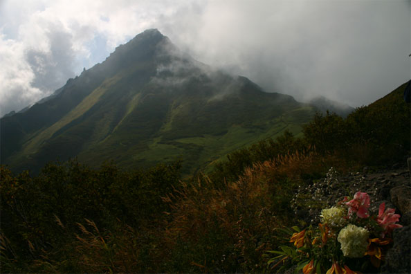
This photo is called RishiriFuji. My Japanese is non-existent, but I assume it means ‘mount fuji, and I totally live the idea behind this photo.
What you did wrong in terms of framing in the previous shot, you definitely did right here. The dimmed hazy colours of the mountain covered in gray clouds in the background is balanced out with the oranges, browns and multicoloured bouquet in the bottom right of the frame.
If I were to nitpick, I think there is too little going on to the right of this image, but it isn’t something that is easily fixed with cropping. Personally, I prefer either a 3:2 or a 1:1 (perfect square) aspect ratio for aestetic reasons, but there is no way you can crop this image using either of those without losing too much on the right, or cutting the top of the mountain off. This could have been addressed on location by taking a step back (making the flowers smaller in the image), moving the camera down (which would put the flowers just beneath the foot of the mountains), and then zooming in slightly (to re-establish the frame).
The other niggle I have about this photo is that I feel it is lacking in contrast, and a little bit too dark. The problem is that the lighting is very soft and even, and that upping the brightness by increasing the shutter time or opening up the aperture would have lost the moody feel of the image. You would have ended up with something like this:
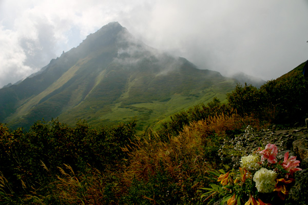
… Which completely ruins the beauty and subtlety of the original photo.
If you have a tripod, a flashgun and an off-camera flash lad, you could have tried to frame the image properly, expose the photo for the mountain, and then add a tiny dash of flash light on the flowers, just to really make them stand out in the image. Once again, you have to be really careful, as it is very easy to over-do the effect, but just the tiniest change would really draw more attention to the photo. I’ve simulated it here, but fill-flash is rather difficult in Photoshop, so do forgive me for not getting it quite right:

I hope I got close enough to illustrate what I was trying to say, however!
Anyway, both these two pictures discussed here, and the ones you sent to me separately show a lot of care and interest in photography – I hope this critique serves as a push in the right direction!
The main message to take home, is that after each photo you take, think ‘what is my message’, and ‘what am I trying to achieve’. If the photo you just took doesn’t convey that message, or doesn’t achieve what you would have liked, try to identify why, and to take another photo which may address the issue at hand.
Do you enjoy a smattering of random photography links? Well, squire, I welcome thee to join me on Twitter - Follow @Photocritic
© Kamps Consulting Ltd. This article is licenced for use on Pixiq only. Please do not reproduce wholly or in part without a license. More info.

