portraits

When cropping heads isn't a photographic crime

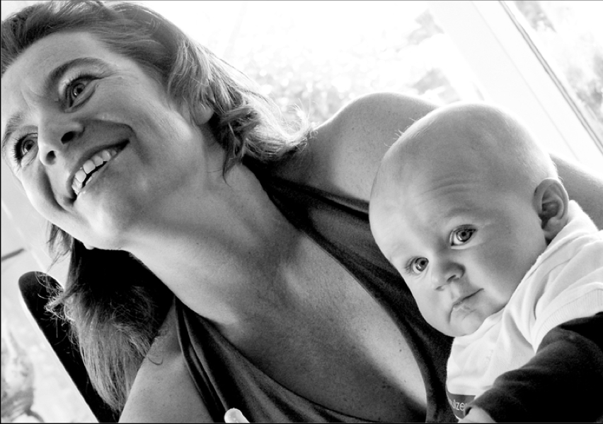
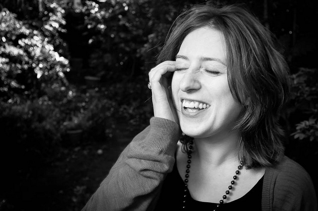
Have you ever had someone take a photo of you and a friend, only to find out later that they cut off the tops of your heads? It looks ridiculous, and if someone’s head 'sticks out' of the composition, your photo is ruined. In other words, it’s not hard to imagine where the don’t-crop-people’s-heads rule came from. When you are working with people and portraits you will soon learn that there are good ways to crop people, and others that are not so good. Cropping heads is at the top of the naughty list. Don’t do it! Slicing off some of the lovely Sarah's head would not have been a good look

Except that, sometimes, cropping heads can be highly effective.

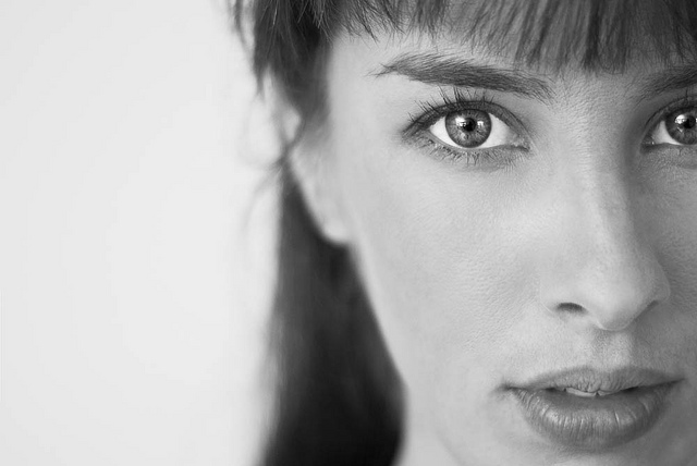
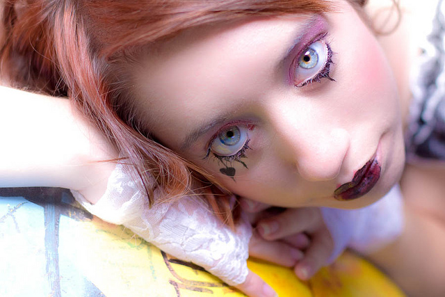
When can you break this rule-of-rules? When you've got in close—really close—to your subject. If your composition is focused only on somebody’s face, it can improve the shot to crop in close.

Get closer!

Don't be afraid to break the rule and crop in close and slice something off of the top, bottom, or sides of the head when the features of the face are the focal point of your composition. The reasoning is this: if you’re going to get in close, get in really close. By filling the frame completely with someone’s face it can make cropping her or his head unavoidable, but it also doesn’t look unnatural.

The key is to decide whether your composition is mainly about the body, upper body (shoulders and above), head, or just the face. Each type of shot has a different purpose, and only the face shots will look natural if you decide to crop the head. Otherwise it merely looks like you failed to plan your shot.

Intentional or accidental? It's hard to tell.

But in-keeping with the adage that if you're going to break the rules, break them properly, if you are going to crop into somebody’s head, make sure that you do it properly. A composition where only a thin sliver of someone’s head is cut off looks accidental. If you go even closer and cut them off across their forehead, the composition looks a lot more powerful, and at least nobody is left wondering whether or not you did it by accident!

Be bold - get in close!

Be bold!


Rules Screen Shot More unusual ways of looking at things, remembering rules, and then breaking those rules, are in my lovely book, The Rules of Photography and When to Break Them. It's available as an e-book and in a dead tree version (UK, US).


The Golden Hour

A lovely Golden Hour Winter Rose, taken by our very own Daniela

It’s that time of the month again – Photography Concept on Friday (remember to refer to it as ” PCoF ” to look cool in front of your friends) looks at the Golden Hour. The Golden Hour is sometimes referred to as the Magic Hour. It’s not to be confused with Happy Hour, although they do share similarities – it’s the one hour of the day you should look to take advantage of as much as possible.

To further confuse you, the Golden Hour occurs twice a day, so technically it’s the Golden Two Hours. It is essentially the first hour of light around dawn and the last hour of light around dusk. For outdoor photography, these hours are special, because the light is of a particularly beautiful quality. Tones are warmer, the light is softer and the shadows are longer.

A lovely Golden Hour winter rose, taken by our very own Daniela

Now for a little bit of science (and I mean “a little bit”). The reason the light is of a different quality at this time of day is due to the positioning of the sun. The closer the sun is to the horizon, the farther the light has to travel through the Earth’s atmosphere. This reduces the intensity of direct light, such as the kind you might see at high noon (think duels in Wild West films). During Golden Hour, more of the light comes from indirect light from the sky.

Contrast is less pronounced during the Golden Hour, so in landscape photography, shadows are less dark and highlights are less likely to be overexposed. Golden Hour is great for everything, in fact – portraits benefit from the beautiful, dramatic lighting, as the diffuse, soft, warm nature of the light is kind to skin tones.

My advice would be to get creative with the Golden Hour: don’t just limit it to landscapes and portraits. The most mundane of objects and grottiest of side streets can be transformed into beautiful scenes. Go and find something that you know has almost no photographic potential and see how it looks, quite literally, in a different light. Heck, take your own objects outside and set up a still life out in the park.

So instead of taking advantage of the Happy Hour this Friday evening, why not take advantage of the Golden Hour? I use The Golden Hour Calculator to find out exactly when the Golden Hour begins and ends. It’s absolutely brilliant – it shows you exactly when the Golden Hour starts and ends each day. For all you London types, the Golden Hour this evening starts at 7:12pm and ends at 8:32pm.

Go forth, dear readers, and discover a whole new, beautifully lit world.

Shoot Report

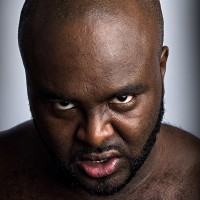
A 50mm prime was used for intense close-up shots

To ease us into the second half of the week, I thought I’d provide you with a little light relief (and, hopefully, a little entertainment) by writing a shoot report. Now I was perusing my recent shoots in an effort to decide which might provide the most entertainment. One of my corporate headshot gigs? Nah, too dry. Perhaps a published editorial portrait? The last couple ran too smoothly to be exciting (for a change). How about…men in spandex? No, really.

When I have the time and a paying client, I venture into the world of wrestling photography. Usually, this takes the form of busting out the studio lights to provide a series of portraits for use in programs, on flyers, posters and roster pages for websites, as well as photographing the show itself. While I can understand that most people wouldn’t even consider tackling this subject, I would argue that it is a really interesting, unusual challenge to set yourself.
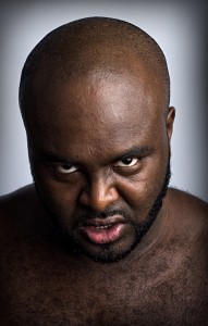
A 50mm prime was used for intense close-up shots

Preparation

After seeing some of my previous work, I was contacted by my client with the request for a full day’s shooting. It was indeed to be a full day: up at 7am, home at midnight. I was commissioned to reshoot the promotional portraits for the entire roster and then shoot the show itself in the evening. I was given pretty much free reign to shoot the portraits as I saw fit, with the only requirement being to shoot them against a white or light background, for ease of cutting out for posters and the like in the future.

I spent the week prior to the shoot communicating with the promoter about each wrestler’s persona. This meant I would have my pose ideas in place beforehand, allowing me to work quickly. I purchased a new paper background in “Arctic White” (surely that’s just white? You can’t have shades of white), which I added to the expenses.

On the day of the shoot, I arrived and set up my background in a nice, big gym hall that was to be the changing room and general hanging-out area for before and after the wrestlers’ matches. I was acutely aware that adjusting lighting would take up a significant portion of my time over the day, so, to minimise that, I set a marker on the floor with a couple of pieces of sticky tape for the wrestlers to stand on, setting up my lighting based around that.

The Shoot
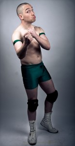
One of the less threatening members of the roster...

So far, so good. Except we hadn’t shot anyone yet. Wrestlers, whilst generally a good bunch of lads and lasses, aren’t models or professional posers, as it were, but generally aren’t nervous of the camera, either. This is both a blessing and a curse. It means they generally take direction fairly well, but if one of them turns up on set with this brilliant idea they have that will definitely look really cool and not at all silly and embarrassing, you have to handle that situation in a certain way.

I bring this up because it can apply to any posed portraiture session. Often, you may find that your subject suggests something that you either know won’t be used, due to the brief you have been given, or is just a horrible, horrible idea (it’s often the latter). It’s important that you indulge your subject at this point, within reason, because you want to keep them open and relaxed. If you listen to and try their ideas, it keeps the flow of the shoot going and makes them happier, even if you don’t use the shot. If you shut them down too often, they will most likely close themselves off to you: why should they try your ideas if you’re not willing to try theirs?

And no, “because I do this for a living” is not a fair point in their opinion.

To be fair, it’s always worth trying an idea your subject brings up: sometimes you can be surprised by how an idea which doesn’t sound so great on paper ends up looking great in practice. Your subject isn’t aware of the ‘rules’ of photography, so when they gleefully break them all without even realising, you sometimes get an unusual shot that actually works. Even if it’s not perfect, you can make suggestions to adjust the idea, explaining why you’re doing so, which will bring you to a great shot that you weren’t expecting to end up with.
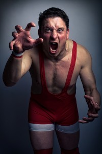
This man is frightening.

For this shoot, my plan was to grab the closest person, get them in front of camera, shoot a range of ideas, adjust the lighting as quickly as possible without compromising the quality, and move on to the next person, keeping a rough “10 minutes per person” time limit in my head.

Although these shoots can be manic, I love seeing the difference in reactions and approaches from person to person. Some come in with their own ideas because they know their own character well. This can go one of two ways – guy turns up, does a variety of entertaining poses, I let them get on with it and make sure the technical side is covered, they’re done in 3 minutes and we have a set of great shots. The other, bad way, is guy turns up, thinks he’s got it down, doesn’t need your help, strikes a series of terrible poses. It’s then down to me to adjust their approach without getting them bent out of shape (emotionally as well as physically), which is a case of dealing with fragile egos to get them a better image without crushing their confidence.

I feel an extreme case of the waffles coming on, so let me fast forward you through the 8 hour shoot with some snippets of choice moments.

Time Lapse of Events

  • “Please don’t backflip so close to my lights” *clunk*
  • “I don’t want to come across as a cartoon character” (said whilst wearing neon, multicoloured lycra with tassles and facepaint)
  • “I don’t need pose suggestions, I’m pretty good at this sort of thing” (guess what happened next)
  • “OK now give me a bit of a sneer. You’re a bad guy, so look mean. That’s….not really a sneer – that’s more of a kissy face”
  • “Right, really tense up now and snarl right into the camera, as intense as possible. Good, brilliant, more more more…OK stop now. No really, stop. I’m pretty sure you’re about to faint”
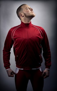
A bit more freedom with lighting and post-prod allows for more dramatic shots.

Wrapping up / Post Work

To finish up with a little technical detail, Lightroom saved me a heck of a lot of time here. I make my own presets based on the general setup of the lighting that day and apply them to a selection of images. The client then chooses their favourites and I run those through Photoshop for the full treatment, carefully editing and tweaking as much detail out of them as possible. With the wrestling promo shots, I tend to do quite a bit of post work, as the wrestlers need to look larger than life, like action heroes, so I’m a little more liberal with curves and sharpening than I usually would be, for that “movie poster” effect.

Finally, it’s a case of adding logos and sending to the client and we’re finished. One camera, one background, two lights and three hundred plus photographs of men in their pants: just another average working day.
Heading Back to the Future with your portraits

Lali, 1978 and 2010 in Buenos Aires

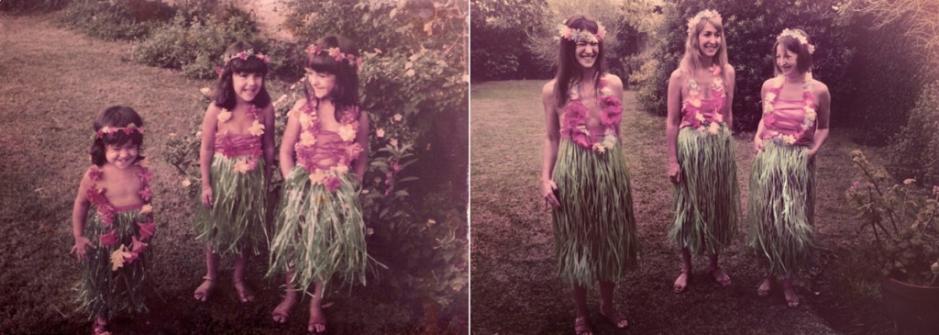
Take an old portrait and recreate it: same people, same place, same look. Sounds like fun, if a bit of a challenge, no? It’s the sort of thing that would complement ‘Dear Me’ (writing to your 16 year old self) or tweeting your 16 year old self, perfectly. It’s also what Argentinian photographer Irina Werning has been up to recently. It’s her project, Back to the Future.

As she says, she loves old photos and she’s a nosey photographer. So this is the hybrid: ‘…it’s imagining how people would look and feel if they were to re-enact them [old portraits] today.’ Well, I’m charmed and rather inspired by the quirky results.

Flor, Male, and Sil in 1983 and 2010, by Irina Werning

In fact, I know precisely which photo of me I’d like to try to recreate. I’m seven years old and I’m standing on the bonnet of a car, halfway up the road leading to the summit of Monte Corona, taking a photograph. It was the holiday when my father taught me how to use an SLR. Perfect!

Take a look at the rest of the Back to the Future project gallery on Werning’s website.

A snapshot of Times Square

Picture 2

The New York Historical Society wants your pictures of Times Square. It doesn’t matter if your photographs are architectural, portraits, reportage, or snapshots. Whether you’re a tourist or a super-enthusiastic amateur isn’t important, either. It’s about creating an archive of contemporary views of Times Square that will be searchable today and in the future.

There are some things take into consideration, though. Your pictures need to have been taken between 21 November 2010 and 31 March 2011. They need to take in Times Square from West 42nd to 47th Streets at Broadway or Seventh Avenue. They need to be in guf, jpg, or png format. They need to be at least 1,200 by 1,500 pixels (which is 8″ by 10″ in old money). And you can correct the colour and crop a bit, but nothing that alters the original subject matter is allowed.

Of course, the photo (or photos, you can make multiple submissions) must be yours, but you should check out the submission details for yourself. You can do that, and find out how to submit your photographs, here.

(Headsup to Photography Blog.)

Make your own reflector

With a reflector

After writing about saving money on your photography a while back, we thought that perhaps you’d actually appreciate having a look at some of the suggestions that we made in a bit more detail. A good place to start is with a reflector. Duncan Howsley will tell you all that you need to know!

So you have bought a dSLR and a lens (or two). You have been taking portraits of friends and family. Whilst they look good, they don’t quite match up to your expectations: the lighting is not quite right and there are shadows in odd places. Or maybe you have been reading about off-camera lighting and want to experiment with using light in new ways; maybe you just want to take your pictures to the next level.

This is lit from the right with a reflector helping to light her face on the left

Unfortunately, buying a lighting set up can be both very expensive and complicated. Okay, so the recent popularity of the Strobist movement has increased awareness of affordable and DIY solutions to this problem, but investing in these systems is still a big step, it doesn’t matter if you’re still wet behind the ears with your dSLR or are a veteran of the manual campaigns. Fear not, however, as other solutions are available!

One of the most simple and affordable ways of controlling light is using reflectors. As if the name didn’t already give it away, they allow you to manipulate the light that’s available by reflecting it at the subject. If you want to splash out and buy a reflector, there are plenty on offer. Most take the form of a large, collapsible disc with both gold and silver faces. These two faces allow for control over the light temperature—essentially, the colour of the light—on the subject. The gold side providing warmer tones.

You can use a reflector with both artificial light and natural light. You can also use them in the same way as fill flash, allowing you to light up the subject’s eyes as well as removing shadows under the nose and chin. Pretty useful.

So, are you ready to get into primary-school-teacher-mode, dig out the scissors and glue and have a go yourself? I thought that you were. You’ll need a roll of aluminium foil, some cardboard, glue, and scissors to make a perfectly sufficient, if not slightly unwieldy, DIY reflector.

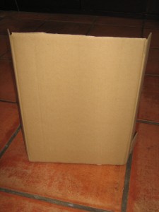
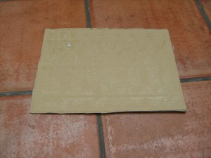
First, select your piece of cardboard. However big it is will be the size of your reflector. A cereal packet will make a cereal-packet-sized reflector, whilst the box that your new vacuum cleaner came in will make a fairly epic sized reflector.

Plain cardboard, still with side flaps at this point

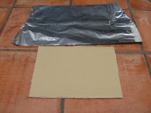
Second, lay out your aluminium foil. It needs to be larger than your piece of cardboard. Foil not as wide as your cardboard? No problem! Use several pieces.

Third, apply glue to your cardboard. (Spray adhesive is probably easiest, but remember to do it somewhere well-ventilated and take adequate precautions.)

There is glue on this. Honest.

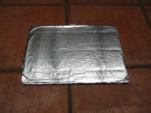
Fourth, stick your foil to your cardboard. Avoid sticking yourself to the cardboard. That’s messy. Fold the overhanging foil around the back of the cardboard and stick it down to make it look tidy, et voila! One reflector!

Tah-dah!

No go forth and take beautifully lit shots knowing that your reflector cost you practically nothing.

If primary-school-teacher-mode isn’t quite doing it for you and you want to advance to secondary school DT level, this blog shows you how to make a rather more snazzy reflector.