squire

Video Photo Critique III: Biz Eating Apple


Today's video critique is Biz Eating Apple, by DiaspirePhoto. Take a closer look at it on Flickr!

This is the third in my now-weekly series of video critiques. To see all (well... Both) critiques and to find out how to get your own critique, check out this post.

Well then, with that out of the way, let's get cracking on the critique:


Do you enjoy a smattering of random photography links? Well, squire, I welcome thee to join me on Twitter - Follow @Photocritic

© Kamps Consulting Ltd. This article is licenced for use on Pixiq only. Please do not reproduce wholly or in part without a license. More info.

My new book: Photographing People


The day I was born, my father took one look at me, and walked to the nearest camera shop. He bought his first SLR camera – a Canon A1 – and a couple of lenses. I still have that camera, and it serves as a reminder of why photography is so important - and of why people decide to start taking photos in the first place.

To me, photography is very closely linked with people. Don't get me wrong, I love taking photos of landscapes, and I have been known to take the occasional still life and macro photo in my time (I even wrote a book on the latter). Nonetheless, to me, photography really comes alive when I'm taking photos of people, be it in a formal setting (like studio portraiture or wedding photos), a bit more relaxed (impromptu photo sessions with friends) or even if I'm sneaking around taking photos of complete strangers when I'm abroad somewhere.

As such, it made sense that I would write a book on how to take photos of people. A lot of hard work later, and it's going on sale imminently. Go on, you know you want a copy...

(The images in the gallery above are a small selection of the pics from Chapter 5 - 'Getting Creative')


Do you enjoy a smattering of random photography links? Well, squire, I welcome thee to join me on Twitter -

© Kamps Consulting Ltd. This article is licenced for use on Pixiq only. Please do not reproduce wholly or in part without a license. More info.

The magic of fill light


Lightroom is magic - and as photographers, we've never had it this good.

There you are, after a long day of shooting, and you realise that some of your favourite photos are too contrasty, with parts of the image bathing in darkness. Adobe Lightroom to the rescue...

I was playing around with my brand new Canon EF 100mm f/2.8 macro lens in my kitchen on a rainy day, and was experimenting with a new reflector I was building (it works great, but more about that in another post). Some of the photos that didn't work out so well ended up on my camera, and then on my computer, and then in Adobe Lightroom. I figured I'd see if I couldn't edit one of them into shape a little, and was (re-)astonished by the fantasticness of Lightroom's Fill Light slider.

Starting with this photo:

haje_jan_kamps_20110317_img_5209.jpg

I started experimenting with various settings. You can crank up the exposure to make the rest of the image brighter, of course, but that would over-expose the already bright highlight on the right of this Hershey's Kiss.

So, by instead adjusting the Fill Light slider:

screen_shot_2011_03_18_at_083717.jpg

I was able to recover the shadows remarkably well:
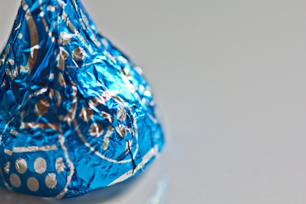
haje_jan_kamps_20110317_img_5209_2.jpg

A closer look at the image shows that you do gain a bit of digital noise:

20110317_img_5209_5184_x_3456.jpg

But it's possible to reduce it quite a bit by using Lightroom's rather phenomenal noise filters:

20110317_img_5209_5184_x_3456_2.jpg

Of course, as always, it's much better to ensure that you get your lighting right when you take the photo; you get less noise, higher quality, and more precise control about what the hell you're doing. And yet, it's rather fantastic to see how photographers are given a lifeline if you balls things up just a little bit too much.

How did we ever survive without Lightroom?


Do you enjoy a smattering of random photography links? Well, squire, I welcome thee to join me on Twitter -

© Kamps Consulting Ltd. This article is licenced for use on Pixiq only. Please do not reproduce wholly or in part without a license. More info.

Macro photography with your mobile phone


In my second round of videos for the Nokia N8 Camera School, I'm getting up close and personal – with some bumble bees. In this video, you’ll see the Nokia N8′s macro mode in action, and the results? Well, let's just say that the compact camera manufactures have plenty to be getting worried about...


Do you enjoy a smattering of random photography links? Well, squire, I welcome thee to join me on Twitter -

© Kamps Consulting Ltd. This article is licenced for use on Pixiq only. Please do not reproduce wholly or in part without a license. More info.

Keep the dust off your lens

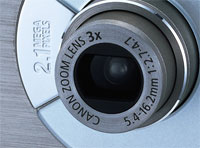
ixus.jpg

If you’ve got a compact camera, you know how bloody annoying it is to have to clean your lens. It’s tiny, and it seems to attract dust as if it was a lamp, and the dust were moths, confused by the lovely, bright source of light. Right? Right? Right.

There’s a ridiculously simple solution worth trying: When you know you’re going to be in a particularly vulnerable situation (a desert, a dusty place, or a night on the lash*, for example), you could do some pre-emptive maintenance: Just cover up your lens with a piece of high-quality scotch tape!

Important: Obviously, only use the following tip if your front lens element (that’s the glass bit) doesn’t actually stick out further than the lens barrel. Otherwise, you’ll make your lens sticky and dirty and the whole point is gone! 


Sounds simple? Well, that’s because all the greatest solutions usually are. The better quality your tape is (i.e. the more translucent it is), the better. The best thing, obviously, is that the scotch tape is a hell of a lot easier to clean off than the crinkly, unreachable crevices of your digital compact camera!

Bonza.

*) on the lash is a Britishism for being pished as a newt. Hammered. Whacked. Smashed. Pissed. Fucked. Or, in the parlance of our times: ‘drunk beyond reason’.

Extra special thanks to CalebVaughn for this ridiculously simple, yet incredibly effective tip!


Do you enjoy a smattering of random photography links? Well, squire, I welcome thee to join me on Twitter -

© Kamps Consulting Ltd. This article is licenced for use on Pixiq only. Please do not reproduce wholly or in part without a license. More info.

Contrast, colours, and curves, oh my!

curves-galore.jpg

curves-galore.jpgCurves is one of the most powerful tools a photographer has in his or her arsenal. You can do a lot more with curves than you can do with the Levels tool. In fact, most photographers who embrace curves stop using the Levels tool altogether – although until you fully understand what Levels is, what it does, and how to use it, you’ll never be able to get the full potential out of the Curves tool either.  


So I figured it was time that we had a very close look at Curves, what they do, and how to use them. Just when I started researching the topic, I discovered that my new friend Matt Greer has an amazing write-up on curves over on his web-site, creatively titled Photoshop Adjustment Layers – Curves.

In fact, his whole blog is worth reading, because he has a series of good Photoshop tips, tricks, and in-depth tutorials that – without being a patronizing git – gives you a gentle introduction along with more in-depth power tips.


Do you enjoy a smattering of random photography links? Well, squire, I welcome thee to join me on Twitter -

© Kamps Consulting Ltd. This article is licenced for use on Pixiq only. Please do not reproduce wholly or in part without a license. More info.

Try before you buy: Rent glass!

rentglass.jpg

rentglass.jpgA good way to get to grips with camera equipment is to go out and rent some. Here in the UK, I’ve found Calumet Photo to be an invaluable source of expensive glass on a temporary basis (they also have a presence in Germany, Holland, and the US), but I just stumbled across a brand new concept: On-line lens rental! 


It is such an obvious thing to do, but I guess it’s like Columbus’ egg – you have to think about it first. Of course, you can’t keep a good idea to yourself for very long, so when I started to look for it, I actually found two companies that do on-line camera equipment rental – One of them is Ziplens, and the other is the unimaginatively named RentGlass.

As far as I can tell, they both only cater for the US market, but hey – it’s a brilliant idea, and I bet it’s only a matter of time before the concept goes around the planet.


Do you enjoy a smattering of random photography links? Well, squire, I welcome thee to join me on Twitter -

© Kamps Consulting Ltd. This article is licenced for use on Pixiq only. Please do not reproduce wholly or in part without a license. More info.

Rule of Thirds explained

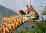
Picture-5.jpg

Picture-5.jpgIt is an age-old adage, but the Rule of Thirds is present in a surprising amount of photographs.

The rule states that an image can be divided into nine equal parts by two equally-spaced horizontal lines and two equally-spaced vertical lines. The four points formed by the intersections of these lines can be used to align features in the photograph. Proponents of this technique claim that aligning a photograph with these points creates more tension, energy and interest in the photo than simply centering the feature would.  


There are quite a few sites out there that talk about the rule of thirds, and there is a lot of discussion going on as to wether it’s a load of poo-poo, or if there is some sense to it. We’d be the last people to say that you should be using the rule of thirds, but one thing it certainly does is that you become more aware of your framing and what’s actually going on in your frame.

Read more about the rule of thirds on Silverlight, Wikipedia and Everything2.

To see some examples of the Rule of Thirds in action, check out the example galleries on Pixalo, PhotoInf, Digital Photography 101 and Better Photo!

Now go out there and give it a try!


Do you enjoy a smattering of random photography links? Well, squire, I welcome thee to join me on Twitter -

© Kamps Consulting Ltd. This article is licenced for use on Pixiq only. Please do not reproduce wholly or in part without a license. More info.

Making food look yummy

Picture-3.jpg

Picture-3.jpgI know we’ve featured Still Life With… once before, but they deserve another mention, for being so damn good. This time, they’ve made a fabulous little guide to how you can make food look good, by using creative lighting techniques.

The great thing is that the tips and lessons learned from this post don’t just apply to food – it works excellently for all sorts of stills photography in a studio setting.  


Trainers, fruit, pens, bottles of ketchup, it all makes no difference: Stills photography is stills photography. Food poses its own challenges, of course, and it’s a good thing they are addressed in this article. Personally, I love food, but that’s beside the point: the tips offered are transferrable skills, and I particularly like to pick up new ideas and hone my skills by being challenged to new forms of photography – so why not food?

By using a “show and tell” approach, Still Life With manages to both show you what looks good, explain why it works, and finally take you through the motions of how you can copy the ideas yourself. It’s worth having a look at their Lighting Positioning: Shooting in the Kitchen either way – you won’t regret it!


Do you enjoy a smattering of random photography links? Well, squire, I welcome thee to join me on Twitter -

© Kamps Consulting Ltd. This article is licenced for use on Pixiq only. Please do not reproduce wholly or in part without a license. More info.