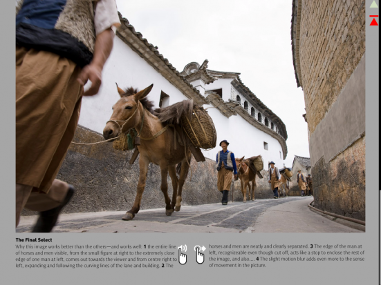
One of the strengths of iPad over normal magazine, is that you can look at more photos up close than ever before
This week, a brand new photography magazine came crashing onto the scene - but it's a photography magazine with a twist. Embracing the awesomeness of the iPad, multiplying it with an experienced production staff, and what do you get? The Photographer's i.
I was one of the contributors for the first issue (proudly, I might add), but apart from submitting my article, I wasn't really involved with the rest of the magazine - so that's why I'm interviewing the executive editor, Marti Saltzman, to find out some more about the Photographer's i.
What is it?
"Photographers i is not like any other photography magazine because it starts from a different premise", Marti says. "It offers innovative content in the form of text, photos, video, and audio—not as gimmicks, but as fully integrated elements that add up to a uniquely informative experience. You can hear and see articles come to life in a way that simply is not possible in print. You can also interact and play with overlays, move things on the page, etc. Hearing a photographer’s voice as you view his work gives such insight into their creative process—it becomes a personal experience, as if they are speaking to only you."
Of course, none of this would have been possible in the static medium of a print magazine. In addition, there are other technical advantages to the iPad - the screens found on Apple's tablets (and, to some degree, on other tablets as well) are absolutely ideal to showing off photography: It makes photos look beautiful in their full detail.
"One of our up-coming contributors said that looking at photos on an iPad was like looking at a full size transparency on a light table", Marti laughs. "How good is that!?"
Focusing on photography - not on gear
It isn't just in terms of the format that the Photographer's i is doing things a differently. Many photography magazines stay current by writing about news and equipment, but the P-i has chosen to take a different approach. As you're exploring the mag, it quickly becomes obvious that the people behind the magazines come from a book-publishing background: There's no reason why the Photographer's I shouldn't be as relevant in six or eighteen months as it is right now.
"Our concern," Marti explains, "is with the art of image making."
It's a great choice, in my opinion: there's little point in reading a 6-month-old issue of most photography magazines, but as you're reading, watching, and listening to P-i, it becomes clear that it's more of a short book covering a series of fascinating photography topics, than a magazine in its traditional sense. Personally, I saw it as a series of short-stories.
Creating Photographer's i
The project - published by Ilex Press - has been a long time coming, Marti says. "We developed the Pilot issue over the summer. I would say that it took about 3 months to put it together. It was a lot of work, but very fun. The people I worked with were a great team of amazingly talented people. It was one of those innovative "skunkworks" projects that came together because we were all committed to photography and new forms of publishing."
"We chose contributors based on their work and their reputation. Our goal was to curate an interesting issue in which every article would be different but all would follow our model of being primarily about a passion for image-making." Marti explains.
"We looked for a variety of genres, ages, genders, and approaches—not only approaches to the photography, but also to what they wanted their article to present to readers. Some of the articles are instructional, others are more contemplative; and a few are just plain fun."
It wasn't all fun and games however - it's a lot of hard work to get the appazine out there - but it seems as if the people who created it did it right. In publishing and design, there's an inarguable truth: People are willing to suffer bad design for good content, but they won't suffer good design for bad content. Or, put differently: Content is king. In P-i, it seems like they got the focus right:
"The hardest thing in my opinion was getting the content right. After all, that is what we ultimately would be judged for and we wanted it to be the best it could be. On the other hand, we wanted to make contributing fairly easy for people because we were working with top-level professionals who have many other things to do in life. So there was a balance to strike. We wanted to put out something that met everyone's high standards—theirs, ours and the reader's." Nothing new about any of that, but it wasn't just a new stack of content they were producing: "But then add in the challenge that we were reinventing the wheel, so to speak. It was difficult to communicate to people what we were trying to create because there was no way to show it to them."
There are other magazines created especially for the iPad that leverage the platform's strengths - Wired is a shining beacon in this respect, for example - but in the photography sphere, it's slim pickings. Most of the traditional magazine publishers have created iPad versions of their magazine that are basically digital versions of the paper magazine. That's the worst of both worlds: You get the static nature of a magazine, but you don't get the 'strokability', the smell, or the 'connection' that you get with a paper magazine. In my opinion, that's exactly where the iPad is so strong: It is possible to create something that is better than a traditional magazine, but it means you have to understand and embrace the platform.
"This was in many ways a new experience for all of us too. Even after we built an article, we couldn't really show it to contributors other than with static pdfs, which didn’t do it justice", Marti says, shrugging. "Even crazier, we had to lay it out in both vertical and horizontal viewing positions, which made the layout process even more complicated."
More complicated, perhaps, but it's delicious to be able to turn your iPad 90 degrees and see the design change right in front of you - some times to a form that's easier to read, often with the outcome that the pictures show up bigger on your screen. Fantastic!
"I finally showed the magazine to some of our Pilot-issue contributors at the PhotoPlus show in New York and everyone said the same thing: 'Now I get it.' It was a lightbulb moment. This is now easier because we have an issue available. We have had a couple of future contributors buy iPads over the weekend so they could see what we are doing."
Whilst some things were predictably hard - getting the content spot-on, and developing for a new platform - other things turned out to be easier than expected.
"I thought that it would be difficult to get people to truly appreciation what we were hoping to create. That was not the case. I was wowed by the comments I got from all sorts of people since we went live, just wowed. I have never received such thoughtful, positive, unsolicited feedback like this for anything else I have ever been involved with", Marti says, uncharacteristically quietly, as she's re-playing the feedback in her mind. "People seemed to understand what we were trying to achieve the minute they looked at it. I am still awed by it. Also, working with Graham Davis, our Art Director made everything easy. He is a real professional. He did a fantastic job and was helpful and supportive through every second of it."
Highlights
I asked Marti what her favourite part of the app-a-zine was, and her face showed that she didn't like the question in the slightest.
"That's mean!", she exclaimed. "That's like asking a parent which is their favorite child."

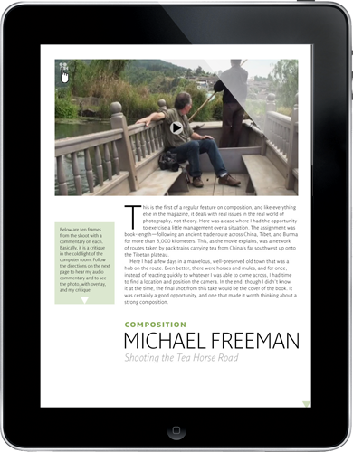
"I love almost everything and, when I look at individual articles, I say to myself, 'This is the greatest.' Then I look at another article and say the same thing. Overall, I think Michael Freeman's Shooting the Tea Horse Road article has the best of everything that we were trying to do—video, audio, overlays, photos, etc. Not surprising as Michael, who is also our Editor-in-Chief, is just amazing and a very, very talented photographer."

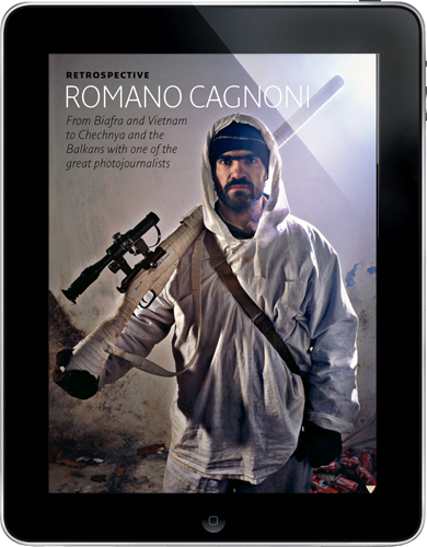
Leafing (or should I say "stroking"?) through the Photographer's i, she comments on a few more pieces, but settles on her second top-favourite feature as well. "I really love the Romano Cagnoni feature. It is because, as a war photographer, he is so passionate about what he does and you can hear this passion in his voice and witness it when he smooths out that big print with his hands. He also had a real empathy with his subjects—those Chechen soldiers, with their humanity. Plus, you get to know him a little when he talks about the Ho Chi Minh picture that he photographed during the Viet Nam war. His photography is amazing and was shot under incredibly difficult conditions and he is amazing too — brimming with passion."
"The public reception has been fantastic", Marti says. "We have exceeded our initial expectations and, as I said above, I am thrilled by the feedback we have received. Once readers download it and see it, it 'clicks'. They realize this is what they’ve been expecting in a tablet magazine. So I hope that trend continues."
"The sales have been great, too. We've already sold more than we expected on iPad, but less than we had hoped for on Android." There are changes in the market, though, especially with Amazon's Kindle Fire throwing down the gauntlet for other tablet manufacturers. "We’re looking forward to Amazon’s next expected tablet release, which should be a game changer in its own right."
What's next?
The team have had to cut a few corners here and there - the Apple approval process has been less than easy. "It was mostly small stuff, though", Marti says - but adds that "it would be disingenuous of me to say that there weren't a few frustrations..."
It would be easy to see why; and the first issue of the magazine didn't make it into Apple's Newsstand, for example.
"We absolutely plan on getting in Apple’s Newsstand.", Marti says, and looks a little rueful. "This is an internal issue with Apple that we are working on", she says, diplomatically.
With that out of the way, Marti turns her attention to the dreams - "I do think we have certainly come a lot closer to embracing the power of the iPad than most people who are publishing magazines on tablets—most of which are simple pdf conversions of their print editions, ads included. The whole idea with Photographer's i was to embrace the multimedia and interactive features from the get-go, because that’s what readers are eager for."
Printed magazines cost more than P-i, and tend to have loads of advertising in them. How was Marti and her team able keeping the app reasonably priced without adding advertising? Is there a plan to add advertising in the future?
"Think about it. Magazines are printed - paper and ink are costly these days - and shipped to distribution centers all over the world. Fuel isn’t cheap. All of this has to be packaged and handled too, even with automated systems. Then the magazines are mailed to subscribers' homes. Can you imagine how much it costs to proof, print, bind, label, and ship - not once, but twice - a magazine? Therein lies the answer. The internet is our entire infrastructure, and somebody else takes care of it for us. This is one of the reasons why iPad is the future..."
The team has been rather swamped with creating the pilot version of P-i, and has been in 'start-up' mode for the past three months. Now, things are changing, and they've started looking up and outward a little bit more.
"A lot of fantastic photographers are making great use of Twitter", Marti says, "including some of our contributors. We want to use it too, and reach out and talk directly with our readers. You can follow us on @photographers_i and on Facebook but please be patient for now - we're still figuring out how to best use social media as to complement the magazine."
Photographer's i is out now, and a new issue will be available for download bimonthly. Check it out!


