frame

Frames within frames within frames

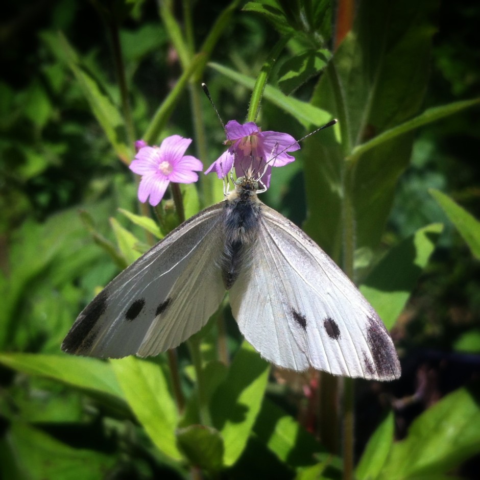
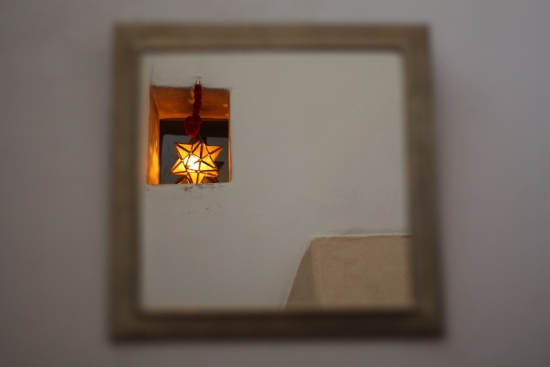
We put pictures—whether they're paintings or photos—into frames to help direct the viewer's eye. The frame is a boundary that directs the gaze: it ensures we know precisely where to look. As well as creating a border from a mounted frame and from the edges of a photo itself, it's also possible to bring focus to your subject and compositional strength and depth by using natural frames within your photos. Despite the name, a 'natural frame' doesn't have to be organic in origin, although trees, streams, and cave mouths do indeed create beautiful natural frames, rather the term describes a frame-within-the-frame. Look out for windows, doorways, and arches—in fact anything that bounces the eye back towards the subject—to act as a frame.

Why the eye likes natural frames

Primarily we appreciate images that include natural frames because they direct the eye straight to the photo's subject. As the eye travels towards the edges of the image—and especially if it contains lines that drag the gaze away from the subject—a frame helps to draw it back toward the focal point, just where you want it.

The eye knows precisely where to look (Image by Haje)

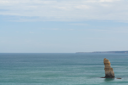
Second, they can bring a sense of perspective and three-dimensionality to an image, giving you the sense that you're looking through one layer of an image and on to another.

Moving on through

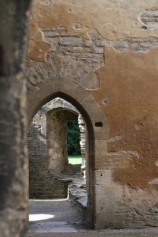
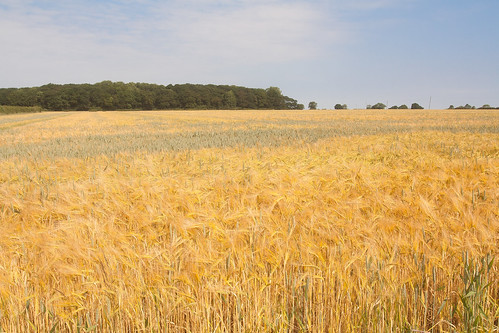
A frame can also give a sense of place or give context to your photos, for example, indoors versus outdoors or a modern area versus a historical one.

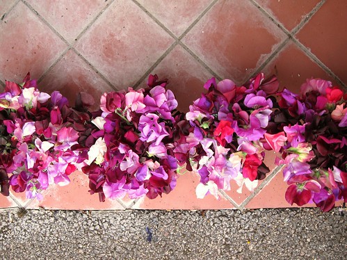
Finally, we find images that make use of natural frames attractive because it brings a sense of order to the image, in much the same way that triangles bring order to scenes with multiple subjects. They place limits on the scene and provide it with some boundaries.

Composing with natural frames

Just because your scene has a terrific natural frame within it, it doesn't mean to say that you can ignore any other compositional theory. You still need to consider your use of lines, your subject placement, and the balance of the shot. Remember: combining these compositional techniques can help to elevate a good photo to a great one.

Think about other compositional elements, not just the frame

Frames and depth-of-field

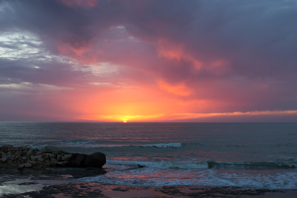
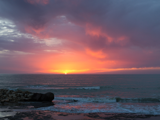
If you're planning on using a natural frame in your composition, consider if you want the frame itself to be sharp or blurred. If your subject and frame are at different distances, but you wish them both to be in focus, you'll need to use a relatively small aperture to achieve an adequate depth-of-field. Of course, having the frame in focus might prove a distraction and defeat its purpose, in which case using a larger aperture and isolating the subject using a shallow depth-of-field will work better.

Choose your focal point

Metering

If you're inside a cave or tunnel and using its natural form to provide a frame for a brightly lit sbject on its outside, you will have to meter accordingly. Spot-metering for the well-lit subject might be the easiest option. Alternatively you could dial in some negative exposure compensation should you prefer to stick with matrix (or evaluative) metering.

Meter for the subject

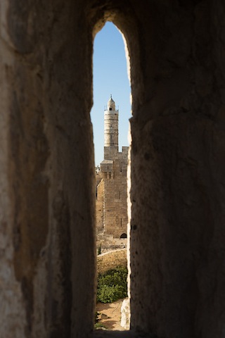
In order to capture the full dynamic range of such a scene, with its bright exterior and dark interior, you would need to shoot two differently metered images and combine them using post-processing software.

Don't over do it

Using frames-within-a-frame is such an effective compositional tool that it's all too easy to get carried away with them and over-use them. One natural frame within a portfolio is clever; a dozen is cliché. Just because a potential natural frame exists doesn't mean it is the best way to compose the shot; it needs to bear some relationship to the main subject.

If you're not sure if a natural frame is appropriate for your photo, ask yourself: Does the frame add drama to the photo? Does it help to tell a story, add context, or give a sense of depth? Does the frame help to illustrate or enhance the focal point of the photo? If the answer is no to any of these, you might be better looking for an alternative composition.

Aspect ratio: what it is and why it matters

Did you go to see Wes Anderson's glorious fondant fancy of film The Grand Budapest Hotel? Did you notice how the size of the picture varied depended on the era being portrayed in the story? As the story moved between 1985, 1968, and 1932, the aspect ratio, or size of the image, jumped from 1.85:1 to 2.35:1 to 'Academy Ratio'. This was part of Anderson's story-telling technique: the aspect ratio provided viewers with a visual cue for each period of the narrative. It's also a reflection of the changes to aspect ratio that film and television have experienced over the years. But what about photographers? Where does aspect ratio come into stills?

Frame size

Maybe we need to back-track and establish precisely what we mean by 'aspect ratio' first. It's the size of the image expressed as a ratio, width to height. You'll often see film-making aspect ratios expressed as a value to 1 (like to 2.35:1 and 1.85:1 mentioned earlier), whereas the most common photography aspect ratios are 3:2, 4:3, and 1:1, although there are plenty more besides. If your image has an aspect ratio of 3:2, it will be three units wide and two high. When you come to print it, you might choose a 6×4" or a 12×8" print.

The entire rectangle is 3:2 (900 by 600); the red zone represents 4:3 (800 by 600); and the purple zone is 1:1 (600 by 600).

Originally, these aspect ratios were as a result of our film sizes. Lots of medium format cameras produced square, or 1:1, images; 35mm cameras used film that measured 36 by 24 millimetres, giving an aspect ratio of 3:2. What's referred to in the film-making world as 'Academy Ratio' is very close to 4:3. It's also the common aspect ratio you'll find in smartphone cameras as well as Micro Four Thirds and some medium format cameras. 16:9 is usual for recording video.

While our digital sensors might preserve these aspect ratios in their physical dimensions, at the press of a button I can switch between 3:2, 4:3, 16:9, and 1:1 on my camera. And when I import an image into Lightroom or edit it in Snapseed, I can select from 1:1, 3:2, 4:3, 5:4, 7:5, 8.5:11, 16:9, or settle upon an entirely idiosyncratic free-styled aspect ratio. But why would I want to?

Composing the frame

It's about composition, and dividing and filling your frame.

Photographers talk a lot about subject placement, about the different rules that can be used to divide the frame, and about negative space. All of these elements contribute to creating visually appealing, dynamic images that draw the eye. It follows, then, that the dimensions of the frame will have an impact on composition: on where you place your subject and how much space surrounds it and how you divide your frame.

Different rectangles

We've already written about the square crop here on Photocritic, and how the eye has a tendency to move around a square frame, as opposed to across it, which it does with a rectangular crop. When changing between 3:2 and 4:3 crops, are there any considerations that need to be made?

Lily square

At its simplest, you have more space to fill with a 3:2 frame. Depending on your style and your subject, this can mean your subject has more room to breathe compared to a 4:3 crop. But it can also mean your subject has that bit too much space and feels a touch lost. You certainly need to be aware of this when you're shooting; and indeed if you intend to have prints made.

When I photographed my cousin on his graduation day, I adhered to my preferred 3:2 aspect ratio. It was how I approached filling the frame on the day and, consequently, how I processed the images afterwards. However, when my aunt had her prints made, she opted for a 24×18 canvas. I had to re-crop her favourite shot in a hurry. You can see both of them here. Can you see why I prefer the 3:2 aspect ratio in this instance? It doesn't feel nearly as squashed as the 4:3 version does.

My preferred 3:2 ratio - a little wider, with more room for the subjects to breathe

What my aunt needed for her print: 4:3 ratio. I think it looks more squashed. (Image measures 800 by 600 pixels.)

If you compare these sunset photos, you can see how much of the view the 4:3 version loses when compared with the 3:2 aspect ratio. It can prove difficult to fill the extra space in a landscape shot, but sometimes you need it, too.

Sunset, 3:2. (Image 600 by 400 pixels.)

Sunset, 4:3. (Image 533 by 400 pixels.)

Of course, you don't have to adhere to 3:2 or 4:3 aspect ratios. I decided that 4:5 worked best for this bee enjoying the Sicilian springtime flowers. The more compact frame focused attention on the bee better than the larger 2:3 version.

The original 2:3 version

A more compact, and focused, 4:5 version

Don't forget, if you switch from landscape to portrait orientation, then the aspect ratio will alter format accordingly. Width always goes first, thus 3:2 will change to 2:3 and 4:3 becomes 3:4. Or in the case of the bee, it's 4:5.

Opting for a different aspect ratio doesn't necessarily mean that you need to use a different compositional rule; however, in some circumstances, you might find the Golden Ratio preferable to the rule of thirds. It depends on your vision for the image. But do think about how much space you need around your subject. If you're struggling to fill it, think of trying 4:3; if it looks squashed, consider 3:2. Or try something else. Try not to feel too constrained by the constraints of aspect ratio.

But I will leave you with closing thoughts from xkcd. Who could put it better?

Up or across? The choice between horizontal and vertical frame orientation

Sweet peas

It is a truth universally acknowledged that landscape format pictures work more successfully in articles than their portrait format counterparts.

When I'm offering feedback on the assignments submitted by our Photography School students, one of my most frequent questions is 'Did you think about framing this vertically?' Or at least, something along those lines. Human vision is binocular, meaning that we have two eyes that happen to be positioned adjacent to rather than on top of each other. We are, therefore, predisposed to scanning things along a horizontal plane rather than a vertical one. It’s no surprise then that we’re more inclined to capture horizontally oriented pictures. The vast majority of cameras have been designed around this fact, thus have a default horizontal orientation and it's just about uncomfortable enough to rotate it that we sometimes overlook doing so. 

We shouldn't be so hasty.

The case for horizontal

The long and the short of it (ahem) is that the majority of subjects that are wider than they are longer will benefit from being photographed in landscape format. You'd have to be standing an awfully long way back to fit all of the Schonbrunn Palace into a portrait format picture. Most of the time, the horizon in a landscape photo will demand to take up as much space as possible, stretching across the frame. Typically, there's more to see when you scan left-to-right than there is up-to-down. But not always.

Corn field

The case for vertical

It's hardly an accident that vertically oriented pictures are referred to as 'portraits'. Any subject that is taller than it is wider—people, trees, skyscrapers, doorways, bottles—will suit a portrait shot.

Sheara i

It's hardly a co-incidence that portraits are called portraits.

It's a case of letting the natural lines in the image dictate how it's framed. Don't be afraid to swing your camera through 90° and give it a go.

Arrow slit

The entire point of this image is the vertical. Why would I shoot it horitonzally? Let the subject dictate the line.

Creative choices

If you stop to think about it, the majority of the time it will feel obvious whether you should be framing your subject horizontally or vertically. There will be a natural line and flow to your composition. Sometimes, however, you might be presented with a compositional dilemma or you might want to spread your creative wings.

Lonely Apostle

The Lonely Apostle might be a vertical feature, but it's the landscape that gives it context and the horizontal framing emphasises that.

For example, you might have a landscape that features a mountain range running off into the distance—a horizontal motivation—but with tall trees in the foreground that would enjoy the vertical emphasis of a portrait framing. Which do you go for? What you have to decide is which element do you want to be the dominant one and therefore be emphasised by your framing. There's not necessarily a right or wrong here; it's about ensuring the subject and the framing complement each other.

Sheara ii

But portraits don't always have to be oriented vertically. A landscape format can look fabulous.

If you've time, shoot both. You've nothing to lose.

Sunset kayaker, Mullaloo

The traditional landscape format works perfectly for this sunset seascape...

It is worth trying something new and different, though, to challenge your thought processes and expectations. You don't need to be wasteful and practise obscure compositions for their own sake, but it is always worth moving and rotating and shifting and changing. Don't feel constrained by what is expected, work to produce an image that tells a story.

Mullaloo beach

... but take nothing away from the vertical version.

Click, snap, hang: showing off your prints with Fotobit

You've created a stream of several hundred, maybe even thousand, Instagram images that you love. There are landscapes and portraits and birthday cakes and bumble bees and holiday photos and you're really rather proud of a few. Now what do you do with them? Fotobit thinks that you should print them and display them in its nifty interlocking, extendable frame system that its launching on Kickstarter right now. You start with one 4×4" frame to which you can attach more frames—left or right, up or down—creating a block of images on a wall, a line of them around a room, or a zig-zag pattern of pictures. As you take more photos you can extend your display or re-arrange it to accommodate the new images.

Arrange and re-arrange with Fotobit

Fotobit has already achieved its Kickstarter funding goal, but you can still pledge $30 for a three-pack of frames, $45 for a six-pack, or $65 for a nine-pack (but there aren't many of those left; when they're gone, the price goes up to $80). And there are much larger packs of frames available for even bigger pledges. The Fotobit team has signed-off on the final design and production samples; it's waiting on the Kickstarter funds to place a minimum order of frames with its manufacturers, which means that if everything goes to plan, backers should have their frames by the end of May.

First it came in black, but there are white options now, too!

'There’s nothing better than the nostalgic feeling you get when reliving a memory through a photo and I was looking for a way to share and display the countless photos I’ve taken with Instagram in a more permanent way,' says Alan Yeung, Fotobit co-founder. 'Traditional frames made the task too daunting, so that’s when I came up with Fotobit, which I hope inspires people to get photos out of their phone and onto their walls.'

You've until 24 April to make a pledge via Kickstarter.

Considering the square crop

I've never been a particular fan of the square crop; I have no good reason for my disfavour, but it doesn't stop me from recognising that it does have its place in the canon of crop. And that's not just its historical position, but its artistic one, too. Consequently I do use it from time-to-time, and I've spotted an increase in the frequency that I at least try it out on my photos. That doesn't mean to say I'll use it, but it's worthy of closer consideration. If you're accustomed to the rectangular frame, you'll notice almost immediately that the compositional rules with which you are so familiar don't seem to apply any longer. The frame is different and you must think differently, too.

Dynamic shift

Primarily, the tension within the frame has shifted. What makes a picture 'work' and what holds the eye to the frame has changed. With a rectangular crop, the eye has a tendency to move across the image until it finds its focal point; with a square crop the eye moves around the image. This shift in the dynamic, from fluid to static, presents you with a great setting for capturing the serene. Striking still lives with plain backgrounds and posed portraits work a treat in a square frame.

Lily square

Centred subjects

Centred subjects have a tendency to look flat and dull in a rectangular frame, but that circular eye motion that we make with square-cropped images means that they don't lose their impact.

Centre placement works because the eye moves around the frame

Symmetrical images

Following on from the centred subject comes the symmetrical subject. When you place a symmetrical subject within a square frame, it is bounded and the symmetry emphasised.

Okay, so it isn't perfectly symmetrical, but I was in a moving car (being driven, not driving) when I took it

Evenly balanced images

Splitting the frame and balancing your subject across it: black against white, calm against active, rough against smooth, will work to the benefit of a square crop. There's nothing wrong with splitting your frame horizontally or vertically, but diagonal divides work brilliantly, too.

Buzzzzzzzz

The point is, of course, to use whichever crop works best with your vision and your image. Don't feel that square crops carry the mark of the Instagram devil and that a rectangular frame is somehow symbolic of photographic purity. Try it; you never know, you might like it.

What is the rule of thirds?

This week's Photography Fundamentals column digs into composition, and one of the most-cited 'rules' of the discipline: the rule of thirds. Even if you don't know what it is, you've probably heard of it. We are, therefore, here to explain what it is and why it's useful. And then when you understand the rule and you know how to implement it, you can go ahead and break it properly. We have a natural tendency to place our subjects in the centre of the frame. It makes sense, logically, to have our point of focus right in the middle, being gloried by its surroundings and utterly unavoidable to the eye. Except that centred subjects don’t really make for very interesting images. There’s an unmistakable flat and dull quality to them. Compare this:

IMG_0347

With this:

Washed up copy

Next time you’re watching a film or TV, notice where the heads and the eyes of the people doing the talking are. I’ll bet they’re not in the centre of the frame.

Instead, they’ll be positioned slightly to one side. They’ll probably be making use of what’s called the rule of thirds.

Imagine that your frame is divided by four lines: two running horizontally and two vertically. They are equally spaced and split the frame into nine smaller rectangles. The points at which the four lines intersect create four ‘points of interest’. This grid is your guide for composing an image.

rule-of-thirds grid

Aim to position subjects that run upright through your image along one of the vertical tri-lines. Lines running across the image—especially skylines and horizons—should run along a horizontal tri-line. (Definitely not through the centre with a horizon.)

The horizon is sitting perfectly along the lower tri-line.

Aim to place anything that’s of particular significance to the composition, for example the eyes in a portrait and the sun in a sunset scene, on one of the points of interest.

The butterfly is sitting on the lower-right point-of-interest.

Variations

I often find that rather than using the rule of thirds to place my subjects, I have a natural predeliction for the Golden Rectangle. It's based on the mathematical princple of the Golden Ratio: an irrational number equal to approximately 1.618. It's also known as Phi (φ). If you want the technical explanation, it's

If you divide a line unevenly into two sections a (longer) and b (shorter), the ratio of these two sections will equal φ if a divided by b is equal to the sum of a plus b divided by a.

The Golden Ratio translated to Golden Rectangles. (Diagram thanks to Wikipedia.)

Yes. Ahem.

Rather than divide your frame using three equally spaced lines along each edge, as you would with the rule of thirds, you have two longer sections (a) either side of a shorter section (b). The ratio of the longer side to the shorter is the golden ratio.

It looks like this:

Her eyes are sitting on the Golden Ratio's points-of-interest.

Square crops

If you're using a square crop for any of your photos, you might find that the rule of thirds doesn't produce the sort of dynamic image that you're used to with a rectangular frame. That's because the eye tends to move around a square photo, rather than across it. For this reason, centred subjects often work effectively in square frames. Or try dividing the frame into triangles, and using those for balance.

Butterfly

TL;DR

  • The rule of thirds is a compositional aid that places two equally spaced lines across your frame, and two down it
  • The horizontal lines can be used for the strong placement of horizons and skylines
  • The vertical lines can be used to position key vertical elements in your frame
  • The four points at which the lines intersect are known as 'points of interest'
  • Use the points of interest to place significant elements of your composition, for example the eyes in portraits or the sun in sunsets, in your frame
  • There are variations on the rule of thirds, based on the mathematical principle φ
  • The rule of thirds doesn't necessarily work with a square crop; you might find a centred subject works better

Quality vs quantity << Photography Fundamentals >> Speed