


A brief introduction to editing: from why to what to how.

When you hear the term 'high-res' thrown about with such abandon when it comes to images for web use, have you ever stopped to think just how big or how high quality and image meant for the web needs to be?
There's an assumption that high-contrast images are more dynamic, more compelling, more inviting. Have a go at some low-contrast photography. You might surprise yourself with the results.
Balance doesn't mean symmetry; it means an internal consistency and tension within your photos. And it's a vital element of composition.
Great photos might be down to a little bit of luck, but most of that 'luck' you make yourself. Don't believe us? Read on...
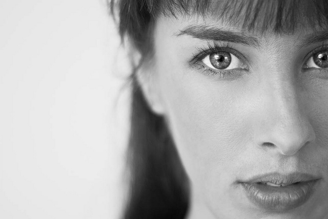
Have you ever had someone take a photo of you and a friend, only to find out later that they cut off the tops of your heads? It looks ridiculous, and if someone’s head 'sticks out' of the composition, your photo is ruined. In other words, it’s not hard to imagine where the don’t-crop-people’s-heads rule came from. When you are working with people and portraits you will soon learn that there are good ways to crop people, and others that are not so good. Cropping heads is at the top of the naughty list. Don’t do it!
Except that, sometimes, cropping heads can be highly effective.
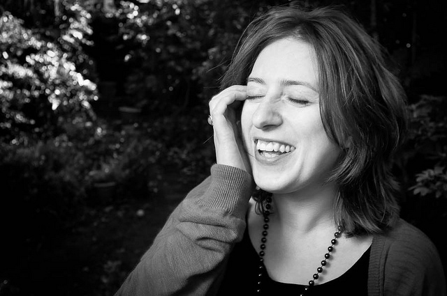
When can you break this rule-of-rules? When you've got in close—really close—to your subject. If your composition is focused only on somebody’s face, it can improve the shot to crop in close.
Don't be afraid to break the rule and crop in close and slice something off of the top, bottom, or sides of the head when the features of the face are the focal point of your composition. The reasoning is this: if you’re going to get in close, get in really close. By filling the frame completely with someone’s face it can make cropping her or his head unavoidable, but it also doesn’t look unnatural.
The key is to decide whether your composition is mainly about the body, upper body (shoulders and above), head, or just the face. Each type of shot has a different purpose, and only the face shots will look natural if you decide to crop the head. Otherwise it merely looks like you failed to plan your shot.
But in-keeping with the adage that if you're going to break the rules, break them properly, if you are going to crop into somebody’s head, make sure that you do it properly. A composition where only a thin sliver of someone’s head is cut off looks accidental. If you go even closer and cut them off across their forehead, the composition looks a lot more powerful, and at least nobody is left wondering whether or not you did it by accident!
Be bold!
 More unusual ways of looking at things, remembering rules, and then breaking those rules, are in my lovely book, The Rules of Photography and When to Break Them. It's available as an e-book and in a dead tree version (UK, US).

Earlier this week an infographic design agency, NeoMam Studios, sent us an infographic about 'smoasting' which they'd produced on behalf of print company Photobox. Once I'd got over the shock of awful elision of 'social media' and 'boast' to form the ghastly portmanteau word 'smoast', there was one particular statistic that caught my eye. Take a look at the infographic and guess which it was.
Despite the prevalence of Instagram, the host of editing features that are built into apps such as EyeEm, Facebook, and Twitter, and the plethora of free-to-download editing programmes, only 28% of photos are cropped or styled in some way? Wow! I am surprised. And it's something I think deserves remedying.
While Team Photocritic advocates getting as much right in-camera as possible—you'll certainly not be able to turn a sow's ear into a silk purse—we're not beyond a little post-processing, either. If it's good enough for Cecil Beaton and Horst, it's good enough for us, too. A snip here and a swipe there can elevate an ordinary image into something a bit more special.
This isn't about air-brushing away half of someone's thigh, but about making minor adjustments to three specific areas: the crop, the colour, and the contrast. Here at Photocritic we call them The Three Cs. They're not complicated and they'll make a world of difference.
However well composed you think your image is, it will almost certainly benefit from having a few pixels shaved off it. It might be a case of reinforcing the rule of thirds, removing a bit of unwanted background that crept into the frame, or getting a bit closer to your subject.

Being a purist, I tend to stick to traditional 4:3 or 3:2 ratios, but don’t feel limited by my prejudices. Select from any of the standard crops, from square to 16:9, or free-style it to adjust the crop any way you like.
At the same time as cropping, make sure to straighten your image, too. Unless you are deliberately tilting the frame for creative reasons, uprights should be upright and horizons should be level. When lines that are expected to be upright or level are wonky, it has an unpleasant impact on our sense of balance. By correcting wonky lines, you'll produce a stronger image.
Light has a temperature, and depending on the source of the light, or the time of day if it’s the sun, that temperature will vary. When the temperature varies, so does the colour of the light. As a general rule, we don’t notice the variation because our eyes cleverly adjust to the changes. Our cameras on the other hand aren’t quite so clever.

Have you ever noticed how white objects in your photos can show up with blue or yellow casts? That’s because the white balance in your photo was off.

It's a relatively easy correction to make using the 'Warmth' or 'White Balance' function in an editing programme. If you think the whites are looking a bit too blue (or if an image looks a little 'cold' over all), nudge the slider to the right. If the whites are too reddish in tone, or the photo looks a bit warm, slide it to the right. It's a case of trial and error to make the right adjustment, but the more that you practise it, the better you'll understand the shortcomings of your camera and how it reacts to different types of light.
Now if you want to intensify or tone down your colours, you can do so using the saturation slider. I don't recommend bumping up the saturation too much; it can result in a cartoon effect rather than a photo!
Contrast is the difference between the dark and light tones in your photos. Images shot on bright sunny days tend to have a lot of contrast, with dark shadows and bright highlights, but those taken in fog won’t have a great deal of tonal variation and will be low contrast. From time to time, you’ll want a low-contrast image, but, generally speaking, your photos can be improved by increasing the contrast a touch. It brings definition and depth to them.
Don’t go overboard, though, as too much of a good thing can turn bad. You’ll find that if you over-cook the contrast you’ll lose too much detail and end up with an ugly image. Subtlety beats brickbats.

If you use Snapseed to make your edits, it's worth getting to know the ambiance slider, too. I've often found that this is a preferable alternative to the contrast slider.
At this point, any other adjustments are gravy. I'm a fan of Snapseed's 'centre focus' options and often apply one of those. You might want to play with a tilt-shift effect. Or there's the waterfall of filters you can try in any programme, but you might find that you prefer your own edits to prefabricated filters, now.
Oh, and don't forget that it all starts with a decent photo, so check out our eight tips for better smartphone photos, too.
Did you go to see Wes Anderson's glorious fondant fancy of film The Grand Budapest Hotel? Did you notice how the size of the picture varied depended on the era being portrayed in the story? As the story moved between 1985, 1968, and 1932, the aspect ratio, or size of the image, jumped from 1.85:1 to 2.35:1 to 'Academy Ratio'. This was part of Anderson's story-telling technique: the aspect ratio provided viewers with a visual cue for each period of the narrative. It's also a reflection of the changes to aspect ratio that film and television have experienced over the years. But what about photographers? Where does aspect ratio come into stills?
Maybe we need to back-track and establish precisely what we mean by 'aspect ratio' first. It's the size of the image expressed as a ratio, width to height. You'll often see film-making aspect ratios expressed as a value to 1 (like to 2.35:1 and 1.85:1 mentioned earlier), whereas the most common photography aspect ratios are 3:2, 4:3, and 1:1, although there are plenty more besides. If your image has an aspect ratio of 3:2, it will be three units wide and two high. When you come to print it, you might choose a 6×4" or a 12×8" print.
Originally, these aspect ratios were as a result of our film sizes. Lots of medium format cameras produced square, or 1:1, images; 35mm cameras used film that measured 36 by 24 millimetres, giving an aspect ratio of 3:2. What's referred to in the film-making world as 'Academy Ratio' is very close to 4:3. It's also the common aspect ratio you'll find in smartphone cameras as well as Micro Four Thirds and some medium format cameras. 16:9 is usual for recording video.
While our digital sensors might preserve these aspect ratios in their physical dimensions, at the press of a button I can switch between 3:2, 4:3, 16:9, and 1:1 on my camera. And when I import an image into Lightroom or edit it in Snapseed, I can select from 1:1, 3:2, 4:3, 5:4, 7:5, 8.5:11, 16:9, or settle upon an entirely idiosyncratic free-styled aspect ratio. But why would I want to?
It's about composition, and dividing and filling your frame.
Photographers talk a lot about subject placement, about the different rules that can be used to divide the frame, and about negative space. All of these elements contribute to creating visually appealing, dynamic images that draw the eye. It follows, then, that the dimensions of the frame will have an impact on composition: on where you place your subject and how much space surrounds it and how you divide your frame.
We've already written about the square crop here on Photocritic, and how the eye has a tendency to move around a square frame, as opposed to across it, which it does with a rectangular crop. When changing between 3:2 and 4:3 crops, are there any considerations that need to be made?
At its simplest, you have more space to fill with a 3:2 frame. Depending on your style and your subject, this can mean your subject has more room to breathe compared to a 4:3 crop. But it can also mean your subject has that bit too much space and feels a touch lost. You certainly need to be aware of this when you're shooting; and indeed if you intend to have prints made.
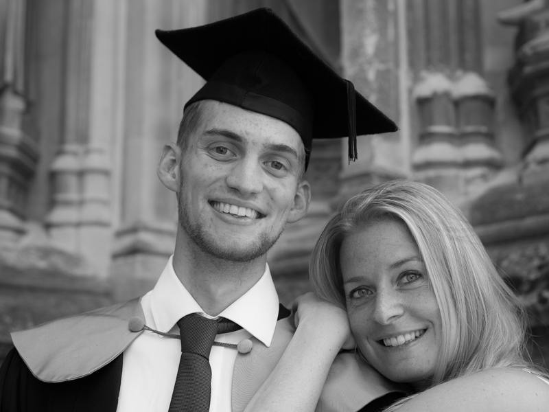
When I photographed my cousin on his graduation day, I adhered to my preferred 3:2 aspect ratio. It was how I approached filling the frame on the day and, consequently, how I processed the images afterwards. However, when my aunt had her prints made, she opted for a 24×18 canvas. I had to re-crop her favourite shot in a hurry. You can see both of them here. Can you see why I prefer the 3:2 aspect ratio in this instance? It doesn't feel nearly as squashed as the 4:3 version does.

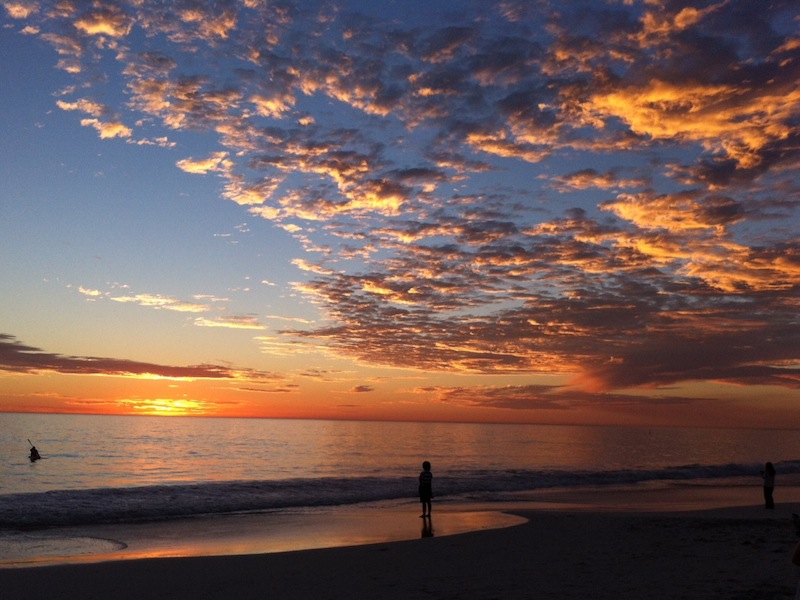
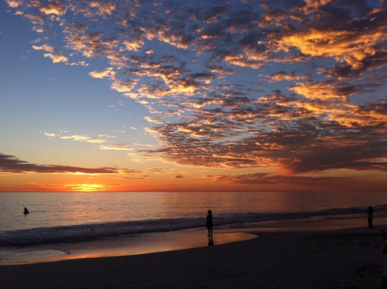
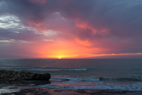
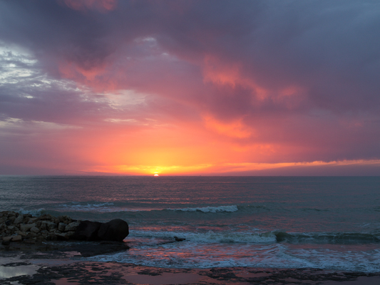
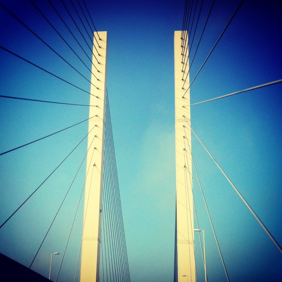
If you compare these sunset photos, you can see how much of the view the 4:3 version loses when compared with the 3:2 aspect ratio. It can prove difficult to fill the extra space in a landscape shot, but sometimes you need it, too.
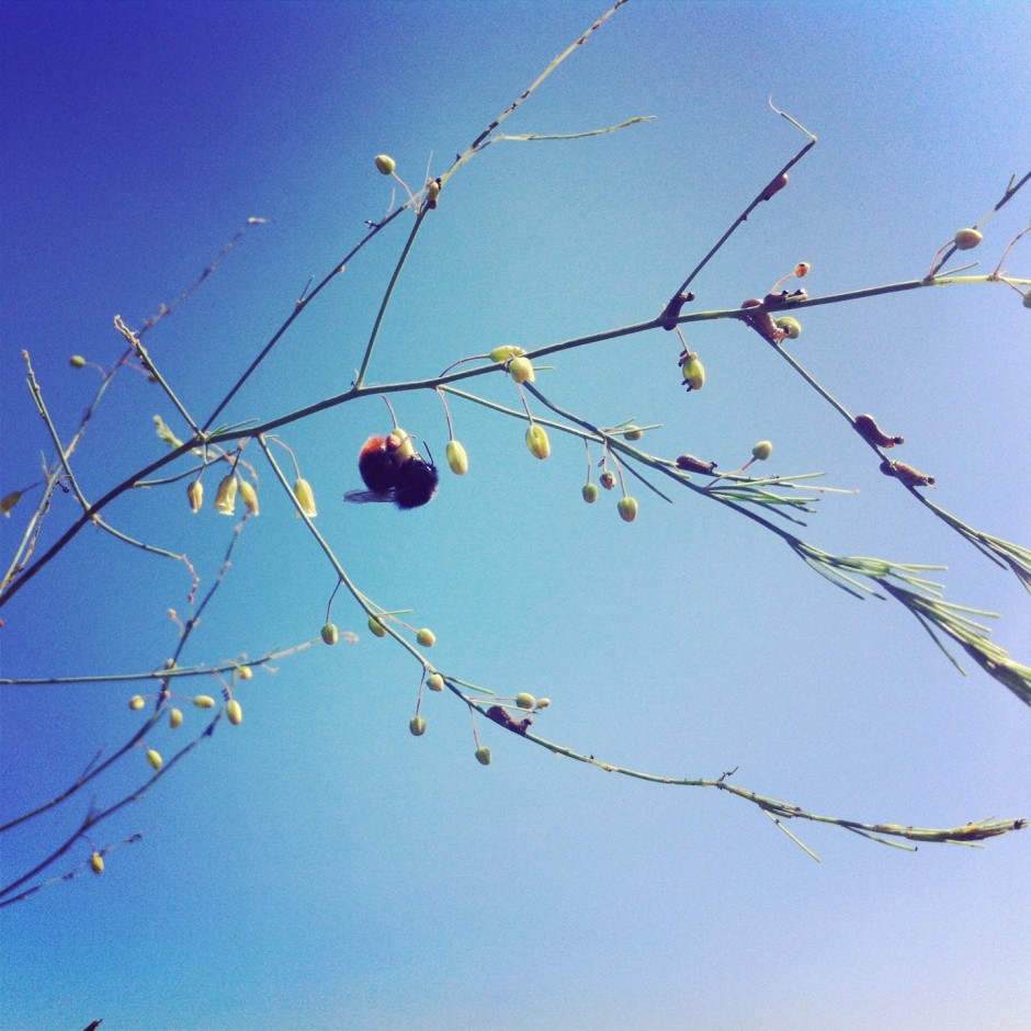
Of course, you don't have to adhere to 3:2 or 4:3 aspect ratios. I decided that 4:5 worked best for this bee enjoying the Sicilian springtime flowers. The more compact frame focused attention on the bee better than the larger 2:3 version.
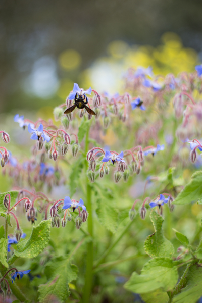

Don't forget, if you switch from landscape to portrait orientation, then the aspect ratio will alter format accordingly. Width always goes first, thus 3:2 will change to 2:3 and 4:3 becomes 3:4. Or in the case of the bee, it's 4:5.
Opting for a different aspect ratio doesn't necessarily mean that you need to use a different compositional rule; however, in some circumstances, you might find the Golden Ratio preferable to the rule of thirds. It depends on your vision for the image. But do think about how much space you need around your subject. If you're struggling to fill it, think of trying 4:3; if it looks squashed, consider 3:2. Or try something else. Try not to feel too constrained by the constraints of aspect ratio.
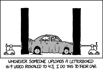
But I will leave you with closing thoughts from xkcd. Who could put it better?
I've never been a particular fan of the square crop; I have no good reason for my disfavour, but it doesn't stop me from recognising that it does have its place in the canon of crop. And that's not just its historical position, but its artistic one, too. Consequently I do use it from time-to-time, and I've spotted an increase in the frequency that I at least try it out on my photos. That doesn't mean to say I'll use it, but it's worthy of closer consideration. If you're accustomed to the rectangular frame, you'll notice almost immediately that the compositional rules with which you are so familiar don't seem to apply any longer. The frame is different and you must think differently, too.
Primarily, the tension within the frame has shifted. What makes a picture 'work' and what holds the eye to the frame has changed. With a rectangular crop, the eye has a tendency to move across the image until it finds its focal point; with a square crop the eye moves around the image. This shift in the dynamic, from fluid to static, presents you with a great setting for capturing the serene. Striking still lives with plain backgrounds and posed portraits work a treat in a square frame.
Centred subjects have a tendency to look flat and dull in a rectangular frame, but that circular eye motion that we make with square-cropped images means that they don't lose their impact.

Following on from the centred subject comes the symmetrical subject. When you place a symmetrical subject within a square frame, it is bounded and the symmetry emphasised.
Splitting the frame and balancing your subject across it: black against white, calm against active, rough against smooth, will work to the benefit of a square crop. There's nothing wrong with splitting your frame horizontally or vertically, but diagonal divides work brilliantly, too.
The point is, of course, to use whichever crop works best with your vision and your image. Don't feel that square crops carry the mark of the Instagram devil and that a rectangular frame is somehow symbolic of photographic purity. Try it; you never know, you might like it.
This week's Photography Fundamentals column digs into composition, and one of the most-cited 'rules' of the discipline: the rule of thirds. Even if you don't know what it is, you've probably heard of it. We are, therefore, here to explain what it is and why it's useful. And then when you understand the rule and you know how to implement it, you can go ahead and break it properly. We have a natural tendency to place our subjects in the centre of the frame. It makes sense, logically, to have our point of focus right in the middle, being gloried by its surroundings and utterly unavoidable to the eye. Except that centred subjects don’t really make for very interesting images. There’s an unmistakable flat and dull quality to them. Compare this:

With this:

Next time you’re watching a film or TV, notice where the heads and the eyes of the people doing the talking are. I’ll bet they’re not in the centre of the frame.
Instead, they’ll be positioned slightly to one side. They’ll probably be making use of what’s called the rule of thirds.
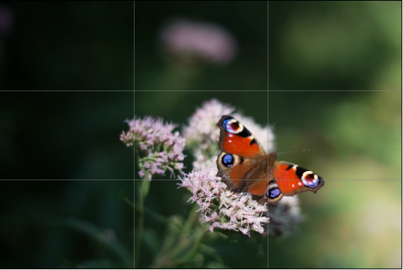
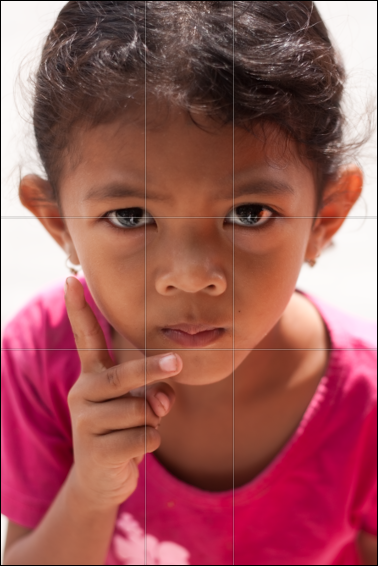
Imagine that your frame is divided by four lines: two running horizontally and two vertically. They are equally spaced and split the frame into nine smaller rectangles. The points at which the four lines intersect create four ‘points of interest’. This grid is your guide for composing an image.
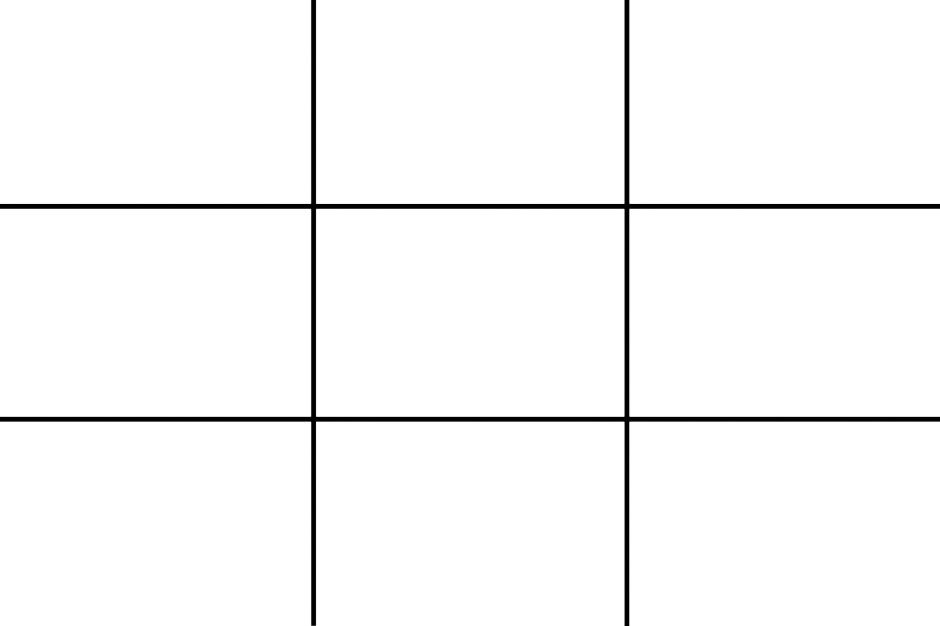
Aim to position subjects that run upright through your image along one of the vertical tri-lines. Lines running across the image—especially skylines and horizons—should run along a horizontal tri-line. (Definitely not through the centre with a horizon.)
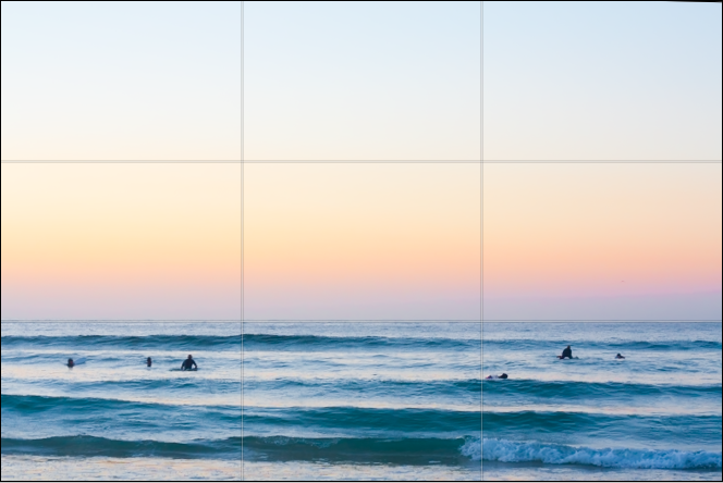
Aim to place anything that’s of particular significance to the composition, for example the eyes in a portrait and the sun in a sunset scene, on one of the points of interest.
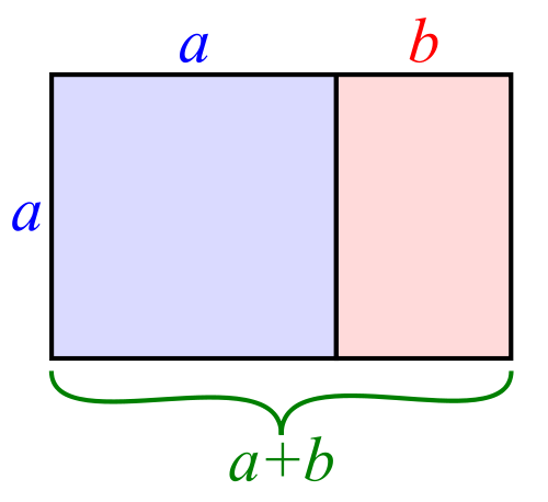
I often find that rather than using the rule of thirds to place my subjects, I have a natural predeliction for the Golden Rectangle. It's based on the mathematical princple of the Golden Ratio: an irrational number equal to approximately 1.618. It's also known as Phi (φ). If you want the technical explanation, it's
If you divide a line unevenly into two sections a (longer) and b (shorter), the ratio of these two sections will equal φ if a divided by b is equal to the sum of a plus b divided by a.
Yes. Ahem.
Rather than divide your frame using three equally spaced lines along each edge, as you would with the rule of thirds, you have two longer sections (a) either side of a shorter section (b). The ratio of the longer side to the shorter is the golden ratio.
It looks like this:
If you're using a square crop for any of your photos, you might find that the rule of thirds doesn't produce the sort of dynamic image that you're used to with a rectangular frame. That's because the eye tends to move around a square photo, rather than across it. For this reason, centred subjects often work effectively in square frames. Or try dividing the frame into triangles, and using those for balance.

Quality vs quantity << Photography Fundamentals >> Speed