share

EyeEm brings new editing and learning tools to its app

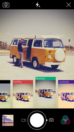
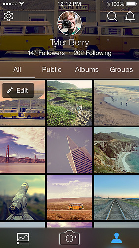
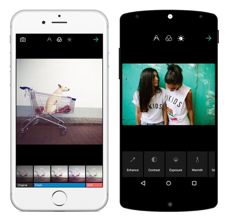
It's been a week of updates to our image-sharing programmes on social media. First Facebook introduced an auto-enhance feature, which will apply the filters that its algorithms calculate are most appropriate for your photos. Then Instagram unveiled five new filters, its first in two years. Now it's the turn of EyeEm, which brings a gaggle of new filters, fine-grained control over their application, and a new feature called Open Edit. The theory behind Open Edit is that it lays bare the post-processing path that a photographer followed to create an image, from the original to the final version. Each crop, tweak, and nudge is set out in a timeline that's made visible to the rest of the EyeEm community. If you see something that you like, you can apply the same edits to your own photos with one tap.
New filters for EyeEm

Right now, only certain photographers have the ability to open up their edits to the community, but it's something that will be rolled out to all members in time. The EyeEm team hopes that this open deconstruction of people's photos will lead to a more collaboratively minded community and one that can learn from each other and share their skills.
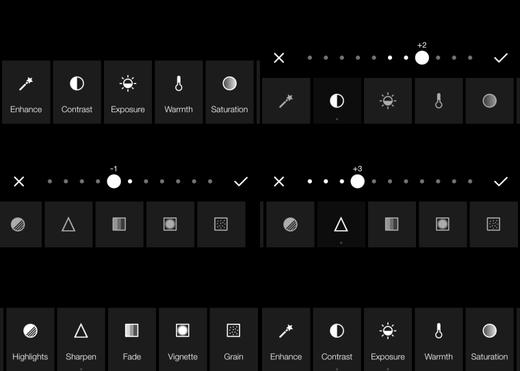
Fine-grained adjustments are a winner

Can I see what EyeEm is trying to accomplish with Open Edit? Yes, definitely. Sometimes I do look at a photo and wonder precisely what sort of magic the photographer wove in order to create that particular effect. But at the same time, I'm not completely sold on it. The mystery and the secret behind someone else's photos are part of their appeal. Having the edits revealed to you can feel a little like the illusion of a magic trick being shattered when you know how it works. My curiosity means that I want to know, but the romantic in me appreciates the mystique.

From a teaching and learning perspective; I love EyeEm's enthusiasm to allow its users to share their knowledge. But I think that by going one step further, they could make this a much more valuable learning tool. How much people will actually learn from being able to see and apply other people's edits to their own photos will depend hugely on how much they're prepared to engage with the editing process and observe the kinds of impact each adjustment makes. Experimentation is such a valuable part of learning that just being able to apply someone else's workflow to your photos feels as if there's an important step in the process that's being skipped. It's not just about the what that you do to your photos, it's also about the why.
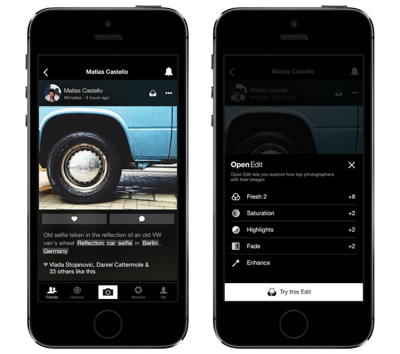
Like what a photographer's done to their photo? Now you can see exactly what with EyeEm's Open Edit.

Bring a bit more dialogue to the experience—underpin the action with some explanation—and I think it could really work. Still, lots of people seem to be very excited by EyeEm 5.0, so perhaps I'm the one who's missing the trick here.

Let me know what you think.

You can download EyeEm 5.0 here.

Top 3 edits you should make to every photograph

Earlier this week an infographic design agency, NeoMam Studios, sent us an infographic about 'smoasting' which they'd produced on behalf of print company Photobox. Once I'd got over the shock of awful elision of 'social media' and 'boast' to form the ghastly portmanteau word 'smoast', there was one particular statistic that caught my eye. Take a look at the infographic and guess which it was.

Despite the prevalence of Instagram, the host of editing features that are built into apps such as EyeEm, Facebook, and Twitter, and the plethora of free-to-download editing programmes, only 28% of photos are cropped or styled in some way? Wow! I am surprised. And it's something I think deserves remedying.

While Team Photocritic advocates getting as much right in-camera as possible—you'll certainly not be able to turn a sow's ear into a silk purse—we're not beyond a little post-processing, either. If it's good enough for Cecil Beaton and Horst, it's good enough for us, too. A snip here and a swipe there can elevate an ordinary image into something a bit more special.

This isn't about air-brushing away half of someone's thigh, but about making minor adjustments to three specific areas: the crop, the colour, and the contrast. Here at Photocritic we call them The Three Cs. They're not complicated and they'll make a world of difference.

Crop

However well composed you think your image is, it will almost certainly benefit from having a few pixels shaved off it. It might be a case of reinforcing the rule of thirds, removing a bit of unwanted background that crept into the frame, or getting a bit closer to your subject.

The original isn't that bad

Being a purist, I tend to stick to traditional 4:3 or 3:2 ratios, but don’t feel limited by my prejudices. Select from any of the standard crops, from square to 16:9, or free-style it to adjust the crop any way you like.

But a crop does make it better

At the same time as cropping, make sure to straighten your image, too. Unless you are deliberately tilting the frame for creative reasons, uprights should be upright and horizons should be level. When lines that are expected to be upright or level are wonky, it has an unpleasant impact on our sense of balance. By correcting wonky lines, you'll produce a stronger image.

Colour

Light has a temperature, and depending on the source of the light, or the time of day if it’s the sun, that temperature will vary. When the temperature varies, so does the colour of the light. As a general rule, we don’t notice the variation because our eyes cleverly adjust to the changes. Our cameras on the other hand aren’t quite so clever.

Notice how the sheet and Cookie's white fur has a blue tinge?

Have you ever noticed how white objects in your photos can show up with blue or yellow casts? That’s because the white balance in your photo was off.

Corrected by nudging the white balance slider to the right

It's a relatively easy correction to make using the 'Warmth' or 'White Balance' function in an editing programme. If you think the whites are looking a bit too blue (or if an image looks a little 'cold' over all), nudge the slider to the right. If the whites are too reddish in tone, or the photo looks a bit warm, slide it to the right. It's a case of trial and error to make the right adjustment, but the more that you practise it, the better you'll understand the shortcomings of your camera and how it reacts to different types of light.

Now if you want to intensify or tone down your colours, you can do so using the saturation slider. I don't recommend bumping up the saturation too much; it can result in a cartoon effect rather than a photo!

Contrast

Contrast is the difference between the dark and light tones in your photos. Images shot on bright sunny days tend to have a lot of contrast, with dark shadows and bright highlights, but those taken in fog won’t have a great deal of tonal variation and will be low contrast. From time to time, you’ll want a low-contrast image, but, generally speaking, your photos can be improved by increasing the contrast a touch. It brings definition and depth to them.

The original looks good enough to eat

Don’t go overboard, though, as too much of a good thing can turn bad. You’ll find that if you over-cook the contrast you’ll lose too much detail and end up with an ugly image. Subtlety beats brickbats.

But increasing the contrast can bring some depth

If you use Snapseed to make your edits, it's worth getting to know the ambiance slider, too. I've often found that this is a preferable alternative to the contrast slider.

Anything else?

At this point, any other adjustments are gravy. I'm a fan of Snapseed's 'centre focus' options and often apply one of those. You might want to play with a tilt-shift effect. Or there's the waterfall of filters you can try in any programme, but you might find that you prefer your own edits to prefabricated filters, now.

Oh, and don't forget that it all starts with a decent photo, so check out our eight tips for better smartphone photos, too.

Just because you found it on the Intergoogles it doesn't mean it's free to use

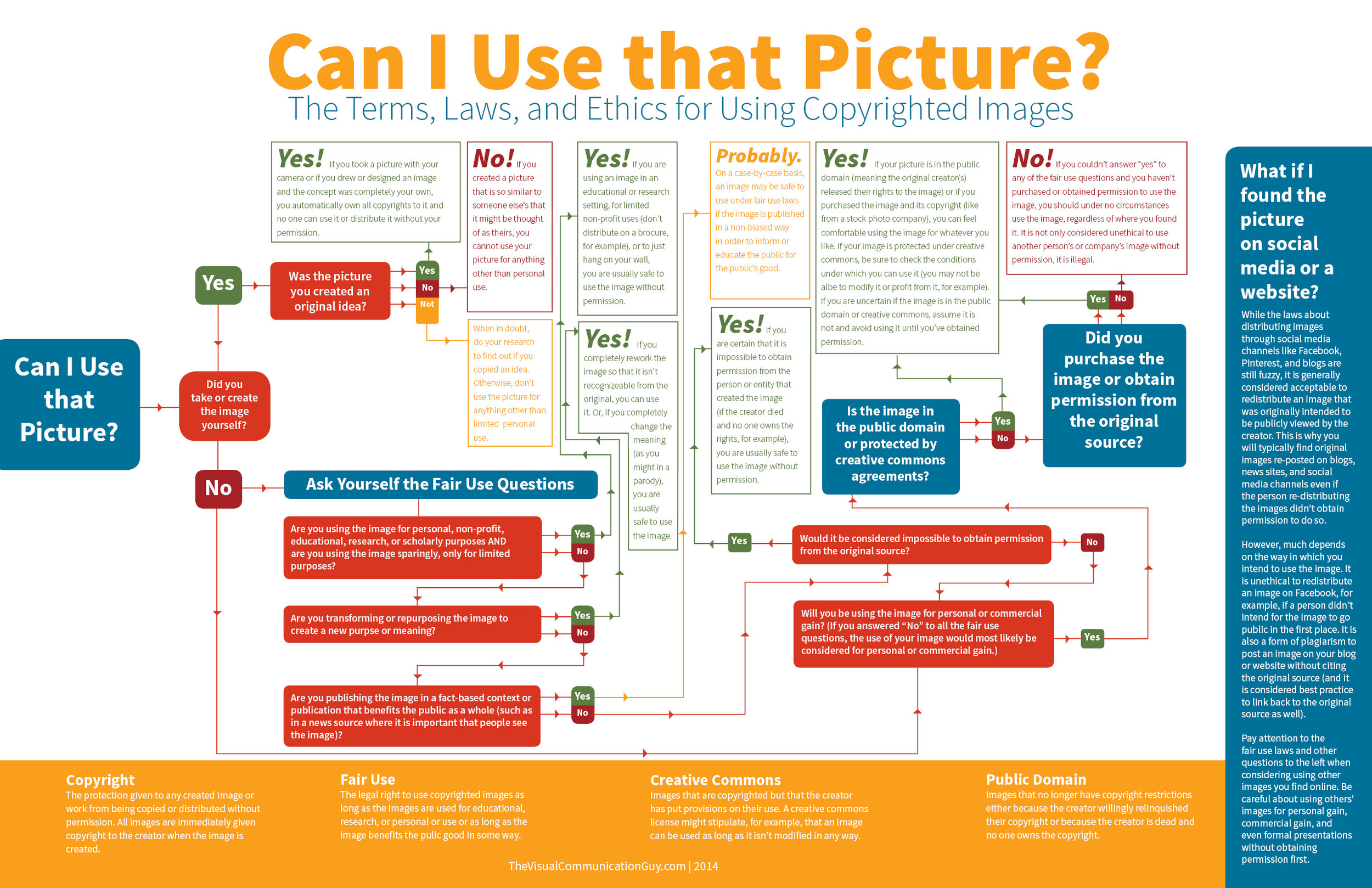
I was having a fairly good morning, until I took my lunchtime peruse of Feedly to see if anything interesting or exciting had dropped into it. Apart from a new post by my favourite film critic, nothing was outstanding until I reached Lifehacker. The Lifehacker team has just posted a link to a visual media usage rights flowchart created by The Visual Communication Guy. Excellent! Ignorance is no excuse when it comes to image theft and unauthorised use and reproduction of photos. While we're all perfectly aware that when you place something on Facebook, Flickr, or your personal version of Frankie's Funky Photos, there's a real chance that someone will try to use it improperly, the more that we can educate people about the right way to do things, the better. This one, however, was not quite so excellent.

You'll find the original here and the Lifehacker article here.

If you're wondering, I can reproduce it here under fair dealing: criticism and review use.

Apart from the fact that it's far too dense and word-heavy, it contains at least one humongous, glaring, verging on the unforgiveable fault for something that purports to advise on usage rights. Take a look and tell me if you can see it. (And tell me how many others you can see. There are plenty.)

Found it?

If you haven't, because it's a horrid thing to read, here it is:

While the laws about distributing images through social media channels like Facebook, Pinterest, and blogs are still fuzzy, it is generally considered acceptable to redistribute an image that was intended to be viewed publicly by the creator. This is why you will typically find original images re-posted on blogs, news sites, and social media channels even if the person re-distributing the images didn't receive permission to do so.

No, no, no, no, no, no. And for good meaure I'll say it again. No.

Images that are shared on social media aren't free for redistribution unless the creator has expressly said so. I put my images on Flickr and use them here on Photocritic and put them on my personal website to display them, to illustrate concepts, to tell stories. I do not put them on the Intergoogles so that anyone else can make use of them. And you should never assume that anyone else does, either.

The law regarding this is hardly fuzzy about the situation, either. There's been at least one monumental court case that supports this opinion, when photographer Daniel Morel sued AFP and Getty Images after they redistributed his images from the Haitian earthquake, which he'd shared via Twitter, without his permission.

Copyright exists from the moment that someone creates something, whether it's a photograph, a tune, a poem, or a piece of prose. It doesn't matter how a creator wishes to share her or his creation with the world, unless she or he has definitely signed away the rights to it, the rights remain theirs.

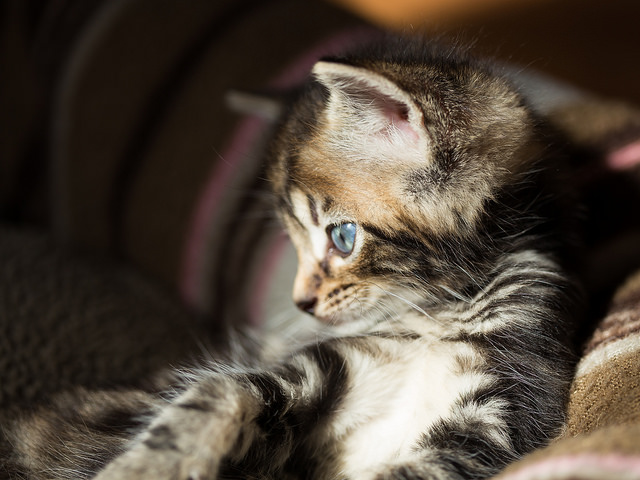
Mine! All mine! Now sod off!  Actually, this was one of Haje's foster kittens. The photo's mine and the kitten is now someone else's. But it's a kitten on the Internet. I couldn't think of a more appropriate image for this article.

To be fair to the Visual Communications Guy, he does state 'My rule above all else? Ask permission to use all images. If in doubt, don’t use the image!' in the post that accompanies the flowchart, but that's not really good enough. It's the flowchart that people are going to share and see, not the article. When incorrect information such as this gains traction, we all suffer. Suddenly what's not right becomes commonly accepted. Or people who were doing their best to not be ignorant are in the wrong when they thought they were doing right.

So I'll say the mantra and everyone can repeat it after me: 'Just because I found it on the Internet, it doesn't mean it's free to use.'

The unlikely and serious consequences of teenage sexting

An 18 year old and a 19 year old are in a relationship. They're committed to and respectful of each other. They enjoy consensual sex and every now and again they share a naughty photo. A 16 year old and a 17 year old are in a relationship. They're committed to and respectful of each other. They enjoy consensual sex and every now and again they share a naughty photo.

What's the difference? Both couples are over the age of consent and no one is being forced into doing anything they do not wish to do. Yet the younger couple is breaking the law. By sharing photos of themselves, they're distributing indecent images of children. They are, of course, under the age of 18 and therefore still children. That they are accustomed to each other's bodies in the flesh means nothing when they're pixillated.

The penalty for distributing indecent images of children is much more serious than a slap on the wrists, too. It can result in being placed on the sex offenders' register. For anyone, that is a life-altering punishment; for someone who is 16, it could be life-ruining.

This issue has been brought into the public consciousness again (it raised its head towards the end of last year) after Nottinghamshire Police sent a letter to schools in the county asking them to advise their pupils about the potential consequences of 'sexting'. Recently, the police have dealt with several cases where sexting has taken a turn for the nasty, and while they've not prosecuted the young people involved, the outcome could have been different.

That's quite enough!

Much of what I've been reading around this topic today—for it seems to be overtaking the BBC—involves admonishing young people not to be so stupid or to consider the consequences of their actions should these photos make their way onto the Intergoogles; invokes despair that young people are capable of such recklessness and disregard for other people's feelings and reputations; or it criticises their lack of self-respect and gutter behaviour. There's also a great deal of concern about the pressure that might be applied to young people to take and share lascivious photos when they really don't want to.

Some of these concerns are valid. The teenaged equivalent of revenge porn can be deeply painful and horribly humiliating with tentacles that spread much further than school. While its perpetrators might be content to wreak harm and havoc on those whose images they share, I doubt that they realise just how extensive the consequences can be. As for coercing young people into sharing pictures that they probably wouldn't want to show their parents; it's another of those pressures of conformation piling up on young people: to be thin, to wear particular clothes, to smoke, to drink, to have sex. Between Snapchat and Slingshot and WhatsApp and any other means of sharing an image, we have for ourselves the social media age incarnation of 'I'll show you mine if you show me yours,' behind the bike sheds, except with potentially longer-lasting and farther-reaching consequences.

We cannot and should not tell young people what to do; it's about giving them the skills, the self-confidence, and the information to make their own choices and about providing them with non-judgemental support when they have to live through it. Vilifying them for a lack of self-respect is unlikely to achieve very much.

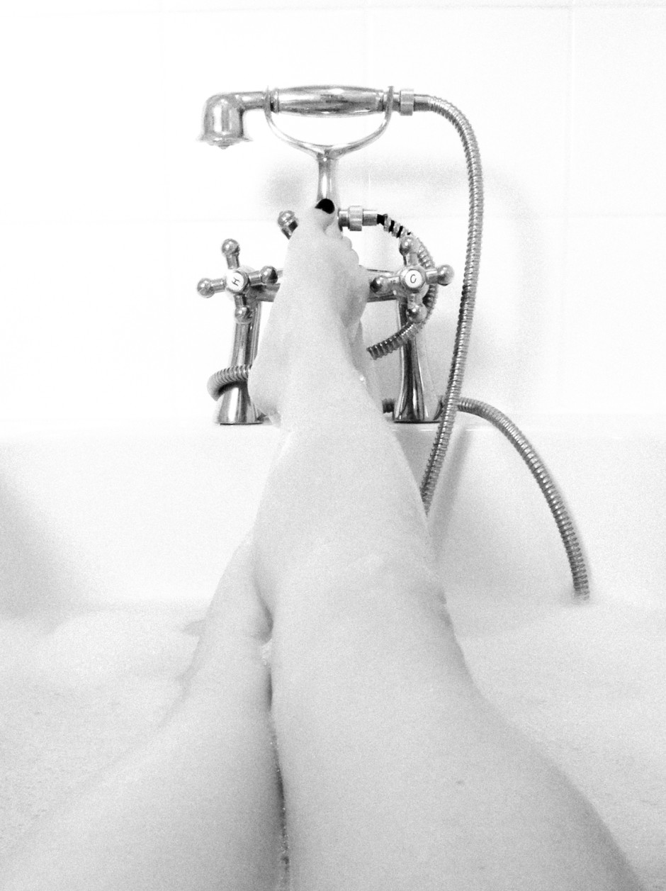
It's a naked body, but not as we know it, Jim! (Photo by Haje)

These are all pertinent points for anyone under 16 who's legally regarded as not being able to give consent. Indeed they remain valid for anyone over the age of 16; but there's a particular issue relevant to 16 and 17 year olds that seems to be overlooked.

There's a disconnect between the legality of their engagement in consensual physical sexual activity and the illegality of recording that same consensual physical sexual activity. A law that's designed to protect young people from exploitation has the potential to criminalise them. I hope that those who have to enforce it apply some common sense to any situations that come their way.

The handy-dandy social media photo sharing guide

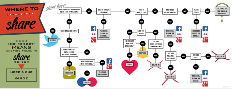
One photo, so many options. Where on this huge web of interconnected social media outlets are we best sharing our quick snaps, our painstakingly created works of art, and our selfies? Really, it all comes down to whom you want to see them. The chances are that different people follow you in different social media spaces, and if Twitter's mostly a work thing for you, selfies on the beach aren't all that appropriate a posting there. You're probably best putting those on your friends- and family-only Facebook account. It only takes a few moments of thought, really, but if you're new to the social media fandango, seeing all those apps lined up on your phone can be a little overwhelming. For a bit of fun, I drew up (quite literally, it involved an enormous sheet of paper and felt-tipped pens) this handy-dandy guide to sharing your photos via social media. Of course it isn't meant to be taken deadly seriously, but it's a pretty useful starting point all the same.

Click for bigger!

You can find it looking even more beautiful in print in the delicious-looking Social Photography, which is available now, either in print or to download!

Like the Google+ Stories idea but not keen on Google+? There are options

On Tuesday, tech and photo sites were awash with the Google+ Stories story. Rather than having to sift through your own images and organise them into virtual albums to chart your travels, document your days out, and record your parties, Google+ can auto-algorithmically-awesomely collate them into Stories or Movies by simple virtue of uploading them there. You can then edit them if necessary, add captions when appropriate, share them if you want to, and generally enjoy. Stories and Movies capabilities are already working on the web and Android platforms and will be making their way to iOS shortly. If you're like me and you auto-upload your iPhone images to Google+, open the web interface and you'll find there are some stories ready and waiting for you.

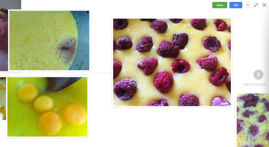
The Story of my cousin's birthday

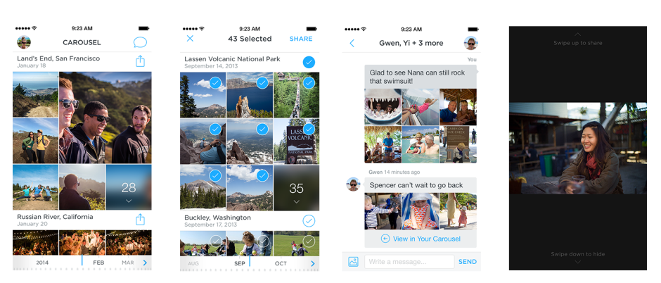
But what if you don't want to upload your photos to Google+, for whatever reason, yet still rather like this idea of hands-free image curation? With the vast number of image storage and organisation apps and services out there, someone, somewhere, must be offering an alternative. There are plenty of apps that can organise your images and videos into a timeline, for example Dropbox's Carousel and Picturelife, but not that many which create narrative albums based on time, date, and location that are ready to go. There are, it seems, two apps that manage something along the line of Stories.

Flayvr

Flayvr is an Android- and iOS-compatible app that organises your images and videos into editable and shareable 'Flayvrs', or albums. That's pretty much what the Google+ Stories feature does. But unlike Google+, which collates all your photos and videos stored there, this works by collating the photos and videos stored on your device's camera roll, making it much more mobile-centric. If you're using Google+ to store all of your images, regardless of the device used to capture them, its capable of giving you a more complete story.

Still, it's swish and stylish, free to download, and I've had fun using it to collate some 'Flayvrs'.

Keepsake

I've not been able to download Keepsake for a trial spin because it seems to be a US-only iOS app at the moment. However, it does look to be slick and easy to use. It automatically sorts images into stories that you can edit them using the pinch-and-drag mechanism. When you have a complete story, you can share it with your contacts via text message.

It's also worth remembering that Google+ acts as a storage mechanism for your photos as well as organising them into sharable (or not) albums. Flayvr explicitly states that it isn't a data storage service. That's going to be a plus for some and a minus for others.

There aren't many options, but there are some, and I'm sure that Google's move will herald the insertion of automatically curated albums from other sites before long.

Flickr 3.0 for iOS and Android is unveiled

At the end of March I noticed that Flickr 3.0 for iOS and Android seemed to be in the works. Today, it has been unleashed on the world. Well, I say 'unleashed on the world' but it's more like a steady trickle out to users. I've not an update for my phone yet. The updated app offers 14 live preview filters, so that you see what a photo will look like under their influence before you take it, and record 30 seconds of HD video using one of them, too. There's also a suite of editing tools that ranges from click-to-select filters, vignettes, and auto-enhance to more sophisticated tools like colour balance, levels, and exposure.

Apply filters as you shoot

Auto-sync, which automatically backed-up photos from iOS phones to Flickr, is now available across the board, letting you make easier use of that 1TB of storage space and keep images safe.

There's also meant to be a new and improved search function that lets you sift through images faster and easier that can define images based on when and where they were taken and what features in them and an enhanced information screen that lets you find out more about where a photo was taken as well as which camera and lens were used to create it.

Easier image organisation

Finally, sharing photos to other networks such as Tumblr, Twitter, and Facebook just got easier.

Colour me intrigued to know what it'll look like.

Update: You'll need to be running iOS 7 for the update to reach your iPhone.

Jumping on and off of Dropbox's Carousel

Yesterday, the cloud storage company Dropbox announced its 'Home for Life' initiative, making Dropbox a service that can 'take pain away from technology so you can do more with your life.' Part of that package is Carousel, a photo and video gallery that combines your Dropboxed images with those on your phone in one accessible, beautiful place. When you have downloaded the app, it backs up your mobile photos, and automatically backs up new ones, before sorting them—and those previously stored in Dropbox—into a chronological gallery. There's also the option to share hundreds of images quickly and simply via 'private conversations'.

Put your images on Carousel

The 'Home for Life' idea is about simplicity, and for Dropbox that means taking care of your photos in a fuss-free way as possible: 'And unlike other mobile galleries, the size of your Carousel isn’t constrained by the space on your phone, which means you can finally have your entire life’s memories in one place.' No, it's just constrained by the size of your Dropbox account. And with Dropbox being one of the more pricey cloud storage options out there, this could become expensive quite quickly. It's fuss-free, but at a price.

Easy to upload and easy to share

I love Dropbox. I use it every day. But not for photo storage. Its cost is prohibitive and despite the convenience and good looks of Carousel, it makes more sense for me to use Google+ to back-up my mobile images and Dropbox to store and share documents. When I'm able to auto-upload an unlimited number of standard-sized images (so that's 2048 pixels along the longest edge) from my phone to Google+, or full-sized ones at Google's much cheaper storage rates, it just doesn't make sense to use up my valuable Dropbox space.

If you're uncertain of entrusting your photos to Google, Flickr has an auto-upload feature in iOS 7 and it'll take you quite some time to burn through its terabyte of storage. Or there's Microsoft's OneDrive, which has an auto-back-up feature, too.

Dropbox has made a valiant attempt with Carousel to create a service that sets it apart from its competitors, with a swish interface and direct sharing options, but I'm not convinced that they offer me enough to justify the outlay. I won't be downloading right now. But I'm not you, and if you think it's what you're after, pay a visit to the Carousel website.

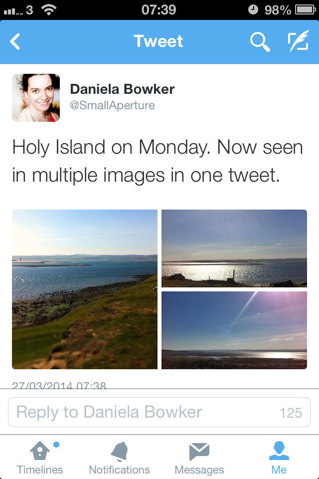
Twitter's augmented its photo capability: multiple images per tweet and image tagging

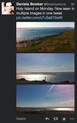
If you've ever been frustrated by Twitter's inability to attach multiple images to a single tweet, today's your lucky day. An update that's mid-roll-out will allow you to select up to four images to share in one 140 character missive. Tap on a preview image to see it full size, and then slide through to view the group. Three images: one tweet

The update has already made it to my iPhone and is steadily making its way to Android and the website version. However, multiple attachments haven't caught up to apps such as TweetDeck yet. So you're saved from seeing your friends' coffees in triplicate if that's your tweet loft of choice.

But not yet on Tweet Deck

In addition to multiple images, tagging people in photos is now possible, too, and their handles won't eat into your 140 character count, either. A maximum of ten people can be tagged in one photo and they'll all receive a notification telling them that they've been featured in a photo. If you'd rather not be tagged in photos, you can turn off the feature in your settings. If you don't see the update yet, hold tight, it'll be there soon.

Update! 11:10, Thursday 27 March 2014: It seems as if TweetDeck is now displaying multiple images.

TweetDeck multiple images display

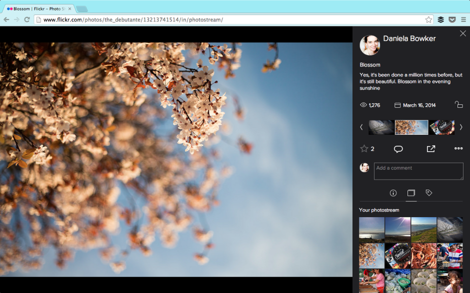
Flickr's implemented its new photo page

In October last year, Flickr implemented a beta version of a new photo page. It was only a beta version, users could opt out, and they were invited to provide feedback on the new-look page, but inevitably there was considerable discontent with the proposed changes. I saw lots of frothing and foaming at the mouth in the feedback forum, some of it sadly lacking in articulated, constructive criticism. And in truth, the beta version did have plenty of bugs, omissions, and oversights that desperately needed rectifying. Flickr's venture into the realms of the new was along a rather rocky path and needed quite a bit of work. A little under six months after implenting the beta, and it seems that Flickr has rolled-out the new-look photo page for everyone. Or at least, I was using the old-style page, and now I'm suddenly not, and my 'Return to the old-style page' button has disappeared. The toddler-type tantrums of 'I don't like it' on the feedback page don't seem to have made much of an impact. And to be fair, neither have the calmer, cooler, and more considered objections to the new layout. The new-look page is here, whether users like it or not. Now it's time to see how many of the niggles have been addressed and kinks ironed out.

I was using the old-style photo page. Now I'm not.

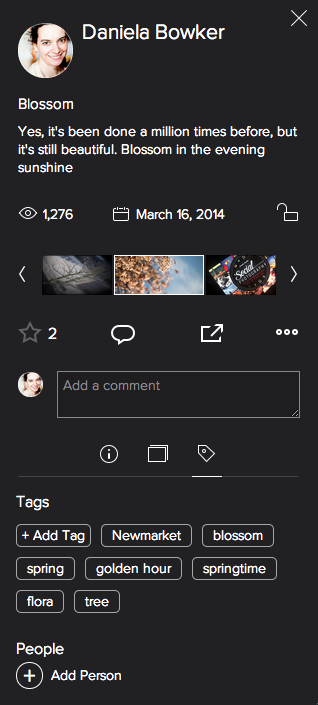
I'm pleased to say that the Flickr team has listened to quite a few of the gripes. For example: you can now see who 'favorited' your photos, rather than there being just a number of 'favorites'. Rich EXIF data are available. Tags have returned to being unhastagged. You can add a photo to a set from the photo page. Lots of the functionality that Flickr users knew and used didn't make it over in the initial beta release. That's been steadily remedied and things are looking more familiar, if different.

Tags are un-hastagged and most of the functionality has returned

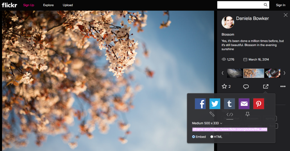
But not everything is yet hunky-dory. A particularly significant bug from my perspective involves sharing preferences. Mine are turned off in my settings. No one looking at my photos should be able to share them via social media or embed them into their blogs. Except that when I look at Flickr logged out of my account, my photos can still be shared and embedded. I'd like to see that fixed sharpish. And it would seem that Flickr's usual location services are still in the process of being ported properly. My map has disappeared and I'd like it back. That's irritating as opposed to concerning.

That shouldn't be happening. At least, not according to my preferences

While I'm not especially concerned by being able to accompany my images with significant pieces of text, I favour short explanations, I know some people who feel aggrieved that the text box is so squashed and insignificant now. For them, being able to use words and pictures in tandem was a favourite feature of Flickr that has been marginalised.

Thankfully, there's a feedback button on every photo page. I shall be making use of it.

As for the new photo page itself, I'm not too bothered by it. My persistence in using the old page was primarily a result of the lack of functionality in the beta version and most, although not all, of those concerns have been addressed. What remains to be seen is how those who initially reacted so negatively to the redesign respond to the changes. Have they grown accustomed to it or have their complaints been addressed? Are the changes unpleasant enough or sufficiently significant in their eyes to see them walk away from one terabyte of free storage together with the network that they've built there? And if there is mass dissent amongst users, what will the impact be on Flickr? Even if, at worst, I'm ambivalent towards the new look Flickr page, what sort of effect will it have on my use of the site if people whom I follow and with whom I interact begin to desert it? I know of some users who feel the changes keenly, and if they choose to quit, my Flickr experience will be the poorer for it. A social network that steadily loses its sociability doesn't have a great deal of value.

Has Flickr really been made awesome again?

Wander leads to Planett, but can these apps go any further?

In December 2011 I took a look at an app called Wander (no, not that Wander; a different one) that aimed to let you explore the world through images. It was a bit like having technologically-based pen-pal. Wander allowed you to connect with people in any one of 80 countries and you could share your lunch, your journey to work, and what you do of an evening to get to know each other and where you live, through pictures. It seemed like a fairly neat idea that allowed you to explore and learn about new places while sharing yours. It didn't, however, catch on as the developers had hoped and Wander closed down on 16 August owing to financial difficulties.

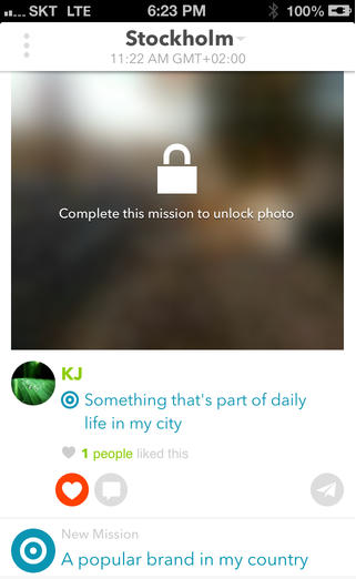
Undeterred, some of Wander's original developers have gone on to launch Planett, a Wander-esque app that allows users to discover new places and people by featuring photos tagged with 'missions' from all over the world and organising them into 'city feeds'. Wander's one-to-one element has had to take a back seat for now, but the Planett team is hoping that it can be introduced soon.

Screen Shot 2013-09-02 at 19.46.11

I'm impressed by the Planett team's tenacity, but I'm left with some nagging doubts about the app's viability. If it failed on financial grounds the first time around, how will the revamped version fare? There are two underpinning factors here: either Wander didn't fulfil a gap in the market and wasn't popular with potential users; or the team weren't able to monetise it effectively.

Rehashing an app that people didn't want to engage with won't necessarily make it any more popular. If that's the case, then Planett is, sadly, already on a hiding-to-nothing.

Not being able to monetise the app effectively could have been because the developers simply didn't know how to do it. They couldn't see a way to make the app economically lucrative and therefore didn't. That's fine if you're able to bankroll an app as a personal project, but not if you need to transform it into a self-sustaining business. Given that Wander closed owing to financial shortcomings, it suggests that it didn't fall into the category of a developer's part-time project. Seeing the way that Wander went doesn't fill me with confidence that Planett can be maintained as a developer's toy, either. If that were the case, then Wander would still be meandering along.

I sincerely hope that the Planett team hasn't sauntered over from Wander thinking that they can monetise it 'somehow' without having thought it through. Attempting the same scheme but expecting a different outcome is somewhere between futile and fanciful. What I would like to know then is what's the plan, Planett? I have asked Planett's developers to elaborate on the app's monetisation potential, but I'm yet to receive response. Without one, I can only anticipate Planett will head towards the same pale blue yonder of Wander.

Alternatively, the Wander team did attempt to monetise their app, but it didn't raise enough revenue. That doesn't bode well for Planett, either: it casts doubt on the monetisation potential of the app. Sure, Planett might have a different vision to Wander, but there's no evidence of it yet. Planett's developers need to consider if their app is something that plugs a gap in the market and if people will be prepared to pay for it, somehow.

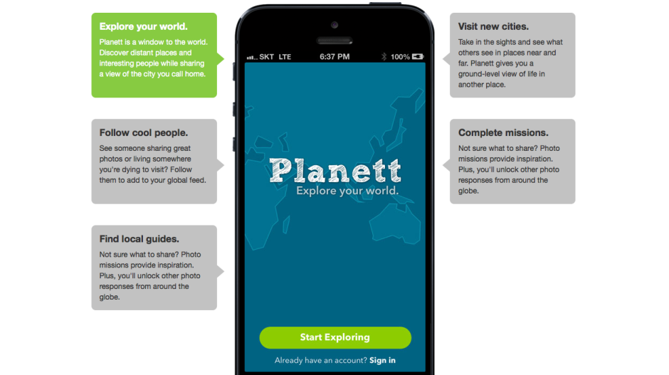
Screen Shot 2013-09-02 at 19.46.41Planett's selling points are that it allows you to explore your world, you can follow 'cool people' who share photos from places you want to visit, you can visit cities pictorially and explore them 'at ground level', and it provides you with photo missions to inspire you and get your creative juices flowing. As you share more images of where you live, you can unlock more images uploaded by other people.

Is this enough to tempt people to join and to share their photos? After all, you can already explore the world photographically using geolocation information with Flickr, Instagram, and EyeEm, and you can follow heaps of people with varying degrees of coolness on all three of those sites. EyeEm has the photo missions element built in, too. The real kicker for Planett is that these examples are already well-established communities with billions of photos, and that they're free. Without something to set it apart, Planett is facing an uphill struggle.

Wander's unique selling point was the one-on-one relationships that it fostered. Planett is hoping to adopt this feature but it hasn't got there yet. Without it, or another appealing and original facet, Planett is trying to establish itself amongst already settled groups that might not be willing to shift (or at least join).

There are billions of photos on the Intergoogles and hundreds, if not thousands, of different ways of sharing them. But if a new kid on the block is going to survive against already well-established communities and ensure its sustainability, it has to know to whom it is appealing, and how. Does Planett?