apple iphone

How exciting is the iOS 7 camera app?

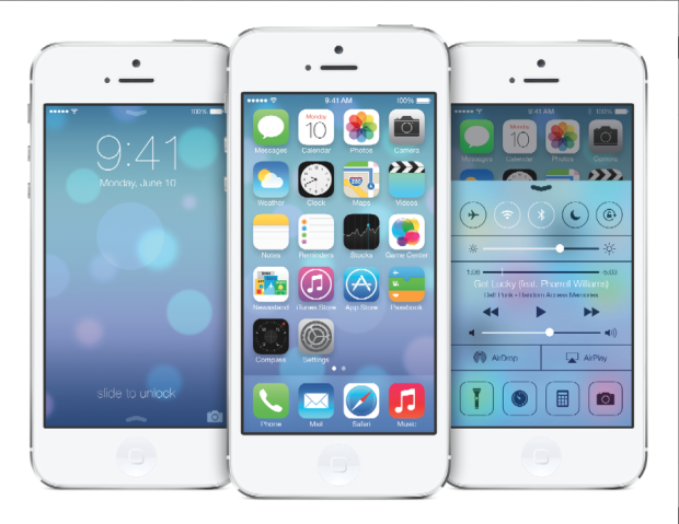
Apple iOS 7 Whilst everyone else is arguing about whether the new flat design and Crayola coloured icons that comprise iOS 7 are genius or travesty, shall we take a look at what's been updated, reshuffled, and introduced camera-wise?

Taking on an iPhotos feel, photos are now automatically organised into 'moments'. It's a twee name for a fairly neat concept: images are sorted and labelled geographically and temporally using their metadata. This will let you search photos you've taken in one particular location by date. It's a more sophisticated digital version of having holiday albums sorted by year and place, with each photo captioned; you can see all the photos from one place organised by date, too.

Airdrop will allow you to drop an image into someone else's iPhone over the same wi-fi network. If we can Airdrop to other devices, for example a MacBook Air, that'd be neat.

Photo Stream already allowed you to share with your friends and for you to comment on their streams; now you can insert your photos into their shared streams, creating a collective album.

Moving between camera, video, panorama mode, and the square crop feature is managed by a swipe. Yes, you read that right, there's a square shooting mode built into the camera app, along with a range of filters. It feels like a dreadful disease that afflicts smartphones. With any luck, it's a childhood illness and everyone will grow out of it soon.

The conclusion? There's nothing revolutionary or even exceptionally exciting here. It feels more like a consolidation of features and in some respects even a game of catch up. That's not to say that sharing images via Airdrop isn't a welcome addition, it's just that it isn't setting alblaze the world of mobile photography.

Making your own grey cards


BEFORE: The Apple iPhone 4 has a great camera, but it's struggling with white balance. By using a grey card, I can fix it...

Most cameras are capable of creating 'acceptably good' white balance on your photos. And even if they're failing, you can make a pretty decent guess for what you think the white balance should have been in post production.

But what if you want to take the guesswork out of the equation, and get perfect white balance every time? The professionals use something called a 'gray card' (or 'grey card', depending on where in the world you learned to write English). The name says it all: it's a gray piece of card or plastic that you can use to balance your photographs.

Finding yourself a gray card

img_0875.JPGDoes that sounds a bit high tech? Well, it really isn't - and the great news is that you can use just about anything that is neutrally coloured. Of course, without advanced colour calibration equipment, it's hard to find something that's actually perfectly neutral. For our purposes, however, you don't need to do that: anything that's just about gray will do. Why? Because once you have your photos balanced consistently, it's easy to make sure they are all well-balanced.
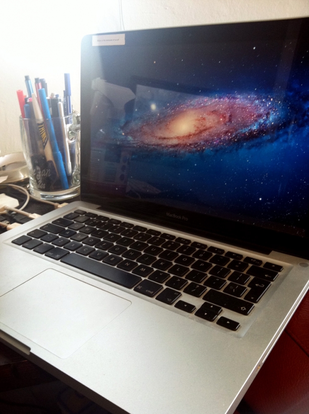
You can use anything that is neutrally coloured, but we would recommend using something that's light gray - it gives the camera the best colour reading, and it makes it easier to do your balancing in post production, too. The lids on coffee cups tend to work pretty well, and personally, I've been using my Macbook. The matt, light silver material is relatively neutral, and since I tend to bring my laptop on photo shoots with me, it's always there when I need it.

Printing off a gray card

If you know what printer you are going to be using to print your images, you could create your own gray card as follows:

1. Open up a photo taken with your camera in Photoshop. This ensures that the correct color profiles are in your image file.

2. Delete the image, and fill the frame with 18% gray.

3. Send the file to your printer, and take it with you on shoots.

The key thing here is that your 'gray card' may not be perfectly neutral, but the important thing is that your printer thinks it is neutral - so if you colour balance your photographs to this particular card, your images should come out neutral when you print them next. Clever, eh?

It could be argued, of course, that if you're serious enough about white balance that you are going to use a gray card, then you may as well buy a set of gray cards that are definitely perfectly colour balanced, but having a home-made set of cards is much better than shooting without anything, so it's a great place to start.

How do you use a gray card? - Whatever you've decided to use as your gray card, the way you use it is pretty simple, and I've covered the process as a video and how-to article; How to use a grey card.

Getting a professional-grade gray card

Of course, you could just decide to go full hog and get a professional gray card. It just so happens that I'm selling some lovely A6-sized cards 

Leica (not) in bed with Apple

leica-i9

So the internet has been a-twitter about the Black Design Associates concept which marries a Leica M9 with an Apple iPhone, creating the Leica I9 concept. The idea is that you’d use Leica optics and sensors, but your iPhone to control the camera.

It’s a pretty nifty idea, although chances of Leica going for anything like this are beyond slim – Leica tend to make cameras for the ages, and Apple aren’t known for their open standards: Nobody knows whether the iPhone 5 will have a shape (or connector) anything similar to the iPhone 4. Besides, it’s not like Leica to interface with anything.

Having said that, I do hope that someone, somewhere, decides to make one of these cameras – the screen on the iPhone 4 is legendary, and slotting it into a dozen-megapixel camera with some decent optics would be hellatasty indeed. Something for Panasonic, perhaps? Do it!

More info on Engadget!