images

Can I use this photo I found on the Internet?

(Or, the non-photographer's guide to image use) It's a truth universally acknowledged that articles, newsletters, blog posts, posters, and basically anything involving blocks of text can be improved upon by the addition of an image. When you're writing about the local cycling club's criterium or producing a short introduction to crochet and macrame, you'll probably want some pictures to illustrate events or to explain techniques alongside your race report or detailed how-to. Can you take a look at the site of a local photographer and use some of his images from the cycle race? Can you conduct a Google Image Search for 'crochet' and download some photos of great examples of people's work?

Cakes with Flickr denim filter

The short answer is always 'No'. Just because someone has posted an image on the Intergoogles, it doesn't mean that it is free for other people to use. You can't use the china in John Lewis' window display without paying for it first, and a photo on Flickr is just the same. Images belong to the people who create them—or in some circumstances, to their employers—so they get to decide how and when they can be used and what the appropriate fee for using them is. We put them on our websites or on photosharing sites because we're proud of our work and we like to display our capabilities, but it's not an open invitation to filch them.

There are a few exceptions to this rule, but until you know better, work under the assumption that every photographer keeps the tightest control over the use of all of her or his images. Being confronted by an angry photographer wielding an invoice for unauthorised image use is not a pleasant situation, so remember: You can't use other people's photos. Mmm'kay?

For completeness, what are these exceptions you talk of?

Some people are happy to licence their images under Creative Commons terms. Creative Commons licences aren't designed as an alternative to traditional copyright, but a complement. They're easy-to-use copyright licenses that allow you permission to use a photographer's images under terms decided by the photographer. One photographer might let you modify and use his images commercially, but another might say that her images must be attributed, cannot be used commercially, and aren't to be modified. However, not all photographers use Creative Commons terms (you'll see it close to the photo if they do) and if there's no evidence of a Creative Commons licence, assume that you can't use the image.

If you receive an image in a press release or it's made available to you from the press section of a website, this will be free to use in the context of the product or situation. For example, when Olympus releases a new camera, it will make a bundle of images illustrating it available to me. Provided that I'm writing about that camera, I'm free to use them in an article. The National Portrait Gallery will supply a selection of images from each of its exhibitions so that if you're reviewing it or publicising one, you have photos to illustrate the article. But, you can only use those photos in relation to the relevant exhibition and they must be attributed under the terms set out by the NPG.

Sunset kayaker, Mullaloo

Some news agencies, for example AFP, are happy for you to use their photographers' images non-commercially and for personal use provided that you credit the photographer and agency and link back to the site. But, some agencies aren't. And you wouldn't want to face the wrath of AP or Reuters. Again, unless you're absolutely certain, assume that an image isn't free to use.

But what if you see an image and want to use it? What should you do?

Get in touch with the photographer! Most of us make it easy to send an email: do just that. We don't bite. Mostly. Tell us who you are, why and how you'd like to use a photograph that we've taken, and ask if you can come to an arrangement. The worst that we can say is 'No'.

That's not so hard, is it?

Book review: The Canon 6D Experience

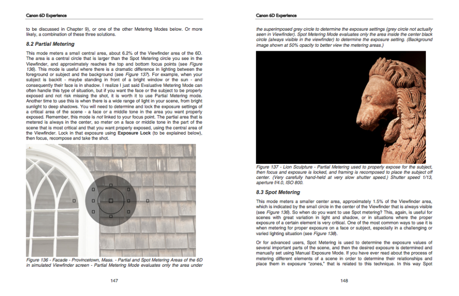
Screen Shot 2013-07-23 at 16.33.28 The Canon 6D Experience is part of Douglas J. Klostermann's series of e-book guides to Canon's and Nikon's dSLRs. There are ten Canon books and five Nikon books, ranging in price from $7.99 for guides to the oldest models of camera to $14.99 for the latest cameras. I've been taking a flick through it and seeing how it fits in with my use of my Canon 6D.

The best way to describe the Canon 6D Experience is as an augmented instruction manual. It doesn't just explain what a function is and how to operate it, but what effect or impact it will have on your photography. It shows you how to expose and re-compose your images, provides examples of different apertures and ISOs, and explains about metering. It covers a great many of the functions that I never use in my camera because I almost always shoot in Raw and almost never venture into liveview mode. Towards the end of the book it moves away from the camera itself and covers composition and discusses lenses.

Diagrams and pictures to explain metering

This, then, is perhaps where this book falls down, or falls between two stools. For someone new to dSLRs and still finding their way in photography, would they be starting out with a 6D? In the book's introduction it says: 'If you are relatively new to dSLR photography and are still in the process of learning all the controls of a dSLR and the exposure concepts of digital photography, you have perhaps ventured towards the proverbial deep end of the pool by choosing the advanced 6D!' Of course there will be some beginners who've gone straight for the 6D, but they're not the camera's intended market. This guide will suit them well, but I'm not sure how many will be needing it.

Not sure that we need a look at Raw vs JPEG for a 6D user?

For anyone who's comfortable with Canon cameras and is a competent photographer, a lot of the book's content is superfluous. It isn't that there isn't useful material in there, but that it's buried amongst the information we already know. Having a smaller, more dense publication that looks at the high level functions of the camera and compares it with other models might be more useful.

All of this leads me to think that if the books in this series that cover the lower specced models are written with the same attention to detail, they would be extremely valuable guides for people finding their way in dSLR photography.

On a very picky production level, I would have liked to have seen references to other chapters in the book numbered, or even hyper-linked. It is an ebook, after all. That would have made navigation a great deal easier.

My verdict, then? At $14.99 I can't really recommend the Canon 6D Experience; I just don't think it offers enough to kind of photographer who'd be using this camera. (Unless you really have thrown yourself in at the deep end.) If you're newer to photography and have a Nikon D5200 or a Canon 700D, for example, do check out the other books!

The Canon 6D Experience, by Douglas J. Klostermann, published by full stop and available for download from Dojoklo.

What is a histogram?

H is for histogram! This week's Photography Fundamentals installment explains the graph that you can draw up on your camera for each image, or appears in the top right corner of your workspace in Lightroom or Photoshop. What does it depict and how is it useful?

It's a graph

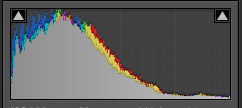
A histogram is a graph that shows the tonal range, or the distribution of brightness, of an image's pixels. On its X-axis it runs from black to white, 0 to 255. On its Y-axis it charts the number of pixels at any brightness value.

Screen Shot 2013-07-17 at 17.21.13

Lots towards the left, but a few specular highlights, too

By looking at a histogram you'll have a feel for the exposure of an image. If the majority of the pixels are sitting in the left-hand side of the histogram, the image will have a lot of darker tones. An image with plenty of bright tones will have a histogram that's predominantly situated in the right-hand side.

A perfect histogram?

There's no such thing as a perfect histogram. Instead, you need to use it as a tool to help you judge if you've exposed your image how you want it exposed. Sure, if your image has a histogram that's concentrated towards the left, it might be under-exposed. It might also be a low-key image with predominantly dark tones.

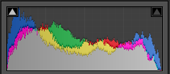
However, the majority of images will have histograms that peak around the centre, in the mid-tones, but taper out towards the blacks and the whites.

Screen Shot 2013-07-17 at 18.52.27

A broad sweep from left to right

If you've any 'blown highlights' or catasrophically over-exposed pixels that are pure white and don't contain any detail, you'll see those peaking right up against the right-hand side. These are sometimes called 'clipped highlights'. You can expect to see some if you've the sun in the frame, or specular reflections on water or metal, so don't think that they're always a bad thing!

And contrast?

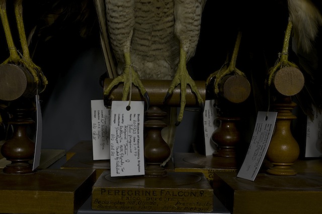
Histograms also indicate the contrast found in a scene, too. A narrow peak will mean a lower contrast image; a broader peak is indicative of an image with high contrast.

Screen Shot 2013-07-17 at 18.44.17

A narrow peak towards the right hand side - lots of brights and not much contrast

Where to find a histogram

All dSLRs and EVIL cameras will have a histogram included in their menu functions; higher end compacts often have them, too. On my Canon it's just a case of viewing an image in playback and then hitting the Info button twice.

When you're editing, the histogram is usually in the top right corner of your screen, but it will depend on your programme, obviously.

TL;DR

  • A histogram is a graph displaying the distributon in brightness of an image's pixels
  • There's no 'perfect' histogram; they're tools to help you assess exposure and contrast in an image
  • Darker images will have histograms with data concentrated towards the left hand side of the graph
  • Brighter images will have histograms with data concentrated towards the graph's right hand side
  • High contrast images will have broad peaks in their histograms; low contrast images will have narrower peak

Golden hour << Photography Fundamentals >> ISO

A Vivid controversy or a storm in a tea cup in Sydney?

Vivid Sydney opening night One censorship argument at a festival celebrating creativity and inspiration is probably enough for any organising committee, but two is overwhelming and potentially damaging. Still, that's the situation at Vivid Sydney, the light, music, and ideas festival that takes over the Australian city between 24 May and 10 June.

'Culling images?'

The first incident arose on Saturday night, when 18 out of 35 images were pulled from the Reportage exhibition that was being projected onto two large screens near the Museum of Contemporary Art at Circular Quay. (For those who don't know Sydney, Circular Quay is where the Opera House is located.) Reportage was intended to be a showcase for photojournalism, and included submissions from photographers represented by Magnum, Noor, and Contact.

Being a display of photojournalism, the potential for any of these images to be distressing or offensive was high, but this was something that Destination NSW, essentially the New South Wales tourist board which owns and manages Vivid Sydney, seemed to have overlooked until the very last moment. Sandra Chipchase, Destination NSW's CEO stated: 'What we don't want is children walking around the corner and seeing pictures of dead children... We just don't want violence, dead people or anything that could distress people. In that public domain area it's about entertainment and engagement.' I don't know about you, but I'm not sure that I've ever considered photojournalism to be 'entertainment'.

As a consequence, photographs depicting the Cronulla riots, the 1979 Iranian revolution, and even the aftermath of an Australian bushfire were pulled from the big screen. They are available to see in smaller venues, but photographers who had travelled to see their work exhibited on the big stage were disappointed and at least two have withdrawn their work in protest. Hurt feelings, poor communication, and what appears to be a woeful misconception of the material intended for display: not a great start.

Concealed genitalia

Controversy number two involves the exhibition Home, hosted in the Cleland Bond building in The Rocks area of Sydney. Two photos, depicting three naked people, had tape placed over their genitalia. Stephen Dupont, curator of both Home and Reportage, claims that this was at the request of the Sydney Harbour Foreshore Authority; the Sydney Harbour Foreshore Authority has stated that it didn't request that the tape be applied specifically, rather that the exhibition be made suitable for the 'broadest possible audience'.

Dupont discussed the request to tape up the images with the Oculi group, who provided the images for the Home exhibition, and they decided that the photos would stand untaped and as they had intended.

Cut-and-dried

In addition to what can only be described as the naivety of the organisers, there is a question of managing expectations around the exhibitions. In my opinion, how appropriate it is to display gentalia in a closed exhibition with a warning by the door is a cut-and-dried decision: if people are aware of the presence of naked human forms, they can decide whether or not to enter. The request to somehow sanitise the exhibition was unnecessary and offensive to both the photographers and the audience. Apart from finding it condescending for someone to tell me what I can and cannot see, I remain entirely perplexed as to what, exactly, people find so distressing, alarming, or offensive about the human body. We all have one, after all.

A storm in a tea cup?

The decision to pull images that some might find distressing are projected publicly feels much more like a storm in a tea cup to me. Whilst there are some significant questions presented here, not least who gets to decide whether an image is distressing or not, it seems to be a situation resultant of mis-communication and resulting in over-reactions.

Point 1 of mis-communication centres on the expectations surrounding a display of photojournalism. I approached destination NSW, enquiring what, if any, guidance was issued to photographers regarding acceptable material for display at the Reportage exhibition. It responded: 'As per agreed editorial contractual arrangements between Destination NSW and the organisers of Reportage, and given Vivid is a family friendly event, we endeavoured to ensure photos and footage that may cause offence or distress, or were not in keeping with the values of the event, are not presented at the outdoor venue and screen.' My interpretation of this is that Destination NSW wanted 'family-friendly' images, but rather than issue clear guidelines before submissions were made, made reactionary and arbitrary decisions on the acceptability of the material once they'd seen just what was going up on the big screen.

Furthermore, given that Reportage is an exhibition dedicated to photojournalism, I'm intrigued to know exactly what sort of imagery Destination NSW was expecting. By its very nature, photojournalism covers issues that are difficult, distressing, or offensive in a visceral fashion. As Andrew Quilty, the photographer whose bushfire images were pulled from the Reportage projection, put it to Guardian Australia:

I don't know what they [the organisers] expected to come from a festival that shows specifically photojournalism. I don't know if they were expecting photos of cats and what the photographers were eating for breakfast. It seems to be coming from a typical kind of ad-person who has a view of how they want their brand to be perceived.

Point 1 of over-reaction centres on Destination NSW, having been presented with a bundle of images that it wasn't quite anticipating, deciding to pull them from the large outdoor display at the last minute. Running through my head is an xkcd-type scene where bureaucrats are tugging at their hair and screaming: 'But won't you think of the children!'

Having taken a look at the image reel on the Sydney Morning Herald website, which includes the redacted pictures, I have to say that very few provoked feelings of distress or shock in me. Would I be happy allowing my five year old nephew look at the photograph of an Iranian protestor whose hands are covered with blood? Probably not. But the photograph of Mexican immigrants being arrested on the Californian border is hardly controversial. I'm inclined to think that Destination NSW over-reacted, but then I'm not a parent.

I'd be interested to know what you think of the images.

Point 2 of mis-communication focuses on the process of removing the images from the projection. Destination NSW has been quite clear that the images it deemed to be too distressing for display were not removed from Vivid Sydney in their entirety. They can still be viewed at other venues, for example the Customs House, just not on the large public screen. Somehow, though, this seems to have been interpreted as the images have been censored wholesale, and without doubt those photographers who had travelled in order to see their work projected on a large scale, or had expected to see their photos alongside the work of eminent photojournalists, will feel bitterly disappointed.

Point 2 of over-reaction is the response of the photographers. At least two have withdrawn their images from display and Dupont, Reportage's curator, expects more to follow suit. If I were a photographer and my work had been pulled from an exhibition at the very last moment on somewhat spurious grounds, I'd be furious, too. However, foot-stamping and toy-throwing is incredibly unbecoming. How about suggesting an alternative?

After 21:00

Rather than leave Destination NSW looking red-faced with embarrassment and the photographers red-faced with fury, I would be inclined to suggest implementing a watershed for the projection. Before 21:00, it's a more family-friendly set of images that doesn't raise questions parents might not be ready to address with their six year olds. After 21:00, it's a full and frank exhibition. It's a compromise that means no one has to lose out, least of all the photographers who submitted their images in the expectation that they would form part of an extensive and exciting exhibition exploring photojournalism. It would also help to mitigate the impact of a mis-communication that is becoming an international embarrassment.

All those years ago when I was training to become a teacher, one of the fundamental principles instilled into me by my tutor was 'Say what you mean and mean what you say.' Destination NSW could do well to adhere to that notion.

(Headsup to the Guardian and thanks to the Sydney Morning Herald)

People in glass houses

Binoculars Where does the line exist between public and private? At which point does photography become voyeurism, or even exploitation? When you live in the Zinc Building, a glass-fronted set of apartments in New York's TriBeCa district, this question has just been thrown into sharp relief by a new exhibition at the Julie Saul gallery in Chelsea.

Arne Svenson, a photographer living on the second floor of a building opposite the Zinc Building, used a telephoto lens to capture images of the residents of the Zinc Building from his flat. These have now been curated and exhibited at the Julie Saul gallery under the title 'The Neighbors'. None of the subjects can be identified from their images, and Svenson maintains that by living in a glass-fronted building, they are putting themselves on a stage:

For my subjects there is no question of privacy; they are performing behind a transparent scrim on a stage of their own creation with the curtain raised high. The Neighbors don’t know they are being photographed; I carefully shoot from the shadows of my home into theirs.

For the residents of the Zinc Building, however, there is a distinct feeling that their privacy has been violated and consequently they are contemplating legal action. The feeling seems to be that there is a difference between an odd stolen glance and a concerted campaign to document their lives from the shadows. Even if they cannot be identified, it feels creepy.

Bearing in mind I'm in no way a legal expert and certainly not one in New York law, I think that there are two critical factors here; first, that Svenson took these photos from his own flat; second, that the images were captured using a long lens. Would someone standing on the street, without optical assistance, have been able to discern these scenes? If this weren't the case then the residents' expectations of privacy were reasonable and their sense of intrusion justified. Legality aside, from an ethical standpoint Svenson's location adds a distinct element of voyeurism and exploitation to his actions: he observed them purposefully and secretly from the security of his own flat.

Even if Svenson's actions are deemed legal, it is ethically dubious situations such as these, which provoke a sense of violation in the public, that leave photographers facing a barrage of abuse and do nothing to support or promote our rights to shoot in public. To say that we should never push the boundaries and paint ourselves into a photography-less corner would be foolish and detrimental to the medium. Rather, we need to be respectful of our subjects; just because we can do something doesn't mean that we should.

Meanwhile, I might just start drawing my bedroom curtains when I change. Nobody can see me from the street and the only possible view into the room comes from the first floor windows of two houses several hundred metres away. But you never know.

(Headsup to The Online Photographer)

A much-needed update for Flickr's iOS app


Android users enjoyed a significant upgrade to Flickr in August, but iOS users were left languishing with a fairly basic app that didn't offer half of the functionality of the website. In fact, using the mobile site was a superior experience to the app. That changed around lunchtime (here in the UK, anyway) today. An updated Flickr for iOS is now available, complete with in-app camera and snazzy new layout.

Ignore the moaners and groaners who are dyspeptically lamenting that Flickr has added a filter option to the camera function. Yes, they included the option to wash your photo, taken on the newly introduced camera, with some kind of filter. Everyone's doing it now and it isn't really new or exciting. In fact, it's probably the scourge of modern photography and we'll succumb to scurvy if we continue to apply them.

But you know what? This upgrade is about a whole lot more than a selection of filters. Some much-needed functionality has been added to the app, which was quite frankly rather poor before hand, bringing what you can do with the app closer to what you can do with the website.

For me, the most exciting addition is the ability to interact with the groups you belong to. You can see the photos that have been submitted to them and you can participate in their discussions. Previously, I found not being able to do that from the app highly frustrating.

When you explore your contacts' uploads, you can select from two layouts. One shows you the uploads by adte alone. The other gives you the streams of your contacts organised by most recent upload. 

As for uploading your own images, take a picture, make your edits with Aviary, apply a filter (or not), and then upload it to your photostream, add it to a group or set if you want, write a description, and complete everything with tags. Or you can select one from your phone's camera stream.

This update improves the functionality of the app hugely, but even I, in my rose-tinted Flickr-adoration, know that Flickr has suffered from stagnation. I don't know if it's enough, but it's a start. And I'm very happy about the improvements.

Whoah! And there's more! Flickr has just announced that over the next few days it'll be rolling out an improved navigation bar and a new-style Explore page on its website. I'm not seeing that yet, but I'm looking forward to trying it.

A photo competition for December


For December's competition we're going back to basics, something simple to round-off the year. We'd like black and white images, please.

Your image can be a portrait, a landscape, a macro... whatever takes your fancy. But it must be in black and white.

The competition is open from today (Friday 7 December) until Friday 28 December 2012. You can submit one entry to the Small Aperture Flickr pool. And the winning image will bag its photographer a 12" Fracture.

I've reproduced the rules for your reference, and here's a wish of good luck:

The Rules

  • If you decide to enter, you agree to The Rules.
  • You can’t be related to either me or Haje to enter.
  • One entry per person – so choose your best!
  • Entries need to be submitted to the right place, which is the Small Aperture Flickr group.
  • There’s a closing date for entries, so make sure you’ve submitted before then.
  • You have to own the copyright to your entry and be at liberty to submit it to a competition. Using other people’s photos is most uncool.
  • It probably goes without saying, but entries do need to be photographs. It’d be a bit of strange photo competition otherwise.
  • Don’t do anything icky – you know, be obscene or defame someone or sell your granny to get the photo.
  • We (that being me and Haje) get to choose the winner and we’ll do our best to do so within a week of the competition closing.
  • You get to keep all the rights to your images. We just want to be able to show off the winners (and maybe some honourable mentions) here on Pixiq.
  • Entry is at your own risk. I can’t see us eating you or anything, but we can’t be responsible for anything that happens to you because you submit a photo to our competition.
  • We are allowed to change The Rules, or even suspend or end the competition, if we want or need to. Obviously we’ll try not to, but just so that you know.

If you've any questions, please just ask!

October's round winner


Crikey! You made it hard for us this month. We almost came to blows trying to settle on a winner for October's round-themed competition. To be fair, it would have been difficult, as none of us is currently in the same city, and we don't really go in for violence, but you get the idea that we struggled to agree.

Eventually, though, it was concluded that Martin's untitled picture should take the spoils of a 12" Fracture. Well done!

Congratulations everyone, you did a sterling job.

If you fancy having a go at November's competition, we're looking for images of wood. All the details are here.

Get your boots on! It's the Burrard-Lucas travel photo contest!


You might associate Will and Matt Burrard-Lucas with breathtaking wildlife photography, but they also run a super annual photo competition. The final quarter's contest is now open for submissions and the theme is travel.

You have between now and 31 December 2012 to submit your travel-themed images. Will and Matt are looking for striking and original pictures that convey the wonder of the world, from its people and their culture, to its history or the environment.

This quarter's winner will be awarded a 16×24 framed print of her or his winning shot, provided by Committed Photography. The two runners up will be eligible for unframed 16×24 prints. The winner will then go up against the previous quarters' winners from 2012, as well as the winner of the Burrard-Lucas Facebook photo contest, to bag a Canon 60D.

The contest is free to enter and you retain your copyright. There are, however, some basic requirements regarding size and eligibility, so you should be sure to check the rules.

You can also check out previous years' winners for inspiration, as you won't be able to check out the competition this time around! (2011; 2010; 2009.)

Otherwise, I reckon you should crack on and submit something!

August's metallic medallist


EMP/SFM by Wntrmute

In a somewhat tenuous celebration of the Olympics, we asked for metallic images in our August photo competition. Judging was a slightly stressful experience, with a flurry of emails bouncing back and forth to decide who'd bag the 12 " Fracture prize. Thanks be to the gods of competition that none of us was expected to provide scores on diving, dressage, or gymnastics in a split second!

Finally, we settled on Wntrmute's enigmatically titled EMP/SFM as our gold medallist. There was something about the sense of texture it conveyed, and the warmth emanating from the structure that did it for us.

As for our runners up, Fred Dunn snatched silver with Stay out, stay in, which we adored for its composition and the ability to make razor wire inviting; bronze went to praire_girl76 for her macro of a wire whisk, which was entry 191 in her 365 project.

7720081382_696fcae37b.jpg

7539446880_0423c6b718_n.jpg

Congratulations all of you, and thank you to everyone who entered. We'll be posting details of our September competition later today!

Pentax invites you to Meet Britain


Reggie Yates encourages you to Meet Britain on behalf of Pentax

Pentax UK wants to know: what makes Britain great? It's inviting people to submit images reflecting what they believe is iconic about the UK. It doesn't necessarily make Britain great, but the rain is definitely iconic. You could get plenty of photos of that. There are five categories for submissions: celebrations (in the rain), summer holidays (and that would be which summer, precisely?), friends and family (soggy), Great British culture (damp), and the Great British outdoors (flooded).

Encouraging people to get on board with this quest for icons are singer and actress Sarah Harding and DJ and TV presenter Reggie Yates. They'll be submitting their own sets of images conveying what they think is great about Britain.

For anyone who wants to enter, you do so via the Meet Britain app on the Pentax UK Facebook page, until 3 September 2012.

If your entry is judged the best in its category, you'll win a shiny new weather-sealed Pentax K-30, perfect for the climate. The person who's talented enough to be judged the over all winner will pick up £1,000, too.

Worth a try, hey?

500px offers 'Plus' membership, in between free and 'Awesome'


Pretty graphs from 500px

500px has just announced a subscription package in between its free-forever-but-somewhat-limited membership and its all-singing-all-dancing-$49.95-a-year-Awesome service. Called the slightly-less-than-inspired Plus membership, it costs $19.95 a year and offers almost everything that Awesome does, barring the 'personalised portfolio'.

That means you can upload as many photos as you want (uploads are limited to 10 a week with the free service), it allows you to sell your images via the 500px store (something you can do with free memebership), it provides you with the ability to collate your images into collections, sets, or stories, and it gives you access to advanced statistics on your images. Yes, it is all rather similar to Flickr's Pro membership, and comes in about $5 a year cheaper, too.

The analytics includes the basic stats that you'd expect: the number of likes, dislikes, favourites, and comments that each of your photos receives over a time period of your choice. However, it also allows you to analyse who are your most engaged followers and friends and shows you which were your most popular images. And it comes with an interactive graph. Being a sucker for graphs and pie-charts, this is the bit that I like the most.

For anyone who is in the slightest concerned about Flickr's longterm future, 500px is looking increasingly like a viable alternative. You can check out the site here, and the membership options here.

A photo competition for April!


For April we'd like to see your photographs of glass vying for the top spot in our competition pool. (Don't ask me how I came up with the theme; I don't know.)

So perhaps you'll photograph an interestingly lit wineglass, maybe some delicate Venetian glass perfume bottles will catch your eye, or a window could be just the thing that gets your creative juices flowing. As long as the photo features glass, it's eligible.

The super team at Fracture are providing a 12" Fracture for the talented winner.

The competition opens today (Thursday 5 April) and runs until Thursday 26 April 2012. Entries should be submitted to the Small Aperture Flickr pool, but please remember that it is one photograph per person. Thank you.

The Rules have been produced below, for your reference:

The Rules

  • If you decide to enter, you agree to The Rules.
  • You can’t be related to either me or Haje to enter.
  • One entry per person – so choose your best!
  • Entries need to be submitted to the right place, which is the Small Aperture Flickr group.
  • There’s a closing date for entries, so make sure you’ve submitted before then.
  • You have to own the copyright to your entry and be at liberty to submit it to a competition. Using other people’s photos is most uncool.
  • It probably goes without saying, but entries do need to be photographs. It’d be a bit of strange photo competition otherwise.
  • Don’t do anything icky – you know, be obscene or defame someone or sell your granny to get the photo.
  • We (that being me and Haje) get to choose the winner and we’ll do our best to do so within a week of the competition closing.
  • You get to keep all the rights to your images. We just want to be able to show off the winners (and maybe some honourable mentions) here on Pixiq.
  • Entry is at your own risk. I can’t see us eating you or anything, but we can’t be responsible for anything that happens to you because you submit a photo to our competition.
  • We are allowed to change The Rules, or even suspend or end the competition, if we want or need to. Obviously we’ll try not to, but just so that you know.

If you've any questions, please just ask!

Our high-key photo competition winner is announced!

For January, we were looking for bright, airy, and positive high-key images to kick off the new year. This was the entry that made both Haje and me go 'Yes!' It's calm, delicate, and gorgeous.

1st year of ballet

Congratulations, Hooker771 (he doesn't give his real name on Flickr), for your charming First Year of Ballet. You've just won yourself a 12" Fracture.

Details of our February competition will be going up very soon!

AoP Awards winners

aopawards_photo_4col

In case you missed it, the Association of Photographers held their annual awards last week, which honours professional photographers and their work – both commissioned and non-commissioned – across genres including advertising, portraits, and editorial. So as to keep up with the changes that are being made to cameras, and specifically to cover video capability, the AoP introduced the Moving Image category this year, too.

Almost 3,000 images and videos were submitted by nearly 400 entrants. There were 17 ‘Best in Categories’ and three Gold awards. A few of them are here for your perusal. Enjoy!

Nick Meek – Best in Catergory and Gold winner for the Environment series

Allan Stone – Best in Category and Gold winner for the Object series

To take a look at the other winners, head over to the AoP Awards website!

(All images are, of course, copyright their respective photographers.)

Our August photo competition

Pattern 11 - moss

We’ve done it! We’ve wracked our brains and thought of a theme for this month’s competition. It was terribly hard work, you should know. We’re looking for pictures on the theme of texture. It can be rough or smooth, you can do a macro of some fabric, you could capture the look of moss or lichen… we really don’t mind. We’re looking forward to seeing what you drop into the Flickr pool. Our winner gets a fabulous 12″ Fracture, too!

You’ve three weeks to submit a photo, so you have from today (Wednesday 3 August) until Wednesday 24 August. It’s only one photo per person, and they need to go in the Small Aperture Flickr pool.

If you’ve any questions, please be in touch. Otherwise, I’ve reproduced The Rules, just in case. Good luck and have fun!

The Rules

  • If you decide to enter, you agree to The Rules.
  • You can’t have written for Small Aperture or be related to either me or Haje to enter.
  • One entry per person – so choose your best!
  • Entries need to be submitted to the right place, which is the Small Aperture Flickr group.
  • There’s a closing date for entries, so make sure you’ve submitted before then.
  • You have to own the copyright to your entry and be at liberty to submit it to a competition. Using other people’s photos is most uncool.
  • It probably goes without saying, but entries do need to be photographs. It’d be a bit of strange photo competition otherwise.
  • Don’t do anything icky – you know, be obscene or defame someone or sell your granny to get the photo.
  • We (that being me and Haje) get to choose the winner and we’ll do our best to do so within a week of the competition closing.
  • You get to keep all the rights to your images. We just want to be able to show off the winners (and maybe some honourable mentions) here on Small Aperture.
  • Entry is at your own risk. I can’t see us eating you or anything, but we can’t be responsible for anything that happens to you because you submit a photo to our competition.
  • We are allowed to change The Rules, or even suspend or end the competition, if we want or need to. Obviously we’ll try not to, but just so that you know.

News in brief: Copy Instagrams with Copygram

Instagrammers, if you’re looking for an easy means to download all your Instagrams, upload them to FaceBook or Google+, or even print them out (with SnapFish), you might want to take a look at Copygram. Non-Instagrammers, if you’re wondering what all the Instagram fuss is about, you can check out people’s public Instagram streams on Copygram.

In the nine days since Copygram has been going, 163,138 instagrams have been copied. So that’s just a few then.

It’s definitely worth noting that if your Instagram feed is public, anyone can download your images and have them printed off through Copygram. There is a note telling you that Instagram photos belong to the original photographer, but I doubt that’ll stop anyone, will it?

What is this? - In our NewsFlash section, we share interesting tidbits of news. Think of it as our extended twitter feed: When we find something that get our little hearts racing, we'll share it with you right here! Loving it? Great, we've got lots more News Flash articles - and, of course, we're still on Twitter as well, for even shorter news tidbits.

Steve McCurry: The Iconic Photographs

iconic-photographs

I don’t happen to be in the habit of splashing out £250 on coffee table books. Mostly it’s because if I had £250 to spare I’d probably spend it on something else, but, believe it or not, there are no coffee tables in the mansion either. (I should rectify that, I think.) However, if I did have a random £250 kicking around my bank account for a coffee table book (wouldn’t that be lovely?), then I could probably do a lot worse than put it towards Steve McCurry: The Iconic Photographs, which has just been published by Phaidon.

Procession of Nuns, Burma © Steve McCurry

The large-format book has a print run of 3,300 copies and each of those comes with a print signed by McCurry. Yes, it does feature the Afghan Girl, but there are 164 other photographs, too, photographs taken right across the globe that have that characteristic, arresting burst of colour and glimpse into another world. It’s an inspiring collection of McCurry’s images that spans his entire career.

Boy in mid-flight, India © Steve McCurry

If you’d like to know more, or perhaps just ogle it a bit more, head over to Phaidon’s website.

News in brief: Twitter to go its own way with photo-sharing?

We don’t know what they’ll call it yet and no one seems to have an idea as to what it’ll look like, but the whispers are that Twitter is due to launch its own photo-sharing doo-dad sometime this week.

Did the TwitPic furore convince them to go down this route? Probably not – think how many images are shared on Twitter every minute. It’s likely they’ve had their eye on this for a while. Did the TwitPic furore convince them to get their skates on? Probably. Who wouldn’t want to take advantage of that marketing mess? And really, it seems a logical step, no?

Just remember to read the ToS, peeps!

(Headsup to TechCrunch)

What is this? - In our NewsFlash section, we share interesting tidbits of news. Think of it as our extended twitter feed: When we find something that get our little hearts racing, we'll share it with you right here! Loving it? Great, we've got lots more News Flash articles - and, of course, we're still on Twitter as well, for even shorter news tidbits.

Your pictures; your rights, redux

Beads

In the immediate aftermath of the TwitPic photo-selling furore it became clear that there can be a great deal of confusion regarding terms and conditions (T&C), terms of service (ToS), terms of use (ToU), or any other terms that you have to agree to when you sign up to any kind of photo-sharing oojimaflip.

When it comes to ToS, the devil is most definitely in the detail, and at one of our reader’s request, I’ve put together a guide to what to look for. As ever, I have to state that I’m not a lawyer; all I have to go on here is my own experience of using photo-sharing sites and, heaven help me, previous experience of drafting ToS.

Copyright and licensing rights

The first thing to get straight is that there’s a difference between copyright and licensing rights. If you take a photo (or compose a song, or write a story… you get the picture) you own the copyright to it. That means you have the right to have that photo attributed to you and you can say how, where, and when you want it reproduced, if at all.

On very rare occasions, you can sign away your copyright to your creation – and in fact I did this quite recently when the copyright of a project that I wrote was attributed to the company for whom I completed the contract, not to me as an individual – but it’s usually in very specific circumstances.

Licensing rights, on the other hand, are what you, as the copyright holder, use to allow people to use your images (or your words or your music &c). If someone wants to publish your photo, you provide them with a licence to do so. There are a plethora of different types of licence out there, which serve different purposes, allow different things, and have different implications for you as a copyright holder. Hence the confusion.

Why you need a licence, part I

You’ve been away on holiday to Mauritius and you have a selection of the most incredible photos showing the places that you visited, the food that you ate, and the sights that you saw. You want to share them with your family, your friends, and to be honest, anyone who wants to take a look because you’re really proud of a few of them. So you sign up to the photo-sharing website SooperPix that’ll let the world at large marvel at your artistic genius.

You have to sign a licence. You own the copyright to these pictures, which means that you have to grant SooperPix the right to display them on your behalf. If you didn’t, it wouldn’t be able to host them on the website and let the world look on awestruck at your awesomeness.

The issue of course is what type of licence SooperPix asks you to sign.

Licences of Awesome

If SooperPix is actually SooperDooperPix, it’ll use a licence that’s similar to Flickr’s (who recently reconfirmed their users’ rights), or Mobypicture’s, or Focussion’s, or 500px’s, or in fact a lot of other cool photo-sharing places out there. It’ll say that you grant it a licence for the purpose of displaying them on the website. The licence might even specifically state that it won’t sell your images. Here are the examples of the licences from those four websites I mentioned:

Flickr:

With respect to Content you elect to post for inclusion in publicly accessible areas of Yahoo! Groups or that consists of photos or other graphics you elect to post to any other publicly accessible area of the Services, you grant Yahoo! a world-wide, royalty free and non-exclusive licence to reproduce, modify, adapt and publish such Content on the Services solely for the purpose of displaying, distributing and promoting the specific Yahoo! Group to which such Content was submitted, or, in the case of photos or graphics, solely for the purpose for which such photo or graphic was submitted to the Services. This licence exists only for as long as you elect to continue to include such Content on the Services and shall be terminated at the time you delete such Content from the Services.

Amongst all the legalese, the key phrase here is ‘solely for the purpose for which such photo or graphic was submitted to the Services.’ You submitted the photo to share it publicly. That’s all that Flickr will do with it. (When it mentions modifying or adapting, that concerns how the image is encoded, and being able to see it in different sized versions.) It’s not going to sell on your photo.

Mobypicture:

All rights of uploaded content by our users remain the property of our users and those rights can in no means be sold or used in a commercial way by Mobypicture or affiliated third party partners without consent from the user.

Focussion:

Your photographs are (and should be) your own, you keep all your rights on them. By using our site, you give Focussion a license to use your work for the functioning of this site (e.g. to display the pictures to our visitors, and to enable comments on them).

500px:

By submitting photographic or graphic works to 500px at Upload page to your profile you agree that this content fully or partially may be used on 500px web-site for promotional reasons (such as photos at home page). By doing so, 500px will comply with the Canadian Copyright Act, which means your work will be properly attributed or quoted. No photographic content, emails, and other private information will be sold for any reasons by 500px.

Those last three sets of ToS are pretty clear I think.

Licences of Evil

However, if SooperPix is just a masquerade for SooperEvilPix that really wants to be able to sell your images and not let you profit from that sale, the licence will read slightly differently. It’ll probably say that you’ve granted SooperEvilPix, and maybe its devil-spawn affiliates and its unwashed friends as well, a licence to reproduce your images. There won’t be a caveat about ‘for the functioning of the site’, ‘the purposes for which you uploaded them’, or explicitly state that it won’t sell on your pictures. TwitPic’s ToS is a great example of this:

You retain all ownership rights to Content uploaded to Twitpic. However, by submitting Content to Twitpic, you hereby grant Twitpic a worldwide, non-exclusive, royalty-free, sublicenseable and transferable license to use, reproduce, distribute, prepare derivative works of, display, and perform the Content in connection with the Service and Twitpic’s (and its successors’ and affiliates’) business, including without limitation for promoting and redistributing part or all of the Service (and derivative works thereof) in any media formats and through any media channels.

Yes, you keep your copyright, but you’ve lost out on your licensing rights. It, and pretty much anyone else it chooses, can sell your image to anyone it likes and take the proceeds from it. You’ll be acknowledged as the copyright holder, but you won’t see a penny for your creativity. As far as I am concerned, this takes advantage of people and their creative pursuits. It’s most uncool.

An example of a website that we all know, but perhaps don’t all love, which has a ToS that’s open to interpretation is FaceBook:

For content that is covered by intellectual property rights, like photos and videos (“IP content”), you specifically give us the following permission, subject to your privacy and application settings: you grant us a non-exclusive, transferable, sub-licensable, royalty-free, worldwide license to use any IP content that you post on or in connection with Facebook (“IP License”). This IP License ends when you delete your IP content or your account unless your content has been shared with others, and they have not deleted it.

I’m not keen on that statement, which is why I don’t have any images on my practically-never-updated and very-infrequently-visited FaceBook page. The chances of one of my images landing itself on a billboard as part of a nation-wide campaign advertising probiotic yoghurt are virtually nil, but dammit, if it does, I’d quite like to profit from it, thankyouverymuch.

Why you need a licence, part II

After reading the ToS, you signed up to SooperDooperPix and gave them the licence to show off your photos to the world. Life is great: your memories are there to relive and for your loved-ones to enjoy. Things get even better when WorldsAway Luxury Holidays spots one of your idyllic holiday sunset photos, and wants to use it to headline its campaign encouraging everyone to visit Mauritius. (Aren’t you pleased that you went before the ad campaign?) They contact you and ask if they can use the photo.

You agree to terms that lets them use your photo. What you’ve done is grant them a licence. It’s a different licence to the one you granted to SooperDooperPix. This licence can take lots of different forms (how they can use the image, for how long, those sorts of things) – and you might want to get a lawyer to take a look at it – but what you’re doing here is giving WorldsAway Luxury Holidays permission to use the photo in return for payment. If you didn’t grant them a licence they’d have to look elsewhere for a picture.

If you’d actually signed-up to SooperEvilPix, the situation would be a bit different because you’ve given SooperEvilPix a different licence. WorldsAway Luxury Holidays wouldn’t approach you for a licence to use the picture; they’d approach SooperEvilPix. You wouldn’t be involved at all. You wouldn’t agree the terms and you wouldn’t see any money out of it. Yes, you hold the copyright, but in this instance not the licensing rights.

It’s all a bit biblical, because licences beget licences, but hopefully you get the picture. (Ahem.)

Finally

The key thing here is to read ToS carefully and give away as little as possible. You want to hold on to as much authority governing your creations as you can. If you’re not sure of how the terms can be interpreted, don’t sign up to them. There are plenty of good guys out there who do want you to profit from your own creativity, so you’ll find a site that meets your needs.

Please note: all of the information and quotations here were correct when I published this. Things change, just like TwitPic’s ToS did. And I’ve not gone into Creative Commons. That’s a whole other essay and this one is epic enough.