adobe photoshop

Sizing up split toning

Historically, split toning was used when developing photos from negatives. Two different toners would be used one after the other in order to produce different colours in the highlights and shadows of an image. For example, follow selenium with gold and you'll produce purple-blue mid-tones; or use sepia and then blue for sepia highlights, blue shadows, and green mid-tones. The effect could be altered by using different papers, too. While chemical split toning isn't an exact science, it does offer some compelling effects for your photos and can give them an entirely different feel. You can use it to add warmth or to cool down an image; you might want to introduce a blue tint, or an orange cast.

Now, split toning is more likely to be achieved using the dedicated split toning panel in Lightroom, or with a colour balance adjustment layer in Photoshop, and it is far more controllable. If you've not ventured into the split toning panel, the degree of variation that it offers you might be a little overwhelming; it can radically alter your photo in a ways that you might not anticipate. That shouldn't stop you from experimenting, and to get you started, here are some suggestions. And don't forget that if you're working in Lightroom, nothing can't be undone.

A quick introduction

If you're using Lightroom, the split toning panel allows you to select the colours that you would like to emphasise in both the highlights and the shadows, the saturation for each of these tones, and then the balance between them.

The eyedropper is likely easier to use than the sliders

If you find using the sliders to control these adjustments a little too abstract, click on the colour swatches beside 'Highlight' and 'Shadow' and use the eyedropper to select the precise colour you'd like for each.

The balance slider places more emphasis on either the highlights or shadows. Once you've selected your highlight and shadow tones, move it about a bit to see which direction, if any, you prefer.

Black and white

The straight black and white conversion is fine. But could it be warmer and have more depth?

The original black and white conversion of Willie's portrait is coming up quite grey-green in tone. By adding some muted browns—that in the shadow very pale—you can introduce a great deal more warmth to the image and bring about an almost-sepia tone.

You don't need to push the saturation or the tones too far

Willie with a sepia feel is less harsh.

Adding warmth

Would bringing some warmth produce a more golden-hour feel to the photo?

This photo was taken fairly early in the morning, on a day when the cloud didn't lift. While the light was wonderfully diffuse, it wasn't especially warm. Even after correcting the white balance, it still felt as if it needed to be brought to life. By adjusting the highlights and shadow tones, it meant I could introduce a more golden-hour feel to the photo.

The adjustments don't need to go too far

You don't need to push too far into the oranges or yellows to intensify the warmth in a photo: sticking to browns and beiges might be enough.

A warmer and more golden Willie

Of course, if you wanted to do the opposite and bring about a colder feel to a photo, you would do that by applying more silvery-blue tones, greys, greens, and even some yellows, to the shadows and highlights.

Cross-processed look

Greens in the highlights and magentas in the shadows

Until now, I've used fairly similar highlight and shadow tones in my split toning adjustments. But for a cross-processed effect, you need to select contrasting colours for your highlight and shadow tones: green and magenta, or cyan and yellow, for example. Which you apply will depend on whether you're looking for a warmer or cooler over all effect.

[gallery columns="2" ids="7128,7127"]

By reversing the shadow and highlight tones (now magenta highlights and green shadows) you can see the imapct it has

By adding a graduated filter, upping the contrast and saturation, and reducing the clarity, you can create a fake toy camera look. We've a tutorial for that, in case you'd like to give it a go.

Split tone away!

The best way to get a feel for split toning is to try it for yourself and see what you can achieve using it. Remember: if you don't like it, you can undo it.

You shall go to the ball: a little fun with layer masks

The sheer scope of Photoshop means that when you first open it up, and indeed for a good long while thereafter, it can be a little—or even a lot—overwhelming. It offers you so many possibilities that deciding where to start can be an agony of choice. Whatever bells and whistles Photoshop might offer you, one of its biggest boons is most certainly layers, making them one of the first things with which you should experiment.

A brief explanation

Layers are what allow you to edit non-destructively, so that any adjustment that you make can be easily amended or even removed altogether without having an impact on your other edits, or your original files. The most common description that you will hear about the layers function is that it resembles a pile of transparencies, each of which contains information comprising the final image and can be altered individually. How many layers can each image have? As many as your operating system can support.

So many options!

Some layers might contain images, effects—for example shadowing—or text. Other layers, however, could appear devoid of content. These are adjustment layers, and they hold the information that governs the edits made to the image as a whole, or to given areas of it. This way, you can alter how something looks without destroying the original image.

You can name layers individually, so rather than trying to remember that Layer 23 adjusts the luminosity of the unicorn’s coat, you can call it ‘Unicorn coat luminosity.’

Layer masks

If you want to create composite images, layer masks will be essential to your work. A layer mask will allow you to place one image over another and mask selected areas of the upper layer from view. Effectively, this allows you to see through it to the image below, thereby creating a montage. Of course, you’re not restricted to just two layers when it comes to compositing; you can include as many as you need.

Going to the Industrial Opera

To give you some idea of what layer masks can achieve and how you can use them, I created an incongruous scene of an industrial sunset reflected in the lenses of a genteel pair of antique opera glasses.

[gallery columns="2" ids="7012,7013"]

Choosing your story

Having a clear idea of the story that I wanted to tell with the image was the first step. It meant that I didn't have to engage in too many changes and I was able to line up the images and accoutrements I needed. Of course things will evolve as you create them, but I would advise starting out with at least a basic 'recipe'.

Deciding on the light

As contradictory as it might sound, surreal images need to be grounded in reality to ensure that they're believable. Unless you're creating a Peter Pan-type figure, objects need shadows, for example. In this case, I needed to check that how my image reflected in the glasses was accurate, even if it were several degrees from reality. I did this using a pair of sunglasses and a torch to look for reflections.

How many layers?

My torch experimentations determined that I couldn't use one copy of the sunset scene to cover both lenses; the angles were wrong. It needed to be positioned separately over each lens of the opera glass. That meant importing the sunset image twice, onto two different layers.

Background and Layer 1

I started by making the opera glasses my background layer and then imported the first sunset layer and then added a layer mask by clicking on the Create new layer mask button at the bottom of the Layers panel.

I decreased the sunset layer’s opacity to about 40% to help me to scale it down to the size that I wanted and shift it into place over the opera glasses' lens.

Sunset over the lenses

Scale images at Edit>Transform>Scale; hold down the shift key to maintain proportions when adjusting the size.

Brushing away the excess

Happy that my sunset layer was in the right place, it was time to mask the parts of it that interfered with the image of the opera glasses. I did this by using the brush tool and the layer mask to 'paint away' the areas of the sunset scene that I didn't want visible.

Brushing away the extraneous data

When you're choosing what to show and what to hide in a layer mask, you paint with black to hide anything extraneous. If you paint away something and change your mind, switch the brush colour to white and it will reveal it.

[gallery columns="2" ids="7021,7022"]

I zoomed in close and used a relatively small brush with a mid-size feather to get the edge that I wanted.

Blending layers

When I was satisfied with my handiwork, I played around with the opacity and blending mode options to determine how the layers meshed together over each other to finalise the effect I wanted. Opacity and blending modes are the subject of a whole other article, but in this instance I set the opacity to 100% and opted for a screen blend.

Sunset over the second lens

With the second lens, it was a very similar process, except that I positioned the image of the sunset differently across the lens.

[gallery columns="2" ids="7018,7019"]

I selected the screen blend again, and adjusted the opacity until I was happy with the result.

Flattening and saving

Happy with my handiwork, I saved the image as a PSD file before flattening the layers and saving it as a JPEG file.

Binoculars final

Alternative views

Having saved my 'finished' version as a PSD file meant that I was able to return to it for adjustments, or to try other looks having laid the ground work. One of the alternative views I created of it was to insert a black & white adjustment layer above the background layer to create black-and-white opera glasses with coloured lenses.

An alternative view

More where this came from!

Surreal Screen Shot This image, together with lots of advice on creating surreal images through in-camera and compositing techniques as well as examples from surreal masters such as Miss Aniela, can be found in my book Surreal Photography: Creating the Impossible. Right now it has been selected by the fickle finger of Amazon super-deals and is available for the bargain price of 1 penny or 2 cents; there's no telling how long it might last, so why not give it a try? Even if you don't own a Kindle, you can download a Kindle reading app for free to use on your smartphone or tablet.

Shooting star trails

Star trail photos can be incredibly compelling and while they take time to produce, they're probably not as difficult as you might think they are. In fact, there are two methods that you can use to capture the night sky with the stars streaking across it: a single long exposure or what effectively amounts to a time-lapse composited into a single image. This is our guide to shooting star trails. Star trails by Thomas Langley (thanks to Triggertrap)

Location

Light pollution can be a pain when you're attempting to shoot a star trail photo. If you're not able to see the stars, your camera won't be able to, either. Should you live in a city, this means looking for a location that's suitably isolated to give you a view of the sky, but isn't so isolated that you make yourself vulnerable. And if you don't live in a city, you still need to be somewhere accessible.

You also want to think about your scene. You might find that having something of interest in the foreground of your shot will improve it. Barns, dilapidated or otherwise, obelisks, and rock formations are all good starting points.

By finding Polaris and focusing on that, you'll produce a circular star trail; point your camera somewhere else in the sky and your trails will be more linear.

Timing

The best time of year for shooting star trails is definitely dependent on personal preference. How long you can manage safely in the cold is probably your primary concern. But you do need to be shooting on a cloudless night with no or little moon.

Setting up

Once you've decided on your location and set up camp with warm clothes, thick boots, and a thermos flask, it's time to set up your camera.

Camera

Set your camera on its tripod; place it in manual mode and switch the lens, preferably a wide-angle one to get as much sky in the shot as possible, to manual focus, too. Frame your shot—ideally with something of interest in the foreground—with the lens focused to infinity.

When it comes to exposure, you need to be in bulb mode, the aperture should be as wide as possible, and try ISO 1,600.

Take a test shot with a exposure time of 30 seconds; if the stars are bright and clear, you're ready to go. If it looks a little dark, adjust the exposure time until you're happy.

Camera trigger

If you're using an intervalometer, you need to set it to record as you would for a time-lapse video, using the exposure time you tested for.

Choose your exposure time, number of exposures, and the intrval between them

If you're using Triggertrap Mobile with its star trail mode, set the exposure time that you established in testing with a two second interval between frames, and select the number of frames you want to take. You can choose a huge number of frames and stop after half an hour or 45 minutes of shooting if you're not certain how long you need to be out there for.

Hit go!

That should be about it. Hit go and wait for your camera and the universe to work its magic. Do remember to keep warm and safe!

Compilation

When you've accumulated all the images that you need, it's time to compile them into a single image with the help of some software. If you have Photoshop, that's perfect. If you don't, there are other options including the star-trail-specific StarStax.

A stack of images

Transfer your images from the memory card to your harddrive, keeping them in a single folder with their original file numbers. Whichever programme you use, this is important to ensure that the images don't get out-of-synch. The rest of this tutorial uses Photoshop to assemble your star trail shot, but you should be able to extrapolate the process to any other programme.

Import your images

Open Photoshop and import your star trail images using File –> Scripts –> Load Files into Stack. Select your folder of star trails photos, highlight all of the photos, and then select Open followed by OK.

Stack importation makes life easy (Image thanks to Triggertrap)

Blending

When all of your photos have made their way into Photoshop, select all of them in the Layers panel, and then in Blending Mode select Lighten. Tah-da! You should have a star trail composite.

Blend them together for your final image (Image thanks to Triggertrap)

You can make adjustments to individual layers if you want, but otherwise, you're done and it's a case of saving. (You might want to save an unflattened PSD file and a flattened JPEG version.)


Much of this, including all the images, is based on the fantastic How to capture a star trail tutorial found on Triggertrap's How-To microsite, and it's reproduced with permission. Triggertrap How-To is full of great content for making the most of your camera. You should take a look.

For those days when you need to be in several places at once: multiplicitous images

Multiplicity, or the art of creating images containing several yous, or anyone elses for that matter, isn’t a digital discovery. It’s something that people have been doing for decades: it's remarkably easy to achieve with film. You set up your shot and either you don’t wind on your film before re-exposing the frame with your subject positioned anew in the scene; or you wind on your film and then wind it back again in between shots. The important thing here is to slightly under-expose all of your shots in the sequence to ensure that your final image isn’t an over-exposed white mass. That might look like me, but actually it's my Ma

If you don't happen to have a Holga lying about (they're great for creating multiple exposures), you can do it with a digital camera, too. Depending on the camera you have, you've a few options for creating a multiplicitous image. Quite a few come with a multiple exposure setting now: you determine how many exposures you want to make and the camera will re-expose the same 'frame' in-camera and adjust your expose settings accordingly to ensure that you don't end up with a too-dark or too-light image. Marvellous... if you have a camera that can do that. If not, you'll need to make friends with Photoshop, or a Photoshop-esque editing package.

Before we go any further, it’s important to remind you that achieving a great final image relies on producing a good image in-camera first. It doesn’t matter how ginormous the barrage of editing you’re going to subject your photo to, it’s got to be good from the get-go. This is just the same for a multiplicity image as any other.

When you set out to create a multiplicitous image, your starting point is your concept. Think of the story that you're trying to tell and what you need to tell it. Having a clear plan makes it so much easier when you're shooting the images because—unless it's a distinct element of the story—you need consistency in your images: furniture can't move between shots, the light needs to be coming from the same direction, and you don't want to be flapping around.

When the scene's arranged, set your camera on a tripod, adjust it's exposure settings and focal point, and shoot a 'plate' image. This is a base photo, devoid of the story's characters, onto which you'll build your final creation.

Now you can shoot your series of images containing your subject in as many different positions as your composition merits. I've found it useful to go for more rather than fewer photos; it gives you more flexibility when you compile your final image.

[gallery ids="6703,6704,6705"]

When you've shot your images, import those you think you might want to use into Photoshop using the Load Files in Stacks option (File>Scripts>Load Files in Stack), which should import your images so that they are perfectly layered one on top of the other.

Importing made easy

Next apply a layer mask to each of the layers, barring the background image, which should be the ‘empty’ plate.

Using the eye icon on the Layers Palette, toggle off all of the layers from view except Layer 1. Now brush your subject, along with anything like indentations in the chair where she or he is sitting or shadows, out of the image. It's those small details which add credibility to the unbelievable, which is what makes them important to the final composition. And while it might seem counter-intuitive to brush your subject out of the image, it isn't really.

Brush out your subject - it makes sense, really

When you’ve disappeared your subject from the scene and you’re happy with the refinement of the edges, invert your selection by pressing Cmd+I on a Mac or Ctrl+I on a Windows machine. The subject will miraculously reappear and the superfluous background will disappear.

Do take care when you're areas where overlapping occurs, because it's here where your image will succeed or fail in its realism.

Repeat this process for each of the layers, toggling them on and off as necessary to decide on which placements you want to keep, and which you wish to discard. I’d recommend saving the image as a PSD file with all the layers intact, which will allow you to revisit it and re-edit as often as your Dr Jeckyll needs to meddle with your Mr Hyde.

Three wise monkeys? Or something like that

When you've settled on a final version, delete the layers that you don't want, save it as a PSD file, and then flatten it and export it as a JPEG image. Ta-dah!

Adobe's security breach in October was far more serious than believed

Adobe announced that it had suffered a security breach in early October that had resulted in the compromise of approximately 3 million customers' data as well as the loss of some proprietary source code. Attackers made away with customers' names, encrypted payment card numbers, and card expiration dates as well as the code for the ColdFusion web application and its Acrobat programmes. KrebsOnSecurity, the firm that spotted the initial attack has now placed the figure of customers affected by the breach at some 38 million, and the source code that was lifted is also said to include Photoshop. According to the KrebsOnSecurity blog, it has taken some time to uncover the extent of the violation because:

At the time, a massive trove of stolen Adobe account data viewed by KrebsOnSecurity indicated that — in addition to the credit card records – tens of millions of user accounts across various Adobe online properties may have been compromised in the break-in. It was difficult to fully examine many of the files on the hackers’ server that housed the stolen source because many of the directories were password protected, and Adobe was reluctant to speculate on the number of users potentially impacted.

Over the weekend, a large file of username and hashed password pairs was posted by AnonNews.org, which appear to be Adobe account details.

Adobe has contacted all of the active customers whom it believes to have been affected and claims that there has been no 'unauthorised activity' on any of the compromised accounts since the attack. It now remains for the inactive customers to be contacted. And regardless of whether users were active or inactive, their passwords were reset if Adobe believed that they were affected by the attack.

Whether Adobe chose to downplay the extent of the attack earlier in the month because it couldn't be certain of the number of affected customers or because it prefered to minimise the damage does not present it in the best light. One scenario makes it look careless, the other deceptive. I wonder how many customers are now looking for alternative products and providers... or waiting for a replicant based on the stolen code?

(Headsup to Engadget)

Update! Heather Edell, Adobe's Senior Manager of Corporate Communications emailed me in the early hours of 30 October. She stated that:

In our public disclosure, we communicated the information we could validate. As we have been going through the process of notifying customers whose Adobe IDs and passwords we believe to be involved, we have been eliminating invalid records. Any number communicated in the meantime would have been inaccurate. So far, our investigation has confirmed that the attackers obtained access to Adobe IDs and what were at the time valid, encrypted passwords for approximately 38 million active users. We have completed email notification of these users. We believe the attackers also obtained access to many invalid Adobe IDs, inactive Adobe IDs, Adobe IDs with invalid encrypted passwords, and test account data. We are still in the process of investigating the number of inactive, invalid and test accounts involved in the incident. Our notification to inactive users is ongoing. We currently have no indication that there has been unauthorized activity on any Adobe ID account involved in the incident.

In short: 2.8 million users had their names, encrypted payment card numbers, and card expiration dates filched by the attackers. An additional 38 million users had their user IDs and encrypted passwords stolen. However, because Adobe was unable to validate the number of users affected by the loss of user IDs and encrypted passwords, it did not disclose this initially. It has waited until it has more accurate figures.

Adobe Photoshop Express 2.0 is go

Photoshop Express

Hot on the heels of Photoshop Express 1.5, which came out at the end of January, version 2.0 of Adobe’s on-the-move photo editing suite for iPhones, or anything running iOS 4.2, really, is available for download. That bit’s free, but there’s also a not-free Camera Pack that you buy for £2.39. Of course, it’s the not-free bit that you’ll be wanting.

So now you can have a noise reduction feature, called, rather originally Reduce Noise; you can self-time pictures at three or 10 second intervals; and there’s the Auto Review function that allows you to decide quickly if you want to keep your picture.

Version 2.0 will work provided that you’re running iOS 4.2 on your Apple-branded mobile communication device; but you need an iPhone 3Gs or more exciting, a third or fourth generation iPod Touch, or either of the iPads for the Camera Pack to work. Oh, and Photoshop Express can’t currently support the camera on the iPad 2. Just by the way. Very useful.

Photoshop Express 2.0 can be downloaded from the iTunes store, naturally.

Lightroom's Graduated Filter - not just for skies!

Lightroom-Thumb

When you’re accustomed to using something, it’s easy to forget that its capabilities might stretch beyond just that for which you usually use it. You get into some sort of rut don’t explore whatever it is that you’re using, whether it is your food processor, your mixing desk, or your copy of Lightroom.

Jamie Gladden got in touch with us to tell us about a rather nifty way of putting Lightroom’s Graduated Filter to better use than just applying it to skies. Jamie, it’s over to you…

I recently posted an article on my blog describing some simple portrait retouching techniques using Adobe Photoshop Lightroom. A friend of mine later commented to me that he wasn’t that familiar with some of the Lightroom tools that I’d mentioned, so he’d go off, find some tutorials, and play around with these new toys. Great! There are loads of cool tutorials out there, and he’ll definitely learn some useful techniques which will improve his photo retouching skills.

One of the tools I wrote about was Lightroom’s Graduated Filter, which was introduced in version 2 and is very handy. If you do a Google search for this, you’ll find lots of useful tutorials explaining how to use the tool to pep up your landscape shots, darkening a bright sky to add more detail and produce a more even exposure without changing the area of land beneath the sky. Cool! So that’s a new technique we’ve learned, the Graduated Filter is used to even up the overall exposure of your landscape shots by darkening the skies, just like using a Neutral Density Graduated filter in front of the lens on your camera.

What if you don’t shoot that many landscapes? You’ll never need to use that filter, right? Maybe, maybe not. It’s easy sometimes to get stuck with the idea that some of the features serve one purpose only, but with a little experimentation, you can find new and unexpected things to do with them.

In my own photography, I tend to photograph bands and people more than I do landscapes. If I’m working in a studio, then I’ll have full control over the lighting, and the light goes mainly where I want it to go – most of the time! Sometimes, I’ll need to make minor post-production tweaks here and there to compensate for areas which are a little brighter or darker than I’d like.

From the studio to the Lightroom

Take a look at these two photos.

The top shot is complete up to the point at which I was happy with all the retouching and post-processing work I’d done, apart from one thing. I thought that the model was just a little too bright on the right side of her face and neck for my liking. The main light is coming in from camera right, and I had a fill light off to the left, and it’s the main light which is doing the damage.

I wanted to tone this down a little, but only on the slightly brighter area on the right side of her face. Decreasing the exposure or brightness isn’t really an option, because that would change the exposure/brightness of the whole shot, and that’s not what I wanted.

I could also have used the adjustment brush to paint over the too-bright areas, and then adjust the brightness level which would change only the area I’d painted over. That would certainly do the trick, and it does give you more control, but it can be a little fiddly sometimes, and would take more time.

But wait! What about the Graduated Filter? Couldn’t we use that to give us a subtle darkening of her skin on one side which is too bright without darkening the skin on the other side of her face? Definitely. The grad filter is perfect for that.

You can see the effect in the second photo. It’s quite a subtle difference, but for me it was necessary to fix it. After selecting the grad filter tool, I dragged the crosshair across the photo from right to left, stopping when I thought I’d arranged the markers in the correct position.

Then, I adjusted the grad tool’s exposure setting down to a level that evened up the lighting nicely, and I was happy.

Outdoors, but not about the sky

Here’s another example. This is Alice:

If you’re working outdoors with natural light, then it’s not so simple to move the light source to where you want it to be, so you have to work the light to your advantage, and maybe use a reflector or diffuser to shape the light how you want it. Again, there will usually be some tweaks needed in post-production.

In the first photo, the background in the bottom left is just a touch too bright for my taste, and I think it draws your eye away from her face. Just a quick application of the Graduated Filter, as before, and it was fixed. Simple and quick. Which leaves you more time to go out and take photos, rather than sitting at the computer.

And even for concert photography

For a final, and more dramatic example, here’s a shot of Benjamin Curtis from the band School of Seven Bells:

When you’re shooting bands on stage, you’re totally at the mercy of the stage lights, which often change quite rapidly. Often, I like to make the lights a feature of my shots, rather than using them solely to illuminate the artist.

In the first photo, the lights are quite overpowering, and they detract from the shot, but by just simply adding a grad filter straight down from the top of the picture, we’ve toned it down a lot, and produced a really cool and striking effect from the stage lights.

So, there are just three examples of using Lightroom’s Graduated Filter, and not a single sky has been prodded. One of the real selling points of Lightroom for me is that it’s easy to experiment like this, safe in the knowledge that if it doesn’t work out, it’s so simple to go back to your original RAW file and start again.

About the author

This article was written by Jamie Gladden. Jamie’s a freelance photographer based in London, UK, with interests in music, fashion and portrait photography. He’s passionate about music and loves discovering new bands and artists. He reckons that there’s nothing better than seeing a really talented unsigned band in a cramped room above a pub. He’s similarly passionate about photography, and there’s no greater pleasure for him than being able to combine the two. Check out his site; 3 songs no flash.


Do you enjoy a smattering of random photography links? Well, squire, I welcome thee to join me on Twitter -

© Kamps Consulting Ltd. This article is licenced for use on Pixiq only. Please do not reproduce wholly or in part without a license. More info.

Sharpening your photos using Unsharp Mask

39-2.jpg

The Unsharp Mask is an old photography trick that has become available to ‘the common man’ through the introduction of digital editing tools such as Adobe Photoshop.

In this article, I will share with you my knowledge and experience of the Unsharp mask tool in the darkroom, and also a thorough introduction to its digital name brother, the Photoshop USM filter. 

The name

Traditionally, the sharpening process happened by adding a mask to the original negative. This mask was a blurred (unsharp…) version of the negative, hence the name; Unsharp mask. The final result has nothing to do with unsharp; the whole purpose of this technique is to make an image appear sharper than the negative can convey

Digital USM

So – if you have no idea how to sharpen your photos in a dark-room, why should you care about doing so on a computer? Well, because the computer does the exact same thing, and – despite what you would expect – the computer doesn’t do it better than someone competent in the darkroom. However; The computer offers you the option of a quick undo, which will cut down the learning time a lot.

In this writeup, I’ll be focussing (pun intended) on how things are done in Photoshop – The newest version at the time of writing, to be exact. I am aware that Gimp and Paint Shop Pro can do the same things, and if anyone wants to node the specifics for these packages – feel free.

However; If you are serious about photography, you are not going to get around photoshop – PSP and Gimp are good for a lot, but Photoshop is the industry standard, and it is the package I have been using for years and years (illegaly for ages, legally the past two years or so). If you can get your hands on a copy of PS Elements or PS LE, both of theses should have fully functional USM filters built in, and they are not quite as expensive as the all-singing, all-dancing full version.

(Learning time? But isn’t this a simple tool?)

The USM built into digital image manipulation packages is an extremely powerful tool. If you ask me, it is the reason to own Photoshop (well, that, and levels. And Variations. And CMYK separation tools. And colour proofing tools. Ah, never mind), but like all other powerful tools, it also makes it possible to thoroughly fuck up an image.

On what images to use the USM tool.

Always. Seriously. Even if you only apply it lightly, I have yet to see a picture that didn’t benefit from a run through USM. All digital files need USM applied to them. Even if you have a tack-sharp image on a medium format slide, you will need to apply USM after digitising the image. Why? Because you do; Inherent in the digitalisation tools (digital cameras*, scanners, etc) is a loss of apparent sharpness.

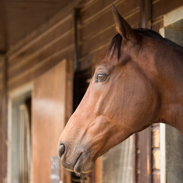
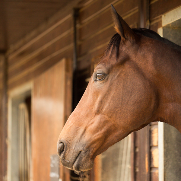
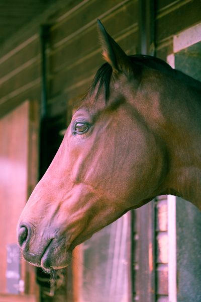
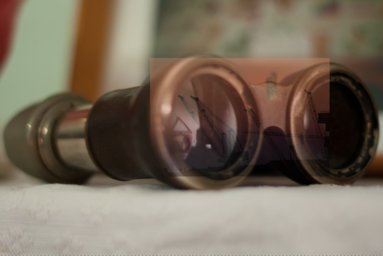
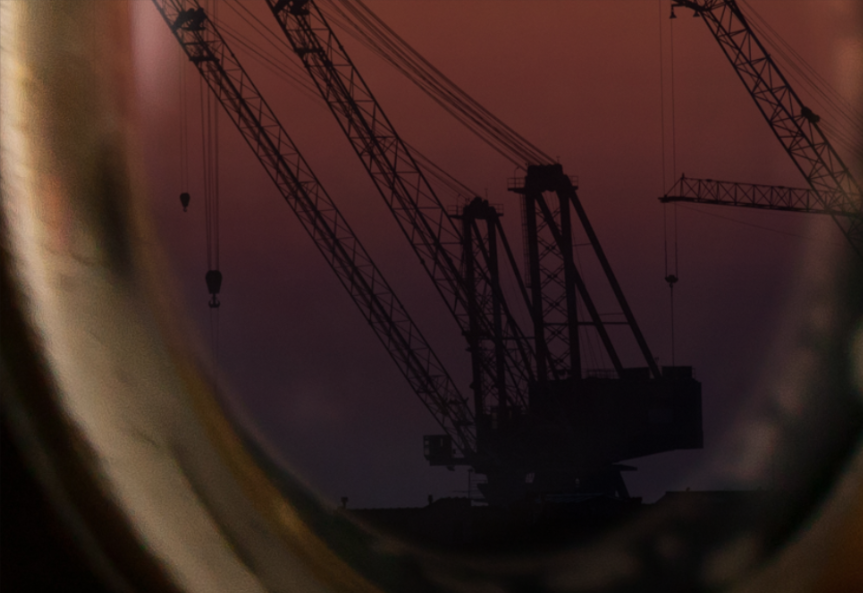
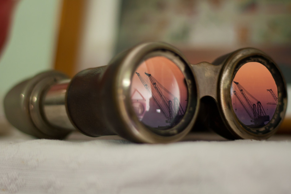
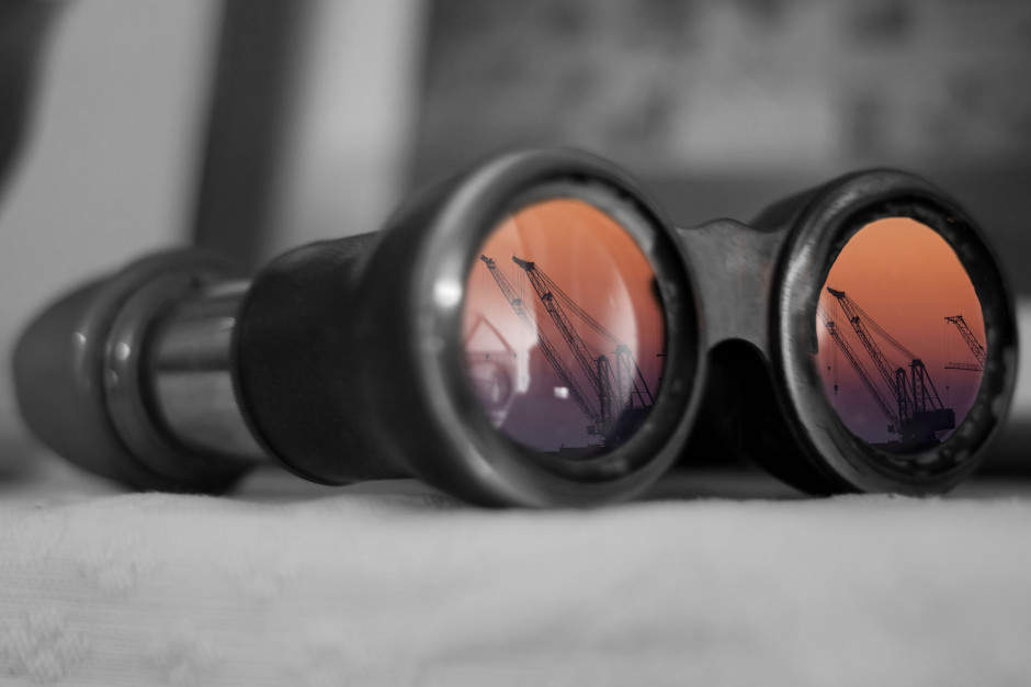
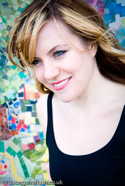
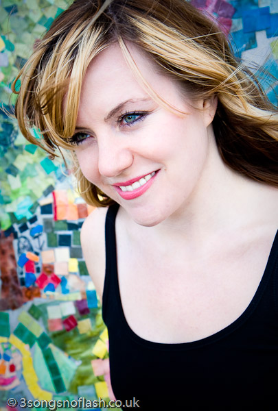
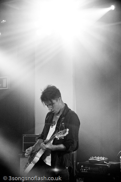
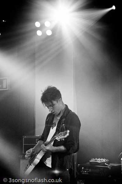
Not convinced how much of a difference USM makes? Check out these before and after images…

39-1.jpg

39-2.jpg

Digital cameras and USM

If you feel that you are photo-savvy enough to use the USM tool on a regular basis, you should have a close look at your digital camera. Usually, there will be a setting in a menu somewhere that says “sharpness” or “sharpen”. You’ll want to turn this down as much as it’ll go. Why? All consumer / prosumer digital cameras sharpen the images in-camera. Why? Because the average consumer only sees the pictures that come out of their camera, and if those images are soft, they will run to the manufacturer and complain, out of ignorance. Sad, but true.

Professional cameras (Canon EOS D30, D60, Nikon D100 and the higher-end models) don’t compensate as much, and also offer the option to turn the sharpening off altogether. This is A Good Thing, because it leaves the photographer with full control. And photographers are control freaks (especially anally-retentive perfectionist photographers), so that’s sweet.

When to use USM

When working on an image, you probably have a long series of steps that you go through. Myself, I always do all basic editing (image corrections, manipulation etc) first, then I apply USM, and then I handle the colour corrections. Most design professionals will tell you to do the USM last, while most photographers will make up their own rules (being photographers and all…). The order DOES matter, as the USM filter is destructive (kinda like JPEG compression algorithms), and you will notice a difference in behaviour of the other filters and corrections you do. Give it a try, and see what you prefer yourself.

How to apply the USM filter.

Open a file in photoshop – the larger the file, the better (the more data the USM filter has to work with, the better.) When I am working on seriously high-precision project, I will first take the 6-megapixel image from my camera, interpolate it up to about 18 megapixels, then do the editing and unsharp mask, before scaling it back down. It might be superstition, but the results do seem to look a lot more refined.

Right – after opening the file, crop it. Then, go to Filter -> Sharpen -> Unsharp mask. You should now see a relatively innocent-looking window with three little sliders, marked A, R and T. Amount; Radius, and Threshold.

Let’s start with the last one first. Threshold. I usually leave this on 0, and so can you, most of the time. However, if you have an image with large amounts of noise (esp. if you are working with digital files that have been made a lot brighter, or taken on a high digital ISO value), you might want to set this to somewhere between 1-5. This also prevents small details from being accentuated. On a portrait, for example, using a high threshold might make skin look smoother (than if you didn’t set the threshold), but the hair of the model will not come out as sharp as if you didn’t set a threshold. As I said; I usually leave this on 0, but if you ever need it; Now you know what it does.

The radius is a sneaky thing. In general, the more pixels the picture has, the larger the radius. You’ll want to get sharp images, but not overly so. On a 6 megapixel image, I usually set the radius between 3 and 6 – but it all depends on what you want and need. Experiment. Also, if the image is more blurry than normal, you’ll want a higher radius. If your image is sharper than normal (i.e has already been sharpened in your camera), you might want to use less. To find how to set the radius, set the amount to 100 %, the Threshold to 0, and experiment. Then, set the threshold, and see if you are still happy with the image. Then tweak the amount:

The amount of USM applied is a function of the threshold and the radius (see below). This is usually the last slider you set. In general, the amount should be between 50 – 150 per cent.

When you are happy with the way the image looks, press ‘OK’, and the whole image is processed. Never – EVER – run USM on an image twice. Wanna know why? Try, and you’ll see. It just looks horrible.

For starting values of the USM filter for different uses, try the ones suggested by PhotographyJam:

Subject Amount Radius Threshold
Soft subjects 150 1 10
Portraits 75 2 3
Moderate sharpening 225 0.5 0
Maximum sharpening 65 4 3
All-purpose sharpening 85 1 4
preparing for Web 400 0.3 0

Advanced use of USM

Right, now you know how to use the basics of USM, but what else can you do with this tool? Lots. For one thing, you can make a ‘fake’ idea of depth of field: Make a loose selection around the items you want to be in your virtual DOF. Then, ‘feather’ the selection a great deal (selection -> feather). If you are working on full-size files, somewhere between 20 and 60 px feather should do it. Then, apply an USM mask. This sharpens the parts of the image you selected, while leaving the non-selected portions intact. This looks a lot more natural than blurring everything else in the image.

Variable USM: every now and then, you’ll find that an image that has USM applied looks good on one side, but not on another. Hit undo (undo the USM), and duplicate the layer you are trying to USM. Then apply the USM to your new layer. Make a layer mask, and put a gradient fill in this layer mask (or use the same feather technique as above). This way, a portion of your layer will become translucent, but your original layer will still show through. This offers the illusion of a partially implemented USM, which looks pretty damn funky.

Manual USM

Remember what we said about photographers being control freaks? Well, here goes nothing: If you want to manually do an USM filter on your images (either to learn and understand how it works, or for full control), here is a quick and dirty way on how to do it. I am not going into details here – if you are pedantic enough to want to try this, you are probably able to work out how to implement every step, too!

  • Make sure your image has a contrast you like. Adjust levels and colours.
  • Duplicate your image into a new layer, two times (the ‘background’ layer will be your backup and reference, so you can see the changes by hiding the top layers)
  • Blur the top layer a bit (1.5 – 10 px, depending on resolution. 3 is usually a good start)
  • Lower the brightness and contrast (approx 25 should do it).
  • Subtract this image from your original (Image – Apply image – set source to original, and mode to subtract). This should leave uou with just the unsharp mask.
  • Move the unsharp mask layer to the top.
  • Invert the unsharp mask layer.
  • Set the channel mode of the unsharp mask layer to multiply.
  • Merge layers.
  • Fix levels / brightness.
  • Congratulations.

The strength of the manual mask can be controlled through the amount of blur, the contrast of the layer, and the opacity of the layer. You get an infinite number of toys to play with here – enjoy!

If anything still is unclear (pun intended), feel free to email me!


Do you enjoy a smattering of random photography links? Well, squire, I welcome thee to join me on Twitter -

© Kamps Consulting Ltd. This article is licenced for use on Pixiq only. Please do not reproduce wholly or in part without a license. More info.