Photoshop

Sizing up split toning

Historically, split toning was used when developing photos from negatives. Two different toners would be used one after the other in order to produce different colours in the highlights and shadows of an image. For example, follow selenium with gold and you'll produce purple-blue mid-tones; or use sepia and then blue for sepia highlights, blue shadows, and green mid-tones. The effect could be altered by using different papers, too. While chemical split toning isn't an exact science, it does offer some compelling effects for your photos and can give them an entirely different feel. You can use it to add warmth or to cool down an image; you might want to introduce a blue tint, or an orange cast.

Now, split toning is more likely to be achieved using the dedicated split toning panel in Lightroom, or with a colour balance adjustment layer in Photoshop, and it is far more controllable. If you've not ventured into the split toning panel, the degree of variation that it offers you might be a little overwhelming; it can radically alter your photo in a ways that you might not anticipate. That shouldn't stop you from experimenting, and to get you started, here are some suggestions. And don't forget that if you're working in Lightroom, nothing can't be undone.

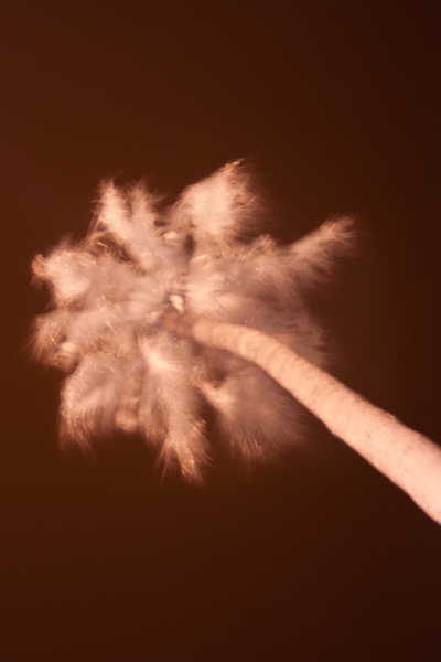
A quick introduction

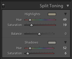
If you're using Lightroom, the split toning panel allows you to select the colours that you would like to emphasise in both the highlights and the shadows, the saturation for each of these tones, and then the balance between them.

The eyedropper is likely easier to use than the sliders

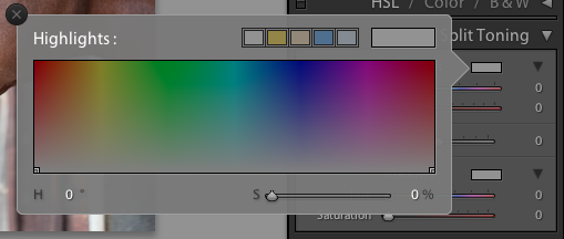
If you find using the sliders to control these adjustments a little too abstract, click on the colour swatches beside 'Highlight' and 'Shadow' and use the eyedropper to select the precise colour you'd like for each.

The balance slider places more emphasis on either the highlights or shadows. Once you've selected your highlight and shadow tones, move it about a bit to see which direction, if any, you prefer.

Black and white

The straight black and white conversion is fine. But could it be warmer and have more depth?

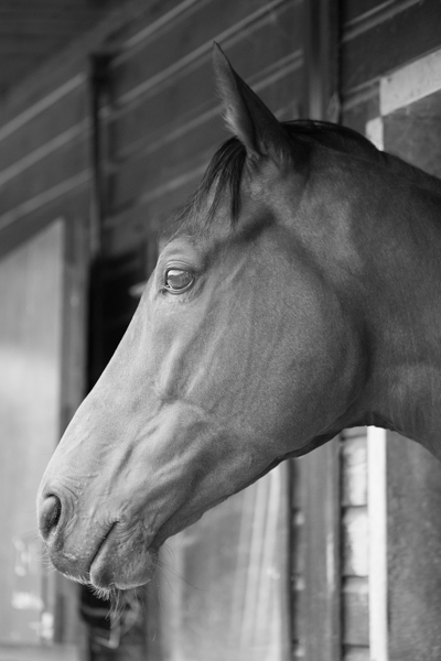
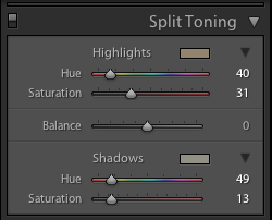
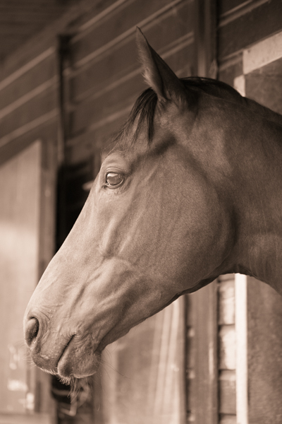
The original black and white conversion of Willie's portrait is coming up quite grey-green in tone. By adding some muted browns—that in the shadow very pale—you can introduce a great deal more warmth to the image and bring about an almost-sepia tone.

You don't need to push the saturation or the tones too far

Willie with a sepia feel is less harsh.

Adding warmth

Would bringing some warmth produce a more golden-hour feel to the photo?

This photo was taken fairly early in the morning, on a day when the cloud didn't lift. While the light was wonderfully diffuse, it wasn't especially warm. Even after correcting the white balance, it still felt as if it needed to be brought to life. By adjusting the highlights and shadow tones, it meant I could introduce a more golden-hour feel to the photo.

The adjustments don't need to go too far

You don't need to push too far into the oranges or yellows to intensify the warmth in a photo: sticking to browns and beiges might be enough.

A warmer and more golden Willie

Of course, if you wanted to do the opposite and bring about a colder feel to a photo, you would do that by applying more silvery-blue tones, greys, greens, and even some yellows, to the shadows and highlights.

Cross-processed look

Greens in the highlights and magentas in the shadows

Until now, I've used fairly similar highlight and shadow tones in my split toning adjustments. But for a cross-processed effect, you need to select contrasting colours for your highlight and shadow tones: green and magenta, or cyan and yellow, for example. Which you apply will depend on whether you're looking for a warmer or cooler over all effect.

[gallery columns="2" ids="7128,7127"]

By reversing the shadow and highlight tones (now magenta highlights and green shadows) you can see the imapct it has

By adding a graduated filter, upping the contrast and saturation, and reducing the clarity, you can create a fake toy camera look. We've a tutorial for that, in case you'd like to give it a go.

Split tone away!

The best way to get a feel for split toning is to try it for yourself and see what you can achieve using it. Remember: if you don't like it, you can undo it.

You shall go to the ball: a little fun with layer masks

The sheer scope of Photoshop means that when you first open it up, and indeed for a good long while thereafter, it can be a little—or even a lot—overwhelming. It offers you so many possibilities that deciding where to start can be an agony of choice. Whatever bells and whistles Photoshop might offer you, one of its biggest boons is most certainly layers, making them one of the first things with which you should experiment.

A brief explanation

Layers are what allow you to edit non-destructively, so that any adjustment that you make can be easily amended or even removed altogether without having an impact on your other edits, or your original files. The most common description that you will hear about the layers function is that it resembles a pile of transparencies, each of which contains information comprising the final image and can be altered individually. How many layers can each image have? As many as your operating system can support.

So many options!

Some layers might contain images, effects—for example shadowing—or text. Other layers, however, could appear devoid of content. These are adjustment layers, and they hold the information that governs the edits made to the image as a whole, or to given areas of it. This way, you can alter how something looks without destroying the original image.

You can name layers individually, so rather than trying to remember that Layer 23 adjusts the luminosity of the unicorn’s coat, you can call it ‘Unicorn coat luminosity.’

Layer masks

If you want to create composite images, layer masks will be essential to your work. A layer mask will allow you to place one image over another and mask selected areas of the upper layer from view. Effectively, this allows you to see through it to the image below, thereby creating a montage. Of course, you’re not restricted to just two layers when it comes to compositing; you can include as many as you need.

Going to the Industrial Opera

To give you some idea of what layer masks can achieve and how you can use them, I created an incongruous scene of an industrial sunset reflected in the lenses of a genteel pair of antique opera glasses.

[gallery columns="2" ids="7012,7013"]

Choosing your story

Having a clear idea of the story that I wanted to tell with the image was the first step. It meant that I didn't have to engage in too many changes and I was able to line up the images and accoutrements I needed. Of course things will evolve as you create them, but I would advise starting out with at least a basic 'recipe'.

Deciding on the light

As contradictory as it might sound, surreal images need to be grounded in reality to ensure that they're believable. Unless you're creating a Peter Pan-type figure, objects need shadows, for example. In this case, I needed to check that how my image reflected in the glasses was accurate, even if it were several degrees from reality. I did this using a pair of sunglasses and a torch to look for reflections.

How many layers?

My torch experimentations determined that I couldn't use one copy of the sunset scene to cover both lenses; the angles were wrong. It needed to be positioned separately over each lens of the opera glass. That meant importing the sunset image twice, onto two different layers.

Background and Layer 1

I started by making the opera glasses my background layer and then imported the first sunset layer and then added a layer mask by clicking on the Create new layer mask button at the bottom of the Layers panel.

I decreased the sunset layer’s opacity to about 40% to help me to scale it down to the size that I wanted and shift it into place over the opera glasses' lens.

Sunset over the lenses

Scale images at Edit>Transform>Scale; hold down the shift key to maintain proportions when adjusting the size.

Brushing away the excess

Happy that my sunset layer was in the right place, it was time to mask the parts of it that interfered with the image of the opera glasses. I did this by using the brush tool and the layer mask to 'paint away' the areas of the sunset scene that I didn't want visible.

Brushing away the extraneous data

When you're choosing what to show and what to hide in a layer mask, you paint with black to hide anything extraneous. If you paint away something and change your mind, switch the brush colour to white and it will reveal it.

[gallery columns="2" ids="7021,7022"]

I zoomed in close and used a relatively small brush with a mid-size feather to get the edge that I wanted.

Blending layers

When I was satisfied with my handiwork, I played around with the opacity and blending mode options to determine how the layers meshed together over each other to finalise the effect I wanted. Opacity and blending modes are the subject of a whole other article, but in this instance I set the opacity to 100% and opted for a screen blend.

Sunset over the second lens

With the second lens, it was a very similar process, except that I positioned the image of the sunset differently across the lens.

[gallery columns="2" ids="7018,7019"]

I selected the screen blend again, and adjusted the opacity until I was happy with the result.

Flattening and saving

Happy with my handiwork, I saved the image as a PSD file before flattening the layers and saving it as a JPEG file.

Binoculars final

Alternative views

Having saved my 'finished' version as a PSD file meant that I was able to return to it for adjustments, or to try other looks having laid the ground work. One of the alternative views I created of it was to insert a black & white adjustment layer above the background layer to create black-and-white opera glasses with coloured lenses.

An alternative view

More where this came from!

Surreal Screen Shot This image, together with lots of advice on creating surreal images through in-camera and compositing techniques as well as examples from surreal masters such as Miss Aniela, can be found in my book Surreal Photography: Creating the Impossible. Right now it has been selected by the fickle finger of Amazon super-deals and is available for the bargain price of 1 penny or 2 cents; there's no telling how long it might last, so why not give it a try? Even if you don't own a Kindle, you can download a Kindle reading app for free to use on your smartphone or tablet.

Shooting star trails

Star trail photos can be incredibly compelling and while they take time to produce, they're probably not as difficult as you might think they are. In fact, there are two methods that you can use to capture the night sky with the stars streaking across it: a single long exposure or what effectively amounts to a time-lapse composited into a single image. This is our guide to shooting star trails. Star trails by Thomas Langley (thanks to Triggertrap)

Location

Light pollution can be a pain when you're attempting to shoot a star trail photo. If you're not able to see the stars, your camera won't be able to, either. Should you live in a city, this means looking for a location that's suitably isolated to give you a view of the sky, but isn't so isolated that you make yourself vulnerable. And if you don't live in a city, you still need to be somewhere accessible.

You also want to think about your scene. You might find that having something of interest in the foreground of your shot will improve it. Barns, dilapidated or otherwise, obelisks, and rock formations are all good starting points.

By finding Polaris and focusing on that, you'll produce a circular star trail; point your camera somewhere else in the sky and your trails will be more linear.

Timing

The best time of year for shooting star trails is definitely dependent on personal preference. How long you can manage safely in the cold is probably your primary concern. But you do need to be shooting on a cloudless night with no or little moon.

Setting up

Once you've decided on your location and set up camp with warm clothes, thick boots, and a thermos flask, it's time to set up your camera.

Camera

Set your camera on its tripod; place it in manual mode and switch the lens, preferably a wide-angle one to get as much sky in the shot as possible, to manual focus, too. Frame your shot—ideally with something of interest in the foreground—with the lens focused to infinity.

When it comes to exposure, you need to be in bulb mode, the aperture should be as wide as possible, and try ISO 1,600.

Take a test shot with a exposure time of 30 seconds; if the stars are bright and clear, you're ready to go. If it looks a little dark, adjust the exposure time until you're happy.

Camera trigger

If you're using an intervalometer, you need to set it to record as you would for a time-lapse video, using the exposure time you tested for.

Choose your exposure time, number of exposures, and the intrval between them

If you're using Triggertrap Mobile with its star trail mode, set the exposure time that you established in testing with a two second interval between frames, and select the number of frames you want to take. You can choose a huge number of frames and stop after half an hour or 45 minutes of shooting if you're not certain how long you need to be out there for.

Hit go!

That should be about it. Hit go and wait for your camera and the universe to work its magic. Do remember to keep warm and safe!

Compilation

When you've accumulated all the images that you need, it's time to compile them into a single image with the help of some software. If you have Photoshop, that's perfect. If you don't, there are other options including the star-trail-specific StarStax.

A stack of images

Transfer your images from the memory card to your harddrive, keeping them in a single folder with their original file numbers. Whichever programme you use, this is important to ensure that the images don't get out-of-synch. The rest of this tutorial uses Photoshop to assemble your star trail shot, but you should be able to extrapolate the process to any other programme.

Import your images

Open Photoshop and import your star trail images using File –> Scripts –> Load Files into Stack. Select your folder of star trails photos, highlight all of the photos, and then select Open followed by OK.

Stack importation makes life easy (Image thanks to Triggertrap)

Blending

When all of your photos have made their way into Photoshop, select all of them in the Layers panel, and then in Blending Mode select Lighten. Tah-da! You should have a star trail composite.

Blend them together for your final image (Image thanks to Triggertrap)

You can make adjustments to individual layers if you want, but otherwise, you're done and it's a case of saving. (You might want to save an unflattened PSD file and a flattened JPEG version.)


Much of this, including all the images, is based on the fantastic How to capture a star trail tutorial found on Triggertrap's How-To microsite, and it's reproduced with permission. Triggertrap How-To is full of great content for making the most of your camera. You should take a look.

Nothing new under the sun? The darkroom techniques we apply digitally

When you tell people that image processing and manipulation isn't anything new, but is just about as old as the art of photography itself, you can get some funny looks. Many of the processes that we carry out without a second thought were equally normal for analogue developers. Depending on how proficient you are with Photoshop, compositing might be faster today, but it's not new. Think of Man Ray and his image Le Violon d'Ingres. And beautifying subjects with the help of a brush was a far from alien practice for Cecil Beaton. Yes, really.

The difference is that now the ubiquity of editing suites means that techniques that were once the preserve of skilled darkroom practitioners are accessible to anyone with a computer. The degree of skill required to complete subtle, effective, and credible edits is still high, but the mystery has gone. Or rather, the mystery has assumed a new narrative as the dark arts of the darkroom remain under wraps.

To try to set some of that record straight, here's an extensive, but not necessarily exhaustive, list of the techniques that bridge the analogue and digital divide.

Crop

Have you noticed how the crop icon is a variation on a theme, in almost every editing package you encounter? That's because it's based on the tool that would be used to crop and resize images in the darkroom.

[gallery ids="6782,6783,6784"]

Brushes

The brush icon is another familiar one, whether you're in Photoshop or Pixelmator or Aperture or GIMP. Brushes were used extensively in the darkroom, to define edges or enhance details, to hand colour, to spot correct, to complete just about any task for which you might now use a digital brush.

dodge.jpg

Dodging and burning

Haje has already written an article that explains why the dodge icon resembles a lollipop and the burn one a fist. Of course, they're techniques that were used in the darkroom to lighten or darken specific areas of an image as required. The dodging 'lollipop'—or piece of black paper on a stick—could protect the photographic paper from too much light during the development process, thereby keeping the areas in question lighter in the final image. The fist would be your hand, controlling how much light got through to darken areas of your photos.

Masking

Using red to distinguish masked from unmasked elements in an image wasn't an arbitrary choice by software engineers. That too is a hangover from darkroom days. Mask an area that you don't want developed with red, gel-like rubylith and the light won't be able to penetrate it in the darkroom, so it won't be exposed. If you've ever found yourself irritated when masking a complicated outline in Photoshop, imagine what it would be like doing it with a scalpel!

Photoshop's Quick Mask overlay isn't red arbitrarily

Sharpening

Yes, there's a reason why the sharpening tool in Photoshop is called the Unsharp Mask. Again, Haje has a comprehensive explanation here, but the short answer is that images were sharpened using a not-quite-sharp positive of the image to make a mask (an unsharp mask) combined with the negative. The blurriness of the positive image should work with the negative to create a sharper final image.

Split-toning

Maybe you use the split-toning feature in Lightroom to create cross-processed effects, or to give a golden-hour glow to your photos, or perhaps to correct the white balance in your images. But it was originally a darkroom technique that allowed different tones to be present in the highlights and shadows of an image. Split-toning was something of a dark art, relying on the interplay of different papers and different chemical toners deployed after the standard developing and fixing process to produce different colours in the final image. Getting the balance right with your sliders might be a frustrasting experience now, but I'm sure it beats fiddling with gold-, selenium-, and sodium-based chemicals!

Split-toning isn't a new-fangled Lightroom thing

Contrast

It might be simple to adjust the contrast in your photos on a slider in a digital darkroom, but you had at least three ways of doing so in an analogue darkroom: with graded papers, with variable contrast paper, or with filters.

Colour

Unless you're shooting with a Leica Monochrom, you can choose between colour or black and white for any given photo now, switching back and forth between them as many times as you like in a non-destructive editing package. But in the early days of film it was black and white, maybe sepia, or perhaps the vagueries of split-toning, unless you opted to hand-colour your images. Love or hate selective colouring, for some people that was all that they could afford when hand colouring was a time-consuming art form. It isn't just a Photoshop abomination.

Airbrush

Finally, the much-maligned airbrush. It's not just a new-fangled phenomenon that magically reduces the size of an already-stick-thin model's thighs. The airbrush has been removing undesirables from images since at least Stalin's time and Cecil Beaton was famous for slimming his subjects.

I think you'll find, then, that there is very little that's new between the red light of the darkroom and the digital glow of Photoshop.

For those days when you need to be in several places at once: multiplicitous images

Multiplicity, or the art of creating images containing several yous, or anyone elses for that matter, isn’t a digital discovery. It’s something that people have been doing for decades: it's remarkably easy to achieve with film. You set up your shot and either you don’t wind on your film before re-exposing the frame with your subject positioned anew in the scene; or you wind on your film and then wind it back again in between shots. The important thing here is to slightly under-expose all of your shots in the sequence to ensure that your final image isn’t an over-exposed white mass. That might look like me, but actually it's my Ma

If you don't happen to have a Holga lying about (they're great for creating multiple exposures), you can do it with a digital camera, too. Depending on the camera you have, you've a few options for creating a multiplicitous image. Quite a few come with a multiple exposure setting now: you determine how many exposures you want to make and the camera will re-expose the same 'frame' in-camera and adjust your expose settings accordingly to ensure that you don't end up with a too-dark or too-light image. Marvellous... if you have a camera that can do that. If not, you'll need to make friends with Photoshop, or a Photoshop-esque editing package.

Before we go any further, it’s important to remind you that achieving a great final image relies on producing a good image in-camera first. It doesn’t matter how ginormous the barrage of editing you’re going to subject your photo to, it’s got to be good from the get-go. This is just the same for a multiplicity image as any other.

When you set out to create a multiplicitous image, your starting point is your concept. Think of the story that you're trying to tell and what you need to tell it. Having a clear plan makes it so much easier when you're shooting the images because—unless it's a distinct element of the story—you need consistency in your images: furniture can't move between shots, the light needs to be coming from the same direction, and you don't want to be flapping around.

When the scene's arranged, set your camera on a tripod, adjust it's exposure settings and focal point, and shoot a 'plate' image. This is a base photo, devoid of the story's characters, onto which you'll build your final creation.

Now you can shoot your series of images containing your subject in as many different positions as your composition merits. I've found it useful to go for more rather than fewer photos; it gives you more flexibility when you compile your final image.

[gallery ids="6703,6704,6705"]

When you've shot your images, import those you think you might want to use into Photoshop using the Load Files in Stacks option (File>Scripts>Load Files in Stack), which should import your images so that they are perfectly layered one on top of the other.

Importing made easy

Next apply a layer mask to each of the layers, barring the background image, which should be the ‘empty’ plate.

Using the eye icon on the Layers Palette, toggle off all of the layers from view except Layer 1. Now brush your subject, along with anything like indentations in the chair where she or he is sitting or shadows, out of the image. It's those small details which add credibility to the unbelievable, which is what makes them important to the final composition. And while it might seem counter-intuitive to brush your subject out of the image, it isn't really.

Brush out your subject - it makes sense, really

When you’ve disappeared your subject from the scene and you’re happy with the refinement of the edges, invert your selection by pressing Cmd+I on a Mac or Ctrl+I on a Windows machine. The subject will miraculously reappear and the superfluous background will disappear.

Do take care when you're areas where overlapping occurs, because it's here where your image will succeed or fail in its realism.

Repeat this process for each of the layers, toggling them on and off as necessary to decide on which placements you want to keep, and which you wish to discard. I’d recommend saving the image as a PSD file with all the layers intact, which will allow you to revisit it and re-edit as often as your Dr Jeckyll needs to meddle with your Mr Hyde.

Three wise monkeys? Or something like that

When you've settled on a final version, delete the layers that you don't want, save it as a PSD file, and then flatten it and export it as a JPEG image. Ta-dah!

Quick and dirty infrared photography

We're accustomed to taking photos with what is somewhat uninspiringly referred to as 'visible light', or the part of the spectrum whose wavelengths measure roughly 400 nanometres (violet) to 750 nanometres (deep red). However, there's an awful lot more to light than just the wavelengths we're able to discern with the naked eye, and it's possible to take photos using that 'invisible light'. In particular we can make use of infrared light (IR), which picks up at 750 nanometres, where visible light drops off, and stretching to approximately 20,0000 nanometres. Lots of people think that IR photography is the preserve of specialist infrared adapted cameras, with 'normal' cameras being insensitive to IR light owing to the 'hot mirror' that sits just before the sensor. However, these hot mirrors aren't 100% effective, and with the help of an IR pass filter, you can capture images made with infrared light.

The most common filter is probably the Hoya R72, which is easy to pick up in a camera shop or over the Intergoogles. It won't allow you to capture IR waves at more than 1,300 nanometres, but that should be enough to start. You can always invest in an IR-adapted camera if you find that it really floats your boat.

R72 filter

Got your IR pass filter? Want to give it a shot? Off we go!

IR photography will present you with several hurdles: focusing, exposure, and post-processing. Overcoming all of them is more a case of trial-and-error than hard-and-fast rules and to be fair, that's half of the fun!

1. Choosing a scene

Okay, so you can pretty much photograph anything in IR, provided that there's some light around. However, the most stunning IR images tend to involve foliage, which comes out as bright white, and blue skies or water, which look deeply intense. But that's all after a bit of fiddling. More on that in a moment.

Achieved by adjusting the red hue and orange luminance sliders

Whatever you choose to photograph, it's not going to be a quick process, so you need to be somewhere that won't put you in people's way or get you into mischief. And it needs to be suitable for a tripod, too.

2. Focusing

The difficulty that you’ll encounter with focusing comes as a result of the IR filter; it blocks out the majority of visible light passing through the lens, leaving you with a dark viewfinder. You don’t have anything to work with when you’re focusing your lens. This means that you have to put your camera into manual focus and set up your shot before placing the IR filter over your lens.

Setting up your shot and then placing the filter over your lens is a bit of a faff, but seeing as you’ll be using a tripod anyway (more on that in a moment), it shouldn’t be too infuriating.

3. Exposure

As for exposure, you’re going to need to use a slow shutter speed, probably between ten and 30 seconds, to allow enough IR light to reach the sensor to expose it sufficiently. This is where your tripod comes in, obviously, as you’ll never manage to hold your camera steady for that length of time. Long exposures also have a tendency to noisiness, so use as low an ISO as you can manage, too.

4. False colour

Don’t be surprised if your infrared photos emerge from your camera with strong red or magenta casts; this is known as false colour. It’s normal and it’s a simple fix in Photoshop to produce a 'traditional' looking infrared photo. If there is such a thing. It involves shifting the white balance to 2000 Kelvin and then flipping the levels in the blue and red channels. In short: open the blue channel and slide 'Red' to 100% and 'Blue' to 0%; in the red channel, 'Blue' needs to be at 100% and 'Red' at 0%. You might want to adjust the contrast and brightness, but that's the basics.

IR images come out with strong 'false colour' casts

5. You don't have to use Photoshop

After playing with the white balance However, there's a lot of fun to be had by simply playing around with other editing packages to produce ethereal-looking images. With something like Lightroom you might want to try:

  • Fiddling with the white balance and tint sliders to produce subtle pink or flaming orange images, and everything in between
  • Playing with the hue and luminance sliders to alter the colour mix of the photo
  • Converting to black and white and using the black and white mix sliders to adjust the look of the image

Really, there's no right or wrong and the range of impact that you can have with an infrared image is enormous. It's a lot of fun.

6. Hotspots

Some lenses are prone to producing ‘hot spots’, or patches of much brighter exposure that are usually, and most inconveniently, in the centre of the image. There’s very little that you can do about this in camera except to try a different lens. Prime lenses seem to be less prone to hot spots, but there are no guarantees, and using a smaller aperture will reduce its size. It's possible to try to correct it in post-processing, too.

What are you waiting for?

Orange and red saturation adjustments

Just a fantasy or an unrealistic depiction of perfection? Dunham, Vogue, Jezebel, and now Leibovitz

I don't watch Girls and I don't read Vogue, so the recent controversy involving Girls' Lena Dunham and her appearance in the glossy magazine failed to catch my eye. However, when Amateur Photographer reported that Annie Leibovitz is threatening legal action over the unsanctioned publication of the shoot's original image files, my interest was piqued. Dunham appeared on the cover of, and inside, American Vogue's February edition (we weren't treated to her here in the UK) in a shoot by Annie Leibovitz that raised plenty of eyebrows and plenty of questions. Some people were perplexed by the apparent clash of principles when a feminist role-model could appear in and on the cover of a magazine that is famed for its stylised and heavily post-produced shoots. Other people wondered why Vogue had opted for a head-and-shoulders shot of a woman known for not being the archetypal Hollywood stick-instect, rather than the usual full-body shot for its cover. And some people just worried about the Photoshop job.

One of the publications most vocal about Dunham's dalliance with Vogue was Jezebel, the feminist blog. Jezebel is highly critical of Vogue's use of idealised, unrealistic images of women that are presented as objections of perfection. While it supported the notion that Vogue could feature a woman who was not its usual front page fodder, it was critical of Dunham being tweaked to make her acceptable for that role: 'Dunham embraces her appearance as that of a real woman; she's as body positive as they come. But that's not really Vogue's thing, is it? Vogue is about perfection as defined by Vogue, and rest assured that they don't hesitate to alter images to meet those standards.'

Jezebel then offered a bounty of $10,000 for Leibovitz's original, unedited image files of Dunham so that it could do a compare-and-contrast. From Jezebel's perspective, this wasn't intended to shame Dunham or criticise her for working with Vogue, although even if it wasn't intentional it's still easy to construe it that way. It's a topsy-turvy version of damning with faint praise. When Vogue is renowned for its fantastical presentation of women, why pick on Dunham's shoot to explore how far it will go if it isn't intended as a criticism of her actions?

Nevertheless, Jezebel got what it asked for.

Compare and contrast

Someone, somewhere, produced the original images and Jezebel was able to lay them side-by-side with the edited versions. Were they extensively retouched? Retouched, definitely. Extensively? That depends on your definition of the word. There's a whole lot more adjustment going on there than I'd make to one of my photos, but I don't shoot for the cover of Vogue and I'm not in the habit of photographing TV stars with pigeons on their heads or posing on the sides of baths wearing evening gowns. As Dunham said to Slate: 'A fashion magazine is like a beautiful fantasy. Vogue isn't the place that we go to look at realistic women, Vogue is the place we go to look at beautiful clothes and fancy places and escapism... '

The furore of whether Dunham should or shouldn't have posed for Vogue, whether or not she's betrayed the feminist ideals that so many seem to have ascribed to her, and just how much alteration the images have undergone has now taken a new twist. For Annie Leibovitz is reportedly extremely unhappy that the unretouched images have made their way to publication and is considering legal action. Precisely what legal action she intends to make, against whom, is unclear. But sources close to Leibovitz claim that she would never have sanctioned the publication of the original images. Vogue has declined to comment and Jezebel has stated that it obtained the images via an anonymous source.

What do I think? I studied history at university. Then I trained to teach it. And I taught it for a bit, too. I'm often asked how I can bear to watch historical dramas without picking holes in their accuracy. My answer is always the same: 'It's a story, not reality.' I don't advise that anyone should take medical advice from a BBC hospital drama, either. When I glance at Vogue, or any other glossy magazine, I treat it in much the same manner. It's a fantasy that deserves the same suspension of disbelief as a film or TV show. It doesn't matter if it's Vogue or Homes and Gardens, it's not reality. When you've resurfaced from your dive into stylised perfection, that's what you need to remember.

(Headsup to Amateur Photographer)

Adobe unleashes some new Photoshop tools

Adobe has announced an update to its Creative Cloud suite of applications, and with it some new tools for Photoshop. Headlining the update is the integration of 3D printing capability into Photoshop. It should now be possible to design print-ready 3D models from scratch or to refine existing models and then send them to a locally connected 3D printer or make use of new partnerships with MakerBot and Shapeways to have them print 3D creations. If you're not so exciting by 3D printing as Adobe is (or perhaps wondering why 3D modelling is included in an image manipulation package), Adobe has also brough Perspective Warp and linked Smart Objects to Photoshop.

Print to your own 3D printer, or connect to a commercial one!

Perspective Warp is able to manipulate an image to alter the standpoint from which a subject is viewed. That could have particular creative uses when playing around with composites, but more general practical advantages to correct distortion in lenses.

Perspective warp: great for surreal creations, or just correcting lens distortions

Linked smart objects should improve collaborative processes by automatically updating a final design (for example a poster) if a file contained in it (a photograph, for instance) is amended or updated. No longer will the old version of the photo need to be removed and replaced with the new edit.

Re-edit a linked smart object and it'll autimatically update in a final design

In line with the subscription model, these applications, together with those made to InDesign and Illustrator, will not have to be paid for and should be available for use as soon as Creative Cloud updates.

Adobe extends its Photoshop + Lightroom subscription offer to everyone

In September, Adobe announced that, for a limited time, owners of Photoshop CS3 would be eligible to sign up to a special Photoshop + Lightroom subscription that would cost them only £8.78 ($9.99) a month. I thought it read like a sweetner for the huge numbers of loyal Photoshop users who felt snubbed by the switch to Adobe's subscription-only model. However, it wasn't of any use to anyone who owned Lightroom and felt like trying Photoshop, or was just getting started with Creative Cloud. Now, if you're not too disgusted with Adobe's handling of its hacking fiasco and prepared to trust it with your credit card details, anyone can sign up for this not-bad-value offer, regardless of whether you own CS3 or later.

Photoshop + Lightroom for $9.99 a month for everyone (but sign up soon)

For £8.78 ($9.99) a month, you will have access to Photoshop, Lightroom, 20GB of cloud storage, and Behance ProSite. However, you must commit to an annual subscription and you must sign up between now and 19:59 GMT on 2 December 2013. (For CS3 owners, you still have until 31 December 2013 to sign up.)

All the details are waiting for you on Adobe's website.

Adobe's security breach in October was far more serious than believed

Adobe announced that it had suffered a security breach in early October that had resulted in the compromise of approximately 3 million customers' data as well as the loss of some proprietary source code. Attackers made away with customers' names, encrypted payment card numbers, and card expiration dates as well as the code for the ColdFusion web application and its Acrobat programmes. KrebsOnSecurity, the firm that spotted the initial attack has now placed the figure of customers affected by the breach at some 38 million, and the source code that was lifted is also said to include Photoshop. According to the KrebsOnSecurity blog, it has taken some time to uncover the extent of the violation because:

At the time, a massive trove of stolen Adobe account data viewed by KrebsOnSecurity indicated that — in addition to the credit card records – tens of millions of user accounts across various Adobe online properties may have been compromised in the break-in. It was difficult to fully examine many of the files on the hackers’ server that housed the stolen source because many of the directories were password protected, and Adobe was reluctant to speculate on the number of users potentially impacted.

Over the weekend, a large file of username and hashed password pairs was posted by AnonNews.org, which appear to be Adobe account details.

Adobe has contacted all of the active customers whom it believes to have been affected and claims that there has been no 'unauthorised activity' on any of the compromised accounts since the attack. It now remains for the inactive customers to be contacted. And regardless of whether users were active or inactive, their passwords were reset if Adobe believed that they were affected by the attack.

Whether Adobe chose to downplay the extent of the attack earlier in the month because it couldn't be certain of the number of affected customers or because it prefered to minimise the damage does not present it in the best light. One scenario makes it look careless, the other deceptive. I wonder how many customers are now looking for alternative products and providers... or waiting for a replicant based on the stolen code?

(Headsup to Engadget)

Update! Heather Edell, Adobe's Senior Manager of Corporate Communications emailed me in the early hours of 30 October. She stated that:

In our public disclosure, we communicated the information we could validate. As we have been going through the process of notifying customers whose Adobe IDs and passwords we believe to be involved, we have been eliminating invalid records. Any number communicated in the meantime would have been inaccurate. So far, our investigation has confirmed that the attackers obtained access to Adobe IDs and what were at the time valid, encrypted passwords for approximately 38 million active users. We have completed email notification of these users. We believe the attackers also obtained access to many invalid Adobe IDs, inactive Adobe IDs, Adobe IDs with invalid encrypted passwords, and test account data. We are still in the process of investigating the number of inactive, invalid and test accounts involved in the incident. Our notification to inactive users is ongoing. We currently have no indication that there has been unauthorized activity on any Adobe ID account involved in the incident.

In short: 2.8 million users had their names, encrypted payment card numbers, and card expiration dates filched by the attackers. An additional 38 million users had their user IDs and encrypted passwords stolen. However, because Adobe was unable to validate the number of users affected by the loss of user IDs and encrypted passwords, it did not disclose this initially. It has waited until it has more accurate figures.