Theory

You want to become a better photographer? Take fewer photos!

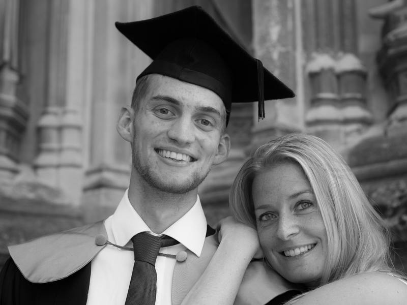
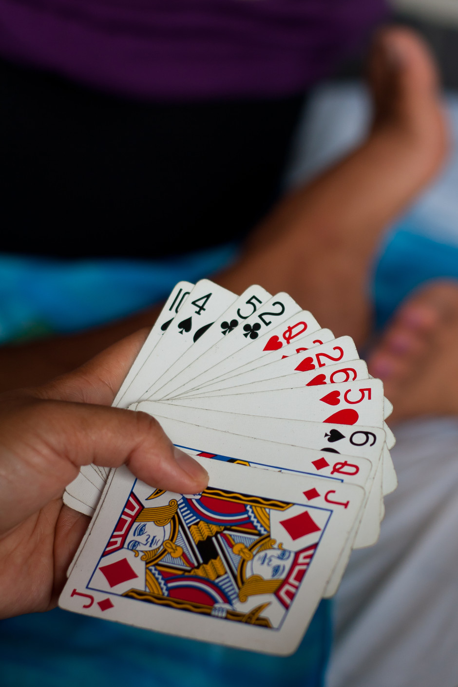
The shock! The horror! The blasphemy! How can we here at Photocritic, a place that purports to teach people about photography, nay has over 2,000 students in its online school, dare to utter a statement that is contrary to the received wisdom of practice making perfect and the 10,000 hours rule? How can we possibly suggest that taking fewer photos might put you on a path to being a better photographer? Quite easily, as it turns out. Upon his graduation, my cousin was gifted with a Nikon D5300 and promptly legged it to Italy where he proceeded to photograph everything in sight. While I might be prone to hyperbole, that is scarcely an exaggeration. When he returned, he asked me if I would peruse his images and advise him on improving his photography. When he told me that there were in excess of 2,000 images, I dispensed my first piece of advice: that he needs to take fewer photos. He looked at me incredulously and said: 'But I see so much that I want to photograph!' And therein lies the problem.

Memory is cheap. Images are ubiquitous. We communicate via self-destructing snaps and have developed a penchant for deliberately aged-looking photos of cups of coffee. As a consequence, there is a persistent temptation to take hundreds, if not thousands, of photographs every time that we venture out with a camera. While this might serve our most pressing needs to relay where we are and what we are doing, the act of creating an image that will stand the test of time requires a more considered approach.

Too many coffees

If you want to improve your photography it demands that you practise it as a craft, and strive to make each photo better than the last, rather than regard images as digital currency in our social media-dominated world. It's time to step back, slow down, and take fewer of them.

Tell your story

All photos are about telling stories. They are about communicating something that you see to other people. This applies whether you're sharing a Snapchat chat or creating a fine art print. But if you are intent upon taking better photos, it should be at the forefront of your mind whenever you pick up your camera. Before you even raise your camera to your eye, you must ask yourself: 'What am I trying to say?' Until you have defined the story that you want to tell, don't click that shutter release button.

Not perfect, but at least I knew what I was trying to achieve.

Without a grounding narrative, your photo will fail to convey anything of value and will, effectively, be wasted. Show some restraint and discipline at this point and you'll benefit your photo-taking skills enormously. First, you will produce a meaningful image. That's step one towards becoming a better photographer. By thinking about what you want to say instead of randomly spraying your camera in the direction of something that you hope might make an image out of one of twenty three variations on a theme, you'll have increased the chances of saying something significant.

I'd worked out this story before I even scurried down the bank to the waterfall

Second, when you have identified the story you want to tell, you have to figure out how you're going to tell it. To do this, you will need to think about the light, know how best to use your camera, and consider how to manipulate light and tools to achieve your aims. That will improve your photography.

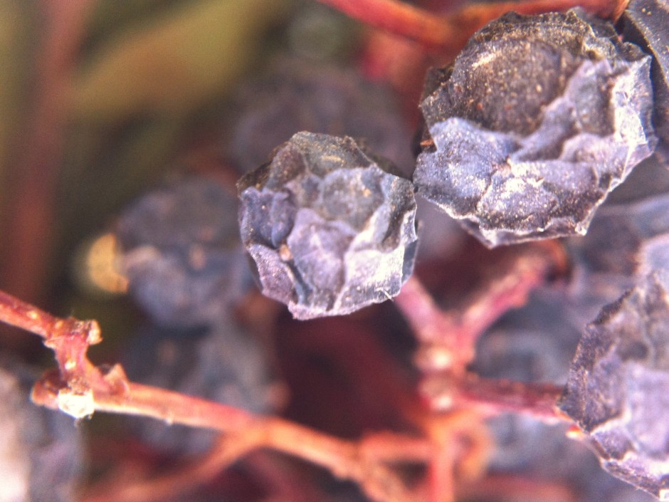
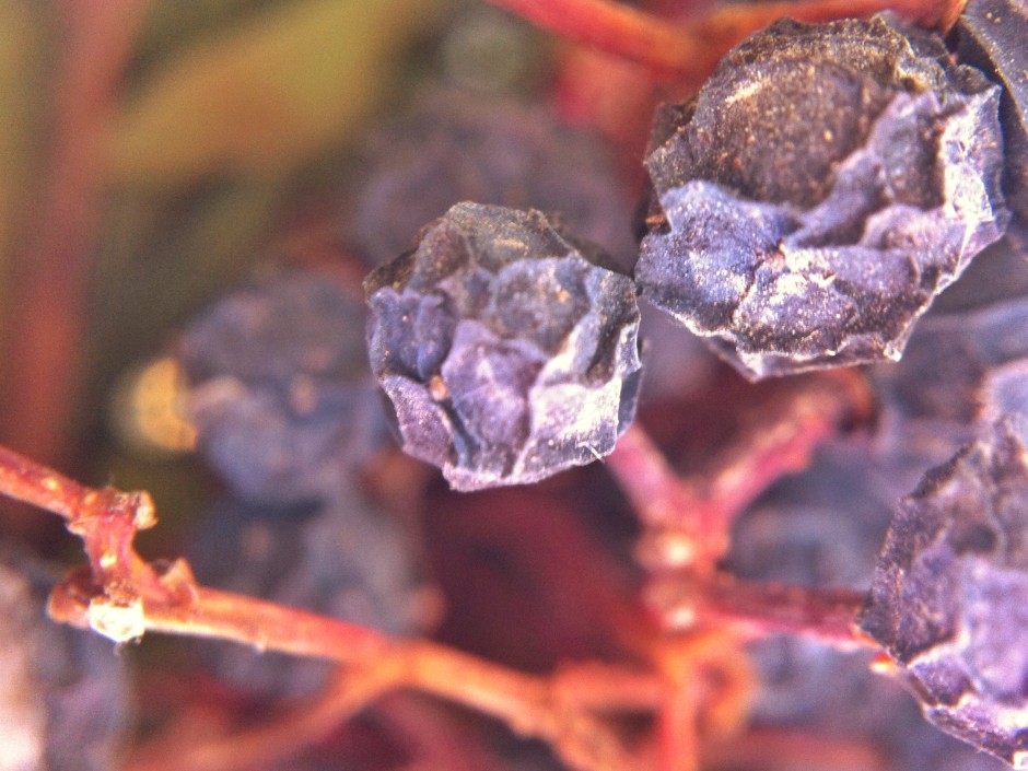
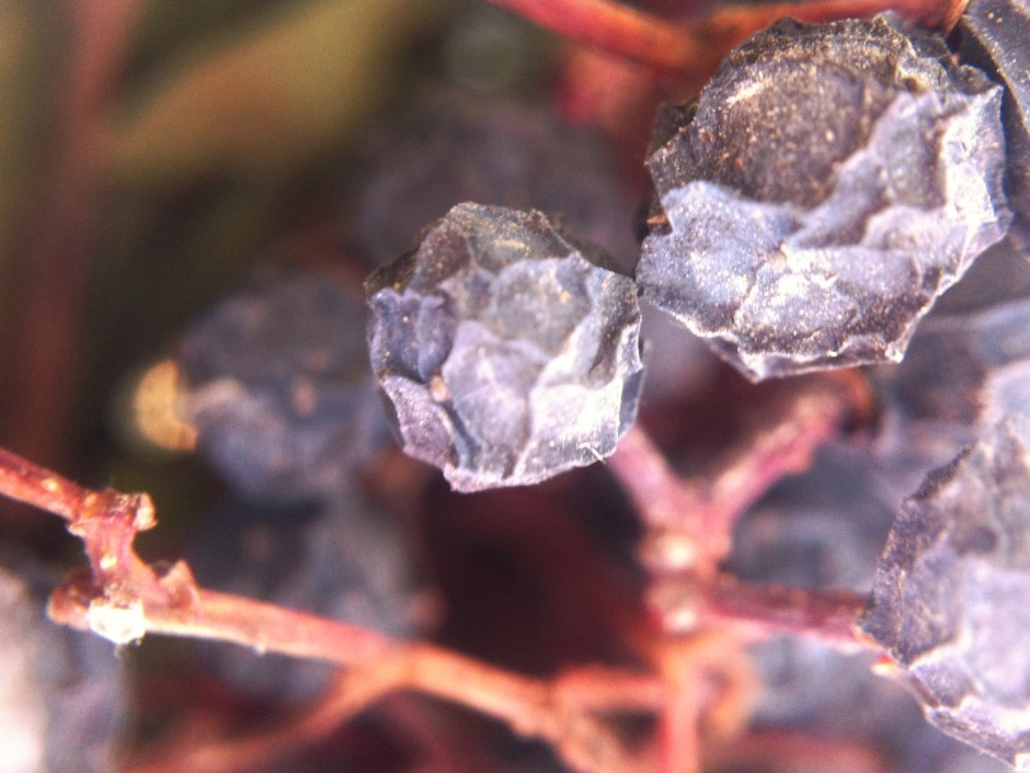
Third, I can guarantee that five miniscule variations on the same sunset scene over the Alps will not offer you any meaningful improvement on the first iteration. Of course we've all done it: taken nineteen photos of the exact same scene using focal lengths that vary over a distance of 3mm; shuffled half a pace to the left, and then switched the right; adjusted the aperture by a stop; and finally reverted to where we started. Looking back at the series of images, there's no discernible differences between them and you're left wondering which you actually prefer and which it's worth investing your time editing. If you take a moment to decide what you really want, you'll make your life easier.

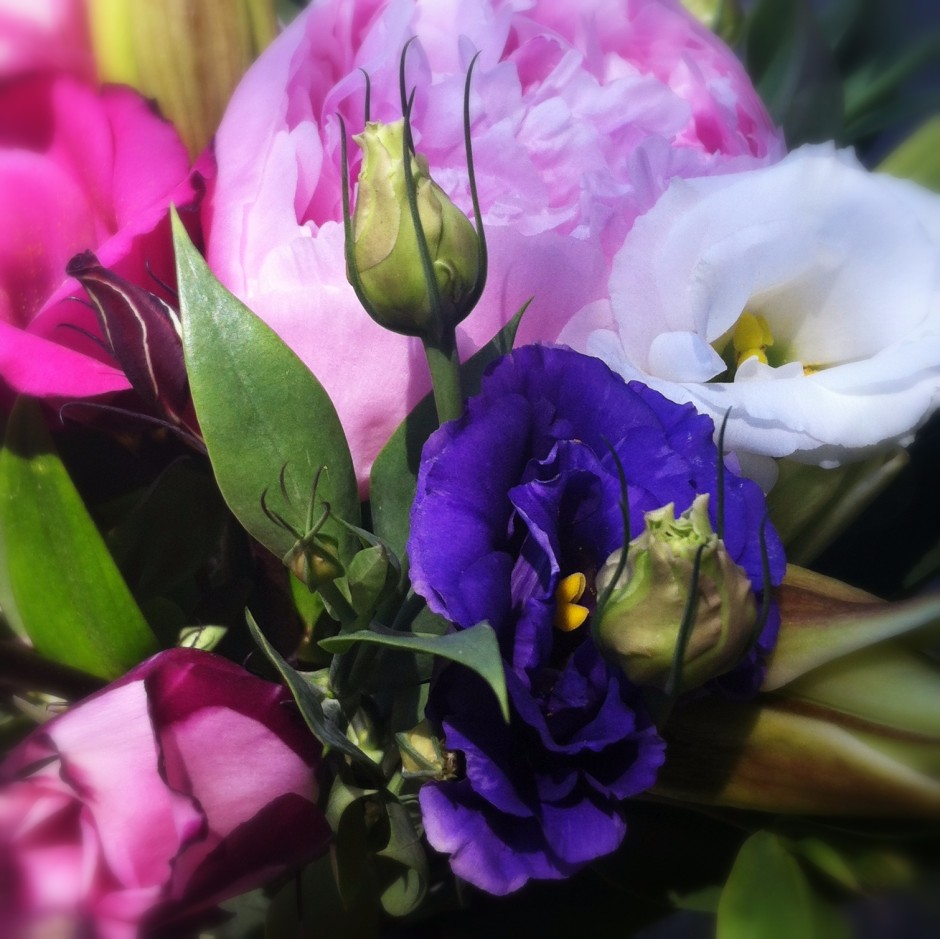
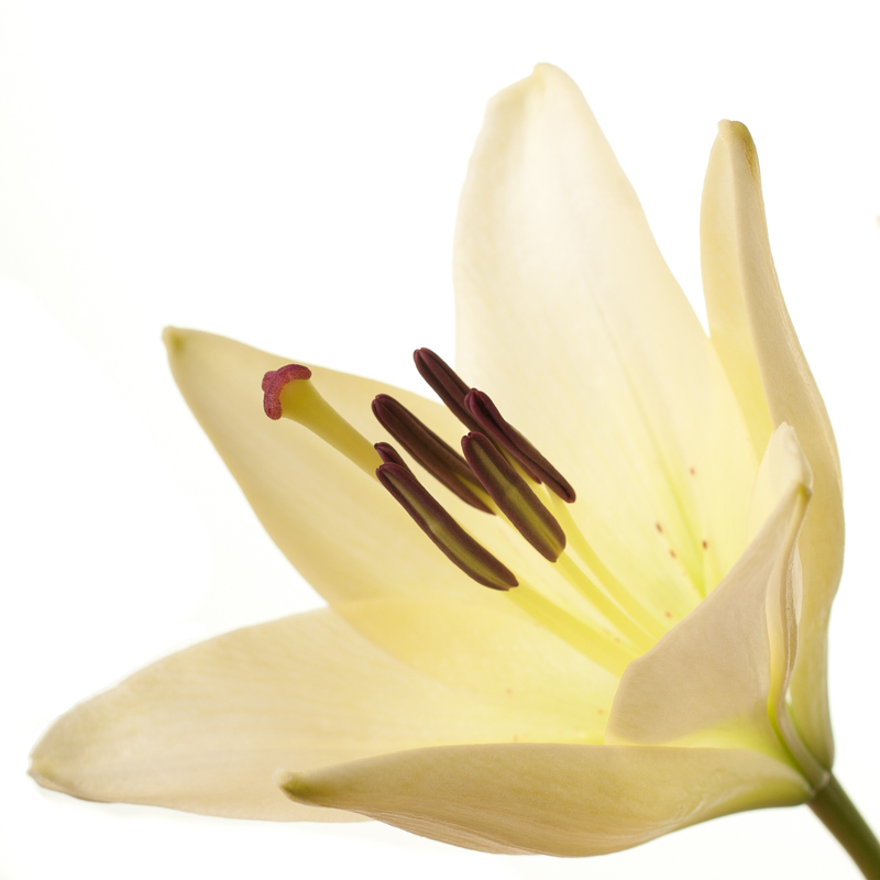
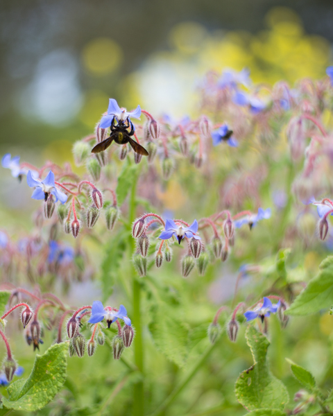
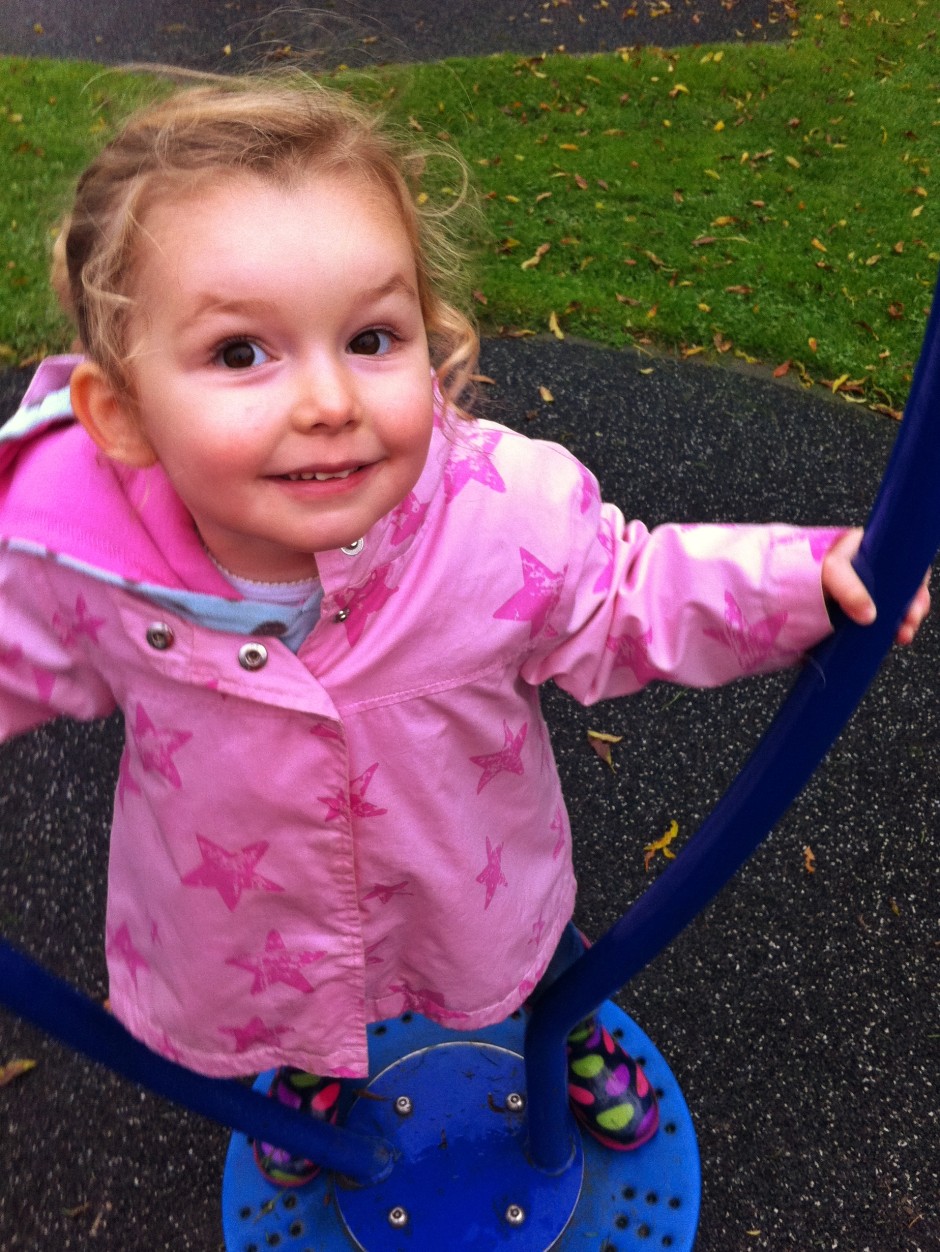
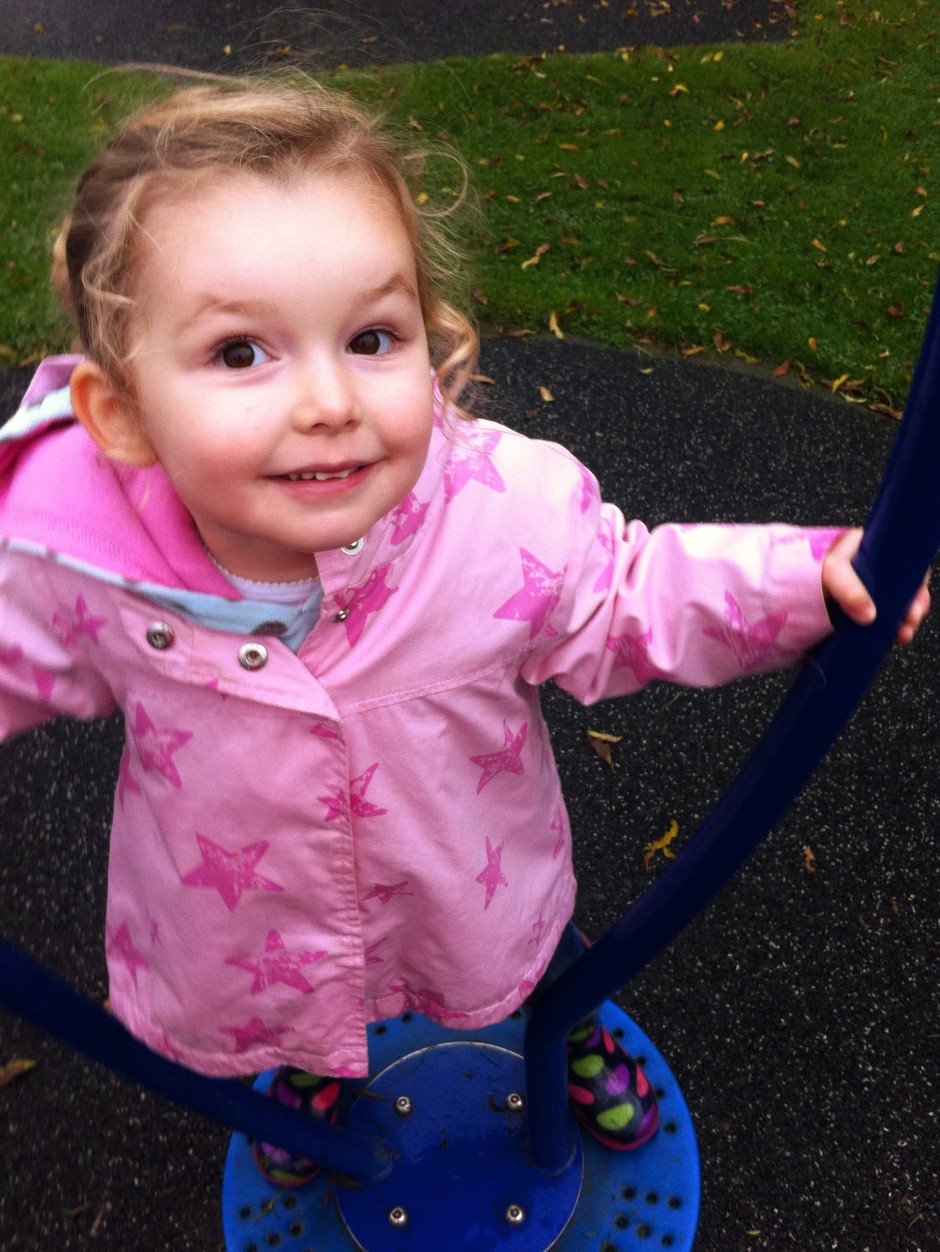
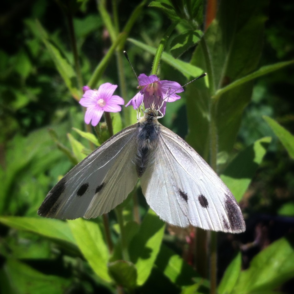
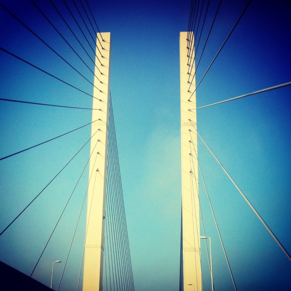
[gallery columns="4" ids="7083,7084,7085,7086"]

By honing your story-telling skills, slowing down your photo-taking process, and reducing the number of photos that you take, you'll force yourself to practise your skills. If that won't make you a better photographer then I doubt much will.

Edit judiciously

All photos deserve a little editing love. This isn't about airbrushing away half of a model's thigh, but subtle tweaks that enhance rather than alter an image. You cannot turn a sow's ear into a silk purse, so you must think of editing your images as adding the final touches to turn something already good into great. You must be working with already-good raw materials. In addition to taking great photos in-camera, learning how to finish them in post-production is part of the process of becoming a better photographer.

Not such a bad original

Apart from giving yourself a better opportunity to manage this by working with fewer, higher quality raw images, you also need to be shooting in Raw. Raw format gives you the flexibility to create images as you want them to be, rather than as the camera thinks they should look. When you shoot in JPEG format, your camera makes various decisions about the final version of the image, for example contrast and colour, that you really should be making yourself. It's a case of you being able to realise your vision, rather than your camera trying to decide for you.

But a teensy crop, a white balance fix, a bit more contrast, and some sharpening makes all the difference.

On a purely practical level, Raw images are significantly larger than JPEG files; you'll probably find that you need to shoot fewer images because storing them becomes a little more complicated.

Fewer photos means more time to edit and finish those you do take, helping you to create a better final product.

Reflect on your images

When you're trying to get somewhere, it helps if you know your starting point. On your (endless) journey to becoming a better photographer, you need to know how well you are doing at every given point and what you must do to improve. This is something that comes from evaluation and critique, given by both yourself and other people. Critically evaluating photos is demanding, however, and finding the stomach to do it for thousands of photos, or at least a good proportion of your catalogue, is probably overwhelming. You want to give yourself the best chance of being able to assess and to improve, and while it might sound counter-intuitive, it comes from fewer, rather than more, images.

Would I have preferred boy in-focus and wall blurred? I'm still not sure.

Go back to the five miniscule variations on the sunset scene over the Alps. With so little to choose between them, when you're in post-processing being able to determine their faults and their positive points will likely be a struggle. Rather than being a distinct iterative process, you might find it's easier to stick a pin in the collection to select one. Think more carefully about one or two shots when you take them, and you'll be able to reflect on them more effectively and improve your skills as a consequence.

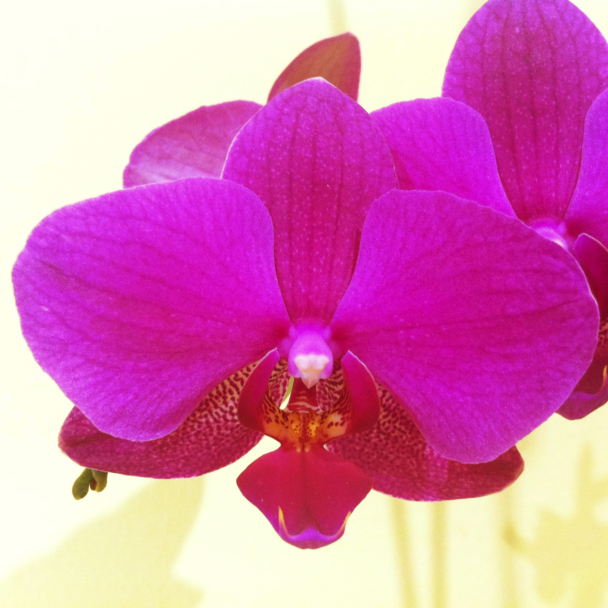
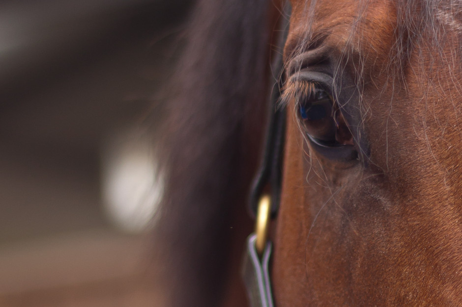
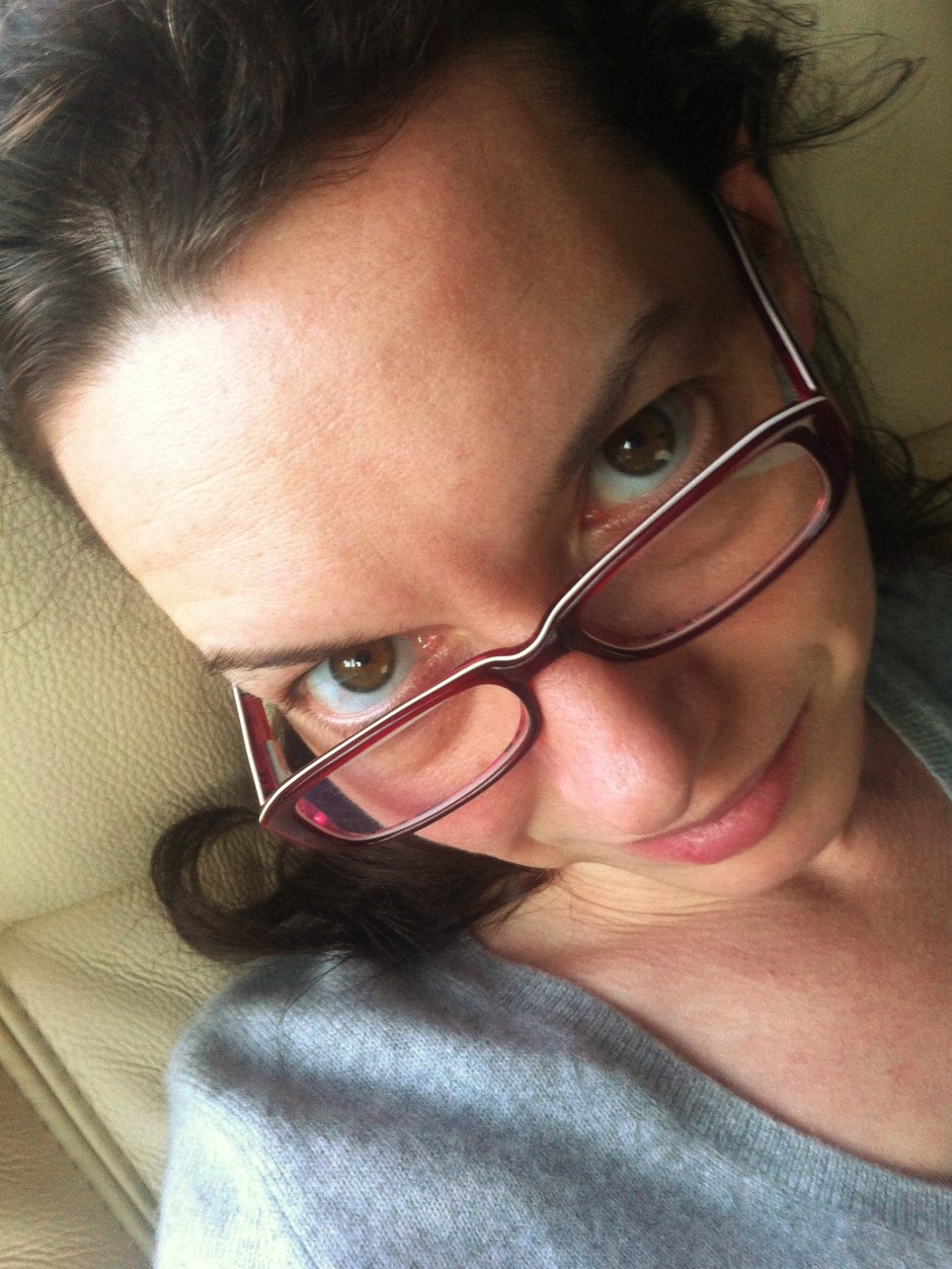
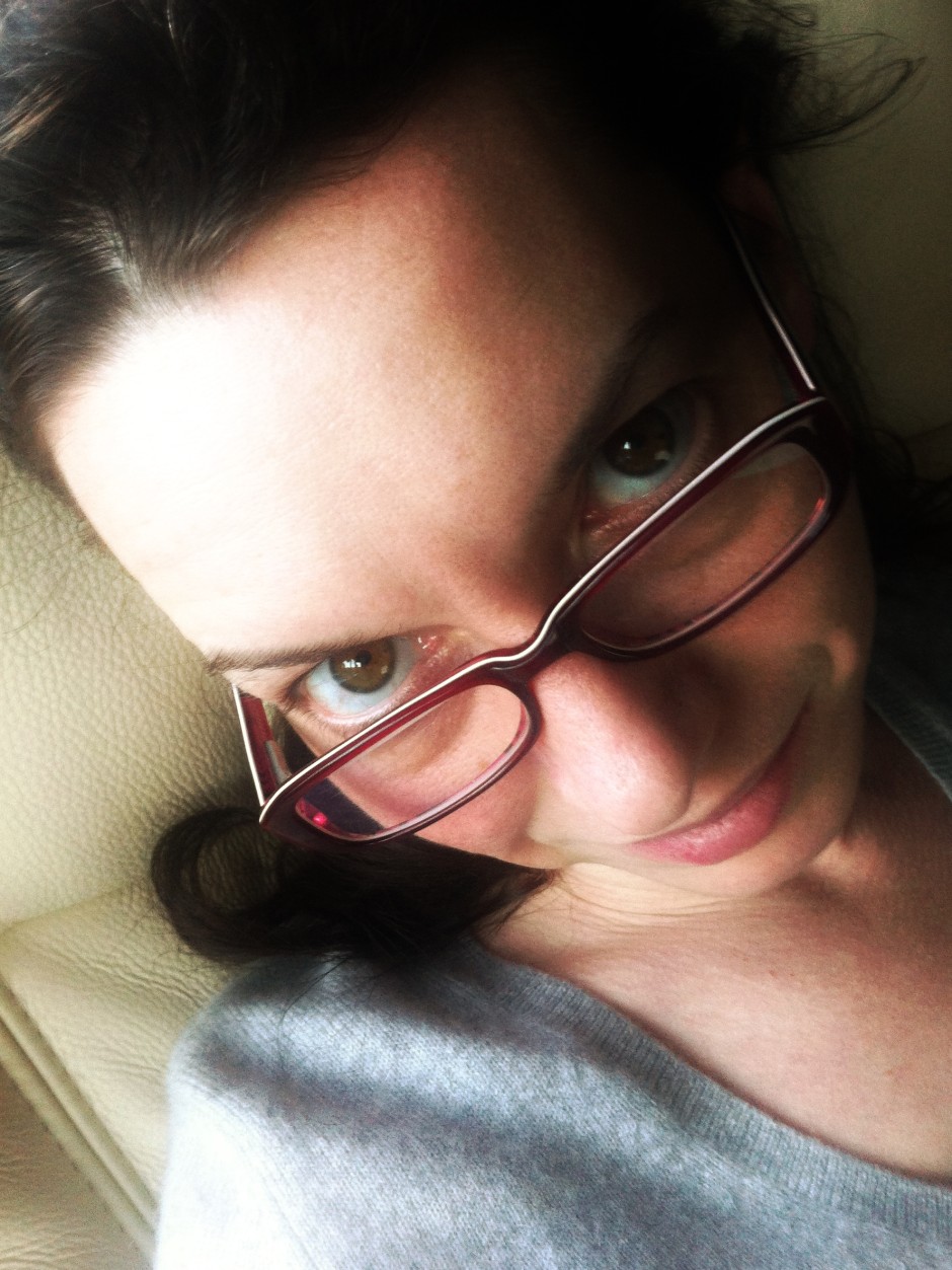
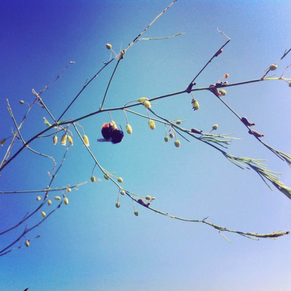
[gallery columns="4" ids="7089,7090,7091,7092"]

Of course, being able to play and experiment is a thoroughly important part of improving your photographic skills. What we're saying is that you need to do it in a way that actually helps you, rather than overwhelms and hinders you.

Practice does make perfect

It is a truth universally acknowledged that the more you practise photography, the better the photos that you'll take. But the word 'practise' carries with it far more connotations than simply pointing your camera and depressing the shutter release button in the hope rather than the expectation that it will result in a well-exposed, beautifully composed shot that tells a meaningful story. It demands that you approach photography as a discipline: that you decide on what you are trying to say before you try to say it (or 'engage brain before opening mouth,' as my primary school teacher would say) and that you evaluate your images to establish what you are doing well and what you can do better. Then, you need to work on making those improvements.

Do I like it? Mostly. Could I do it better? Of course.

It's a never-ending process that you'll be working on for as long as choose to take photos.

Happy with it? Yes. Could it be better? Definitely.

Back in the old days of film you typically had 12, 24, or 36 exposures to a roll. Even if you had multiple rolls of film in your bag having them developed was expensive, or time-consuming if you did it yourself. It meant that you took a little more care in composing and exposing each shot, because every frame cost you money. Each exposure was precious. If you're serious about improving your photography, I'd advocate placing a restriction on the number of photos you can take in one day, or over the course of a trip or excursion. It will soon instill a sense of discipline into your picture-taking!

Four photos good; two photos better

This advice then, is not about using your camera less, it's about using it with more care, attention, and precision. It is about working to ensure that every frame you expose and develop tells the story that you want it to tell, and that you can use each image as a platform to taking a better one next time.

Sleep on it; it usually helps.

Digital zoom: best avoided

Whenever I'm asked for quick tips for better smartphone photos, I usually proffer the same advice that I give to any other type of photographer: get closer and tuck your elbows into your body. But with smartphones (or indeed with some point-and-shoots) that first pointer in augmented with an admonishment to avoid digital zoom. So that's do get closer, but don't get closer using the capability that manufacturers have baked into their devices to accomplish it. Get closer, but nix the digi-zoom.

The truth is, digital zoom sucks. One day it might not, but right now it does. It sucks because digital zoom is nothing more than a glorified cropping tool. Whereas optical zoom relies on the physics of lenses to ensure that what you see appears larger or closer, digital zoom simply crops away the extraneous pixels and enlarges those remaining in the picture. While this might get you closer to your subject—and that's rule number one—it has an unfortunate effect on your images.

Get closer!
Get closer!

By enlarging the pixels that are on display, you've degraded your picture quality. You're spreading your information more thinly over the same surface area. It's the technological equivalent of spreading one teaspoon of jam over a slice of toast rather than two. Even if the processor is clever enough to use interpolation to enlarge the image, there's probably still some degradation.

Don't believe me? Have a look at these examples and tell me which is superior. I'll bet you a friendly pound that you prefer the image where I've got closer to my subject using my hands and my feet rather than the slider on my iPhone.

The first step in the art of getting closer is to do so physically: walk in, reach in, lean in. Getting optically closer is your next step. And if you're still not close enough, take the photo with what you've got and crop in after the fact. You'll still be spreading those pixels more thinly, but at least you'll have better control over the final image.

Get really close with an Easy-Macro band

And if you want to get really close, try an Easy-Macro band. It's $15 well spent.

Aspect ratio: what it is and why it matters

Did you go to see Wes Anderson's glorious fondant fancy of film The Grand Budapest Hotel? Did you notice how the size of the picture varied depended on the era being portrayed in the story? As the story moved between 1985, 1968, and 1932, the aspect ratio, or size of the image, jumped from 1.85:1 to 2.35:1 to 'Academy Ratio'. This was part of Anderson's story-telling technique: the aspect ratio provided viewers with a visual cue for each period of the narrative. It's also a reflection of the changes to aspect ratio that film and television have experienced over the years. But what about photographers? Where does aspect ratio come into stills?

Frame size

Maybe we need to back-track and establish precisely what we mean by 'aspect ratio' first. It's the size of the image expressed as a ratio, width to height. You'll often see film-making aspect ratios expressed as a value to 1 (like to 2.35:1 and 1.85:1 mentioned earlier), whereas the most common photography aspect ratios are 3:2, 4:3, and 1:1, although there are plenty more besides. If your image has an aspect ratio of 3:2, it will be three units wide and two high. When you come to print it, you might choose a 6×4" or a 12×8" print.

The entire rectangle is 3:2 (900 by 600); the red zone represents 4:3 (800 by 600); and the purple zone is 1:1 (600 by 600).

Originally, these aspect ratios were as a result of our film sizes. Lots of medium format cameras produced square, or 1:1, images; 35mm cameras used film that measured 36 by 24 millimetres, giving an aspect ratio of 3:2. What's referred to in the film-making world as 'Academy Ratio' is very close to 4:3. It's also the common aspect ratio you'll find in smartphone cameras as well as Micro Four Thirds and some medium format cameras. 16:9 is usual for recording video.

While our digital sensors might preserve these aspect ratios in their physical dimensions, at the press of a button I can switch between 3:2, 4:3, 16:9, and 1:1 on my camera. And when I import an image into Lightroom or edit it in Snapseed, I can select from 1:1, 3:2, 4:3, 5:4, 7:5, 8.5:11, 16:9, or settle upon an entirely idiosyncratic free-styled aspect ratio. But why would I want to?

Composing the frame

It's about composition, and dividing and filling your frame.

Photographers talk a lot about subject placement, about the different rules that can be used to divide the frame, and about negative space. All of these elements contribute to creating visually appealing, dynamic images that draw the eye. It follows, then, that the dimensions of the frame will have an impact on composition: on where you place your subject and how much space surrounds it and how you divide your frame.

Different rectangles

We've already written about the square crop here on Photocritic, and how the eye has a tendency to move around a square frame, as opposed to across it, which it does with a rectangular crop. When changing between 3:2 and 4:3 crops, are there any considerations that need to be made?

Lily square

At its simplest, you have more space to fill with a 3:2 frame. Depending on your style and your subject, this can mean your subject has more room to breathe compared to a 4:3 crop. But it can also mean your subject has that bit too much space and feels a touch lost. You certainly need to be aware of this when you're shooting; and indeed if you intend to have prints made.

When I photographed my cousin on his graduation day, I adhered to my preferred 3:2 aspect ratio. It was how I approached filling the frame on the day and, consequently, how I processed the images afterwards. However, when my aunt had her prints made, she opted for a 24×18 canvas. I had to re-crop her favourite shot in a hurry. You can see both of them here. Can you see why I prefer the 3:2 aspect ratio in this instance? It doesn't feel nearly as squashed as the 4:3 version does.

My preferred 3:2 ratio - a little wider, with more room for the subjects to breathe

What my aunt needed for her print: 4:3 ratio. I think it looks more squashed. (Image measures 800 by 600 pixels.)

If you compare these sunset photos, you can see how much of the view the 4:3 version loses when compared with the 3:2 aspect ratio. It can prove difficult to fill the extra space in a landscape shot, but sometimes you need it, too.

Sunset, 3:2. (Image 600 by 400 pixels.)

Sunset, 4:3. (Image 533 by 400 pixels.)

Of course, you don't have to adhere to 3:2 or 4:3 aspect ratios. I decided that 4:5 worked best for this bee enjoying the Sicilian springtime flowers. The more compact frame focused attention on the bee better than the larger 2:3 version.

The original 2:3 version

A more compact, and focused, 4:5 version

Don't forget, if you switch from landscape to portrait orientation, then the aspect ratio will alter format accordingly. Width always goes first, thus 3:2 will change to 2:3 and 4:3 becomes 3:4. Or in the case of the bee, it's 4:5.

Opting for a different aspect ratio doesn't necessarily mean that you need to use a different compositional rule; however, in some circumstances, you might find the Golden Ratio preferable to the rule of thirds. It depends on your vision for the image. But do think about how much space you need around your subject. If you're struggling to fill it, think of trying 4:3; if it looks squashed, consider 3:2. Or try something else. Try not to feel too constrained by the constraints of aspect ratio.

But I will leave you with closing thoughts from xkcd. Who could put it better?

Trying the golden triangle

One of the first compositional rules that we learn is the rule of thirds. It's relatively simple but definitely effective: divide the frame into three, horizontally and vertically, and use the divisions to place your subject. But rules are made to be broken—once you understand them properly, that is—or at least adapted and challenged. If you're looking to leave behind the rule of thirds but still want place your faith in geometrically validated subject-placement, try the golden triangle. Look closely...

Determining the golden triangle

Draw an imaginary diagonal line across your frame. Now draw imaginary lines from the other two corners, which each meet the long line at right angles. It should look something like this:

Where the lines meet: your points-of-interest

Your points-of-interest are where the lines meet. Use them to place your focal point, for example the eyes in portraits, and use the lines to divide your frame and draw the eye to the focal point to help create dynamic images.

Why use the golden triangle?

On a mundane and practical level, it's easier for some people to visualise the triangle than it is the rule of thirds. Moving towards a more creative purpose, by using triangles to compose your frame you're introducing a strong compositional shape to it with a great sense of balance pitted against a precarious point. And triangles have a nifty way of retaining the attention of the eye within the frame: the eye moves from one point to another in a continuous loop.

[gallery ids="6953,6954,6955"]

Quite specifically with the golden triangle, you give yourself a means of dividing the frame in a way that is frequently more pleasing to the eye than a horizontal or vertical split. As well as using the lines to draw the eye to focal points, the use of triangles in the frame brings balance to the image. Think of one half as blue and the other as yellow. Or shadow versus light.

White against stripe

By counter-poising the two points-of-interest against each other, you can enhance the sense of balance in the frame. You get dynamism and balance in one go: brilliant.

Cards balanced against foot

Putting it into practice

It's all very well knowing the theory - what about the practice? Try portraits with your subject leaning into the frame and the eyes on a point-of-interest. Use the rule to place bridges in your frame, and have the eye travel along them to a focal point. Just give it a try - you never know!

Triangles galore!

Dare to stray into bulb mode

When setting your shutter speed, have you ever wound the adjustment wheel so far into long exposure that you've gone past seconds and found 'B' or 'Bulb' on your screen? Or maybe you've noticed that you have a 'B' option on your mode wheel, somewhere between Manual and Custom settings? This is bulb mode, and it allows you to control the duration of the exposure for precisely as long as you would like. It's perfect for exposures in excess of the 30 seconds that most cameras have as their longest shutter speed, or for when you need to be in control, for example if you're practising high-speed photography. First, a quick word on why it's known as 'bulb' mode. Haje has a much more thorough explanation here, but it doesn't have anything to do with light bulbs. It's from back in the day when you could control your shutter speed using an air bulb connected to your camera.

'B'? What the hell does that do? (Picture thanks to Triggertrap.)

When your camera is in bulb mode, you open the shutter by depressing the shutter release button; as soon as you raise your finger off of the button, the shutter will close. Seeing as it isn't terribly convenient to stand with your finger on your shutter release button for minutes or even hours on end—and it's not fabulous for camera-shake, either—most people use bulb mode in conjunction with a remote shutter release. And a tripod, but that's probably quite obvious.

Plenty of remote shutter releases come with a locking mechanism, so that you don't need to hold your finger down there, either. However, if you go for something such as our much-beloved Triggertrap, you can select from a variety of different modes to control your super-long exposure, including a timed release that lets you set the duration of your exposure down to fractions of a second, a star-trails setting, and even a bulb-ramping option to fine-tune exposure during very long time-lapse recordings.

Late night in East London

Even if you're shooting at night, your camera's sensor will be able to detect far more light than you think it can, especially with a very long exposure. Consequently, using a small aperture is recommended. If you're photographing during the day, you might benefit from a neutral density filter to prevent unavoidably over-exposing your images, too.

It is worth bearing in mind that using bulb mode can drain your battery enormously. Don't set off to capture star trails with a less-than-fully-charged battery. Take a spare if you have one, too. It's a complete waste to maroon yourself in the middle of nowhere with limited light pollution only for your camera to keel over halfway into the exposure.

Waterfalls, shot using bulb mode. (Picture thanks to Triggertrap.)

Now that you know what bulb is, what can you do with it? Perhaps you'd like to try some long exposures of landscapes? Or maybe capture some smooth, milky-looking water tumbling from a fall. You might want to try your hand at a star trail, or have a go at light painting. You could even grab a flash adapter and have a crack at some high-speed photography and burst some water balloons. So many options presented to you with so much time from bulb mode!

Depth-of-field in greater detail

We're probably all familiar with the notion of aperture controlling the depth-of-field in our photos. By using a faster aperture, you create a shallower depth-of-field. To keep more of your image in focus, you need to use a smaller aperture. But there's a whole lot more to depth-of-field than adjusting your aperture to get more or less of the scene in focus.

'Acceptably sharp'

Let's start with setting out what we mean by depth-of-field. It's the range of distance in a photo that is considered to be 'acceptably sharp', or what we would regard as 'in focus'. Only the actual point of focus in a photograph is definitively sharp and 'in focus'; depth-of-field describes the zone of acceptable sharpness either side of it. A wider band of 'acceptable sharpness' running through an image equates to a greater depth-of-field. To introduce more blur into your photos you would want a shallower depth-of-field with a narrower band that's 'acceptably sharp'.

A shallow depth-of-field with a gradual fall-off

It's worth remembering that there's no sudden transtition from 'sharp' to 'unsharp': focus falls off gently on either side of the plane of focus, regardless of the aperture you use. It is fair to say, though, that larger apertures have a more rapid transition from in- to out-of-focus than larger apertures.

[gallery ids="6855,6856,6857"]

Controlling the depth-of-field in an image is achieved primarily by adjusting your aperture—a smaller aperture for a greater depth-of-field; a larger aperture for a shallower depth-of-field—however, there are other factors that affect it, too.

Focal length

You'll often hear people say that telephoto lenses have a shallower depth-of-field than wider angled lenses. This isn’t strictly true. It’s more accurate to say that because telephoto lenses are mostly used to magnify subjects, and the subject will then fill more of the frame relative to the background, the depth-of-field appears to be shallower.

200mm; ƒ/3.2

All the same, it's worth capitalising on the magnifying effect from telephoto lenses to pick out your subjects and surround them with blurred foregounds and backgrounds.

Subject-to-lens proximity

If you've ever practised macro photography, you'll appreciate how getting closer to your subject makes it harder to get it all sharp. The closer that you position your subject to your lens, the shallower your depth-of-field will be. Choose a subject further into the background and you'll find that the depth-of-field surrounding it is larger.

Crazy-shallow depth-of-field with a macro lens

Distribution of acceptable sharpness

Depending on the focal length you use, you will find that the depth-of-field isn't divided equally in front of and behind the plane of focus. Instead, the area of acceptable sharpness behind the point of focus is generally larger than that extending in front of the focal plane. As focal length increases, so too does the distribution of the depth-of-field in front of the subject.

When you shoot with a focal length of 15mm about two thirds of the depth-of-field will be behind the subject and one third in front of it. When you get to 400mm it's closer to a fifty-fifty divide.

Depth-of-field: not just about aperture.

What is the clarity slider? And why might you want to use it?

Your photography has been progressing and you've made the leap from shooting in JPEG to Raw. Along with this, you've plunged headlong into Lightroom and all of the editing marvels that it affords you. Plenty of the controls are familiar, after all you've been adjusting the white balance in your iPhone photos since you realised you could stop people looking corpse-blue with a simple slide to the right in Snapseed. A few of the others need a bit more thinking about, but they're essentially the same. And then there's the clarity slider. Clarity? What the blinking heck is that all about?

Defining clarity

Before we wade headlong into the ocean of clarity, we need to take a step back and have a quick re-cap of contrast. Contrast is the difference between light and dark in an image. Increase contrast and an image will seem bolder; decrease contrast and it'll have a more muted feel. Adjust the contrast and it has an effect across the entirety of the photo: highlights, shadows, and mid-tones. This is where clarity comes in.

Clarity's influence over contrast happens in the mid-tones of an image; by increasing clarity, you sharpen the edge detail and definition among these tones, leading to a punchier, sharper looking image. Conversely, decrease the clarity value and you'll soften edge detail and lose definition.

Ramping up the examples

The effect that the clarity slider has on your photos is likely as clear as mud until you see it in action. I have, therefore, reproduced the same image but with different clarity adjustments, to see how it looks.

My original photo of a lonely Apostle off of the Victorian coast. It's been adjusted for crop and white balance.

Same image but with the clarity slider pushed to +50. Note how much more defined the waves are, and how the strata in the Apostle are clear?

With the clarity slider moved to -50, everything becomes much softer.

Why, then, would you want to adjust the clarity in your photos? For a start, I've exaggerated the adjustments in my examples to show you precisely the impact it can have. With more subtlety, it can add definition to landscapes, or emphasise a misty, dreamy feel, and give portraits a gentler feel.

Subtler examples

These aren't especially thrilling portraits of my cousin, Emma, but they serve the purpose of exploring the clarity slider perfectly.

Nothing terrible (or exciting, either, to be fair) about the original here

There's nothing at all wrong with the original image (it's been cropped and white balanced); but look at how Emma's skin appears softer and more even with a -15 point adjustment to clarity. The background hasn't been affected too much, but she looks better for it.

But a slight adjustment to the clarity slider (-15), softens Emma's skin a touch.

If you'd like to get even more advanced, you can use Lightroom's adjustment brush to paint softer and more even skin with a negative nudge, but bring definition to a portrait subject's hair by selecting that and giving it a positive clarity adjustment. That's what I've done here.

Here, I've softened Emma's skin with negative clarity, but brought out the definition in her hair with a positive clarity brush.

A cautionary conclusion

As with most things, subtlety is the key to clarity. Too much of it in either direction can leave your photos looking more like cartoons or watercolours than you otherwise might want. And you're not going to want to fiddle with the clarity slider on every photo, either. But at least you can have a bit more confidence about what it does and how you can make it work for you now.

The positive impact of negative space

One of the fundamental rules of photography that we're all taught early in our learning curves is to 'fill the frame'. In fact, the first lesson in the Photocritic Photography School is all about getting closer to the subject and making sure that there's nothing extraneous in the frame. You don't want it to be a tiny, practically unidentifiable blob somewhere in the image that your eye has the hunt to locate. As a consequence, the idea of 'negative space'—or the presence of nothingness in an image—probably seems counter-intuitive. Instead of seeing them as polar opposites, it might help to think of 'getting closer' and 'negative space' as two sides of the same coin that complement each other. Sometimes, a little bit of nothing is just what your subject needs.

Bringing balance

If you have a complex subject that’s detailed and busy, contrasting it against an area of nothing will bring some balance to the composition. It helps the eye to find a point of focus and to stop the image from feeling chaotic.

Even if you’ve done all the ‘right’ things compositionally—you’ve selected the appropriate frame orientation, you’ve used the rule of thirds or the Golden Ratio, the image is balanced, there are leading lines directing the eye to the subject—sometimes an image won’t look as good as it could. By putting some negative space around the subject you give everything ‘room to breathe’ and it somehow becomes better balanced.

A sense of space

If you fill your frame with a recurring pattern or repeating subject, like a mosaic or a pile of fruit, and not give it any boundaries, you can create a sense of the infinite in your photos. Surrounding a solitary subject with negative space creates a similar effect.

For example, you could photograph a sailboat on a lake and include the shoreline, which limits the feeling of space. By composing your image so that you capture just the sailboat on a negative space of water—perhaps by altering you vantage point slightly, maybe by getting in a little closer, or even shooting a touch wider—it is suddenly sailing on an infinite sea.

Creating atmosphere

Negative space can contribute to the atmosphere that you want to create in your photographs. Dark negative space can imply brooding or foreboding. Negative space in particular colours can lend a certain feeling to an image; blue is calming, for example, whilst yellow is uplifting. Or there's the opposite of dark and foreboding with positive and airy negative space created by light colours.

Accentuating the subject

When there is nothing else to look at except the subject in an image, that’s exactly where the eye will go. Placing the subject in a sea of negative space will accentuate it. Obviously this is ideal for product photography, when you want the £50,000 diamond ring to be the centre of attention, but you can also use it to make dramatic or slightly surreal images that aren’t intended to sell something!

Achieving this sort of effect isn’t difficult. The first option is to photograph your subject on a plain background. If you don’t have a professional backdrop, a scarf or a sheet will work, too. However, you can also use lighting to surround your subject in negative space. You can either light your background so strongly that you ‘blow it out’, or over-expose it to the extent that the sensor cannot detect anything in that area; or you can light the subject significantly more strongly than the ambient light, so that it will look as if it is emerging from the darkness. Both techniques are highly effective and you can have a lot of fun experimenting with them.

Enhancing patterns and shapes

Our eyes and brains are constantly roving for patterns and shapes: think about gazing up at a bright blue sky, and how we look out for cloud formations that resemble faces, animals, and countries. The interaction of positive and negative space in a photograph, especially a minimalist black and white composition, creates similar opportunities to make and look for shapes. You just have to look out for the interplay between objects or between light and shadow.

There are two sets of negative space working to create an image here. The black outlines the windows; the light coming through the window highlights the detailing of the latticework.

So that's something for you to try this weekend: looking for the positives in negative space.

Unpicking Snapseed's Ambiance slider

If you use Snapseed to edit your smartphone photos, you might have noticed the 'Ambiance' slider under the 'Tune Image' settings. Ambiance? Isn't that the mood or feeling you get at a party, not a photographic term? Yes, exactly, and that's why I avoided it for quite a while. I just couldn't figure out how to apply it effectively to my photos. And Google, which owns Snapseed, was hardly helpful. The Google help page ambiance explanation reads:

The Ambiance control is a special type of contrast that controls the balance of light in a photo. It can be used to balance backlit photos or to accentuate contrasts throughout your photo. Swipe right for photos where the subject is darker than the background. Swipe left to increase the contrast of dark objects and create a slight glow around darker objects. This is especially helpful in photos that are slightly flat.

I wasn't aware that there was a 'special type of contrast' available to photographers, just the plain old difference between light and dark, so that was surprising. And it's all very well telling us to 'swipe right for photos where the subject is darker than the background,' but what effect will it have?

As with just about everything associated with photography, the best way to understand it is to use it. So that's how I've come to write this and present you with some compare-and-contrast examples where I have swept the slider both left and right on a series of photos and analysed its impact.

In order to create examples that are clear enough for illustrative purposes, all of the ambiance settings, whether positive or negative, have been exaggerated. Subtlety and demonstration aren't natural bedfellows; that's for the real thing.

Dried berries

Let's start with this image of some dried berries. I've adjusted the white balance to correct for a light temperature that was out by several thousand Kelvin and cropped it marginally, but that's all. It's a good base.

Adjusted for white balance and marginally cropped

By increasing the ambiance setting by 60 points, you can see that the image has taken on a more reddish tone. The background has also been lightened, but the highlights—say those on the bottom right of the centre berry—haven't become overwhelming, as you might otherwise expect from an increase in contrast. The definition of the berries has improved, but not at expense of the highlights.

Ambiance increased by 60 points

When I swiped the slider to the left and dropped the ambiance by 60 points, you can see that the background became darker, the red tone has diminished, and the berries have become softer looking and less defined. A negative ambiance setting has given the photo a softer, more muted look.

Ambiance set to -60

Eva

This is my niece, Eva. She's three. She's being spun (by me) on an upright-spinny-device in the park. I've adjusted the original image to correct the white balance, but that's it.

Adjusted for white balance, but nothing else

When I increased the ambiance, pushing it to +60 made Eva look as if she's been on a sunbed every day of her life since birth. It was awful. So I went for +30 instead. She still looks comically rosy-cheeked, but not horrifically so. Her coat is an unattractively bright shade of pink, her wellies are deeply saturated, but the grass looks good.

With an ambiance increased to +30, Eva doesn't look herself.

Decreasing the ambiance to -30 had a rather pleasing effect, though. Her skin became more milky and the darker background helped her to gain even prominance in the image. I reckon that decreasing it even further could make for an even better look.

Decreasing the ambiance, in this instance, makes for a better image

Me

Having tried increasing ambiance in Eva's portrait to unpleasant effect, I didn't even bother trying it with my self-portrait. Decreasing the ambiance, this time to -100, was effective, though. I'm not sure if I prefer the original (again, slightly cropped and heavily adjusted for white balance) image or the edited one, but it's a good demonstration of the tool and shows how it gives a more muted feel to your photos.

Me, looking studious

With the ambiance dropped to -100

Having a swipe and swish with the ambiance slider is definitely something to be considered when you're fiddling with your smartphone photos. The general rule seems to be that left is great for portraits and go right a bit for still lifes. But every photo's different. And maybe 'ambiance' isn't such a terrible descriptor, either. One way is more lively and bouncy and the other more muted and moody. Just like the atmosphere can be at a party.

Considering the square crop

I've never been a particular fan of the square crop; I have no good reason for my disfavour, but it doesn't stop me from recognising that it does have its place in the canon of crop. And that's not just its historical position, but its artistic one, too. Consequently I do use it from time-to-time, and I've spotted an increase in the frequency that I at least try it out on my photos. That doesn't mean to say I'll use it, but it's worthy of closer consideration. If you're accustomed to the rectangular frame, you'll notice almost immediately that the compositional rules with which you are so familiar don't seem to apply any longer. The frame is different and you must think differently, too.

Dynamic shift

Primarily, the tension within the frame has shifted. What makes a picture 'work' and what holds the eye to the frame has changed. With a rectangular crop, the eye has a tendency to move across the image until it finds its focal point; with a square crop the eye moves around the image. This shift in the dynamic, from fluid to static, presents you with a great setting for capturing the serene. Striking still lives with plain backgrounds and posed portraits work a treat in a square frame.

Lily square

Centred subjects

Centred subjects have a tendency to look flat and dull in a rectangular frame, but that circular eye motion that we make with square-cropped images means that they don't lose their impact.

Centre placement works because the eye moves around the frame

Symmetrical images

Following on from the centred subject comes the symmetrical subject. When you place a symmetrical subject within a square frame, it is bounded and the symmetry emphasised.

Okay, so it isn't perfectly symmetrical, but I was in a moving car (being driven, not driving) when I took it

Evenly balanced images

Splitting the frame and balancing your subject across it: black against white, calm against active, rough against smooth, will work to the benefit of a square crop. There's nothing wrong with splitting your frame horizontally or vertically, but diagonal divides work brilliantly, too.

Buzzzzzzzz

The point is, of course, to use whichever crop works best with your vision and your image. Don't feel that square crops carry the mark of the Instagram devil and that a rectangular frame is somehow symbolic of photographic purity. Try it; you never know, you might like it.

When more than just the horizon splits your frame

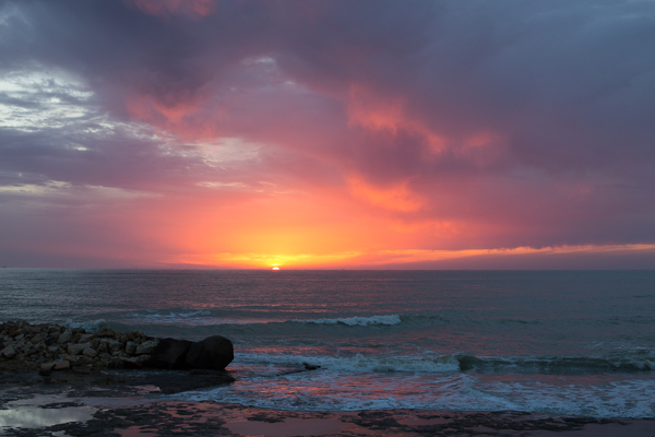
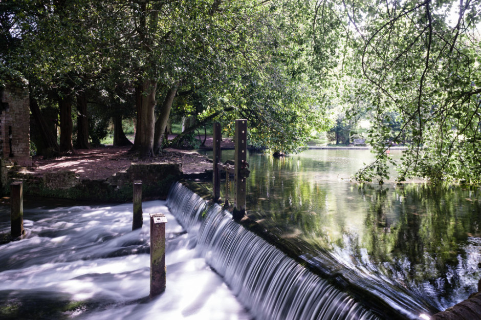
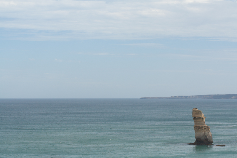
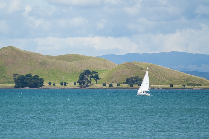
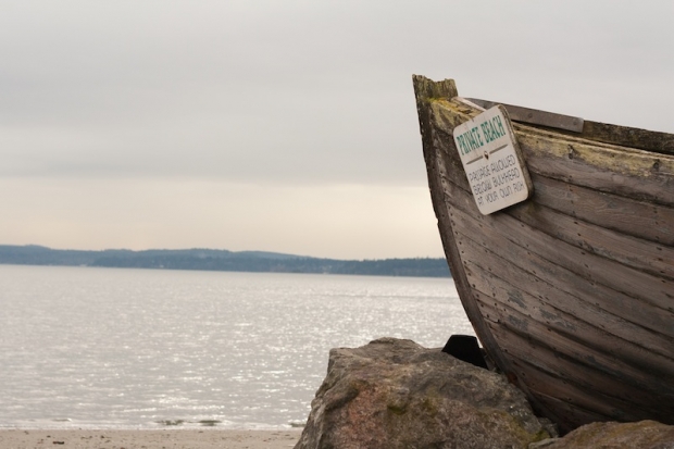
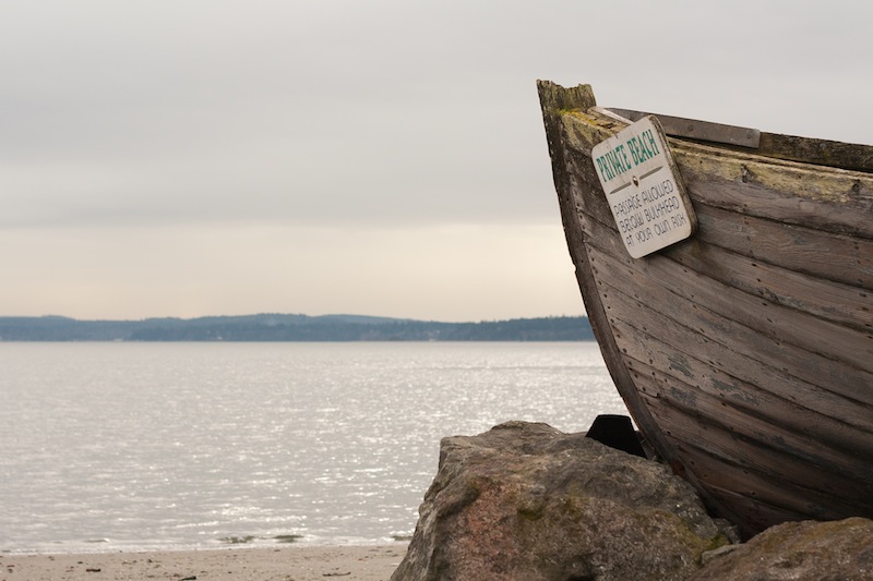
Horizon on the upper third; shoreline on the lower third. Perfect!
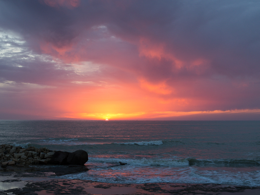
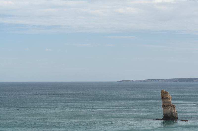
I'm doing quite a bit of landscape photography at the moment; it was my photographic resolution for 2012, and seeing as I'm travelling right now, felt like a sensible choice. This of course means that you'll be subjected to a hefty quotient of landscape articles for the foreseeable future. I'm sorry if that doesn't float your boat, but I'll do my best to keep them entertaining and informative.

So there I was, at the top of Rangitoto, a volcanic island just off of Auckland, snapping away at some landscapes, when it occurred to me: it's a cardinal rule of photography that horizons shouldn't run through the middle of photos, you should apply the rule of thirds. If you want more emphasis on the area above the skyline, you place the horizon on the lower of the two imaginary lines dividing your frame into thirds. Should you prefer that more attention to rest on the foreground, place the horizon on the upper third dividing line. That we know.

What, though, should you do when there's more than one dividing line in an image? For example, if you've a series of islands in your frame. Or a shore line and a skyline right in front of you. Yes, the horizon is the horizon, but these strong lines can also have a nasty impact on your photos if you manage to get one of them smack-bang in the middle of your frame, too.

If you've two dividing lines running through your image, ideally one would go closer to the upper third and the other towards the lower third, with both avoiding the middle. That should keep things dynamic, and prevent your image from looking flat and dull. The first image up there does just that: the shoreline is on the lower third, the horizon is on the upper third. Bingo! But, geography isn't always that accommodating towards geometry - and let's face it, it's why photographing landscapes can be so inspiring - so sometimes you will need to get a bit creative with your cropping.

The skyline might be running along the upper third tri-line, but it does nothing for the shoreline

Take the examples with the solitary yacht. The first one (above) has the skyline is running mostly along on the upper third, but the shoreline is perilously close to the centre. By cropping a bit from the lower half, I've been able to place the shoreline on the lower third, giving it an overall better feel.

Pushing the shoreline, and indeed the skyline, lower, has a more pleasing impact

That shoreline is so strong in this image that it needs to be properly accommodated to prevent the photo from looking oh-so-obviously split in half.

In fact the blue of the sea is so strong in this picture that if you wanted to, you could even push it a little further down the image, which pushes the actual horizon closer to the centre of the frame. Of course, that might not float your boat at all!

An even lower shoreline might work, too, given how strong it is

If you've an image where you have three or more strong dividing lines running through it, the chances are that one of them will end up running straight across the centre of the frame, with others above and below it. Provided that the central line isn't overwhelmingly strong and obviously bisects the scene, there should be sufficient movement across the entire photograph to keep it fluid and interesting. You can see that in the photo of the flooding I took in Morocco (down below). The floodplain runs through the centre of the image (look carefully and you can see the reflections), but the skyline and the shoreline are both strong enough to stop it from coming over as boring. In other words: don't worry too much.

When there are multiple dividing lines running through your images - use your judgement!

Finally, don't forget that if you're using a non-destructive editing package, there is nothing to stop you from playing around with the composition of your image until it looks right. Apart from making that picture look pretty, it'll also ensure that the next time you encounter a similar situation, you'll have a better idea of what works and you'll have to do less fiddling in your editing suite.

Oh, actually, this is finally: make sure your horizons are straight.

The wild blue yonder of straight horizons

Horizons: they are very definitely meant to be level in our photos. Whenever I see a lop-sided horizon, it sets my teeth on edge. Nature intended that they be straight, at least as far as our eyes can see, and our inner ear knows this. A wonky horizon will likely make anyone looking at it feel uncomfortable, as their eyes will be telling them one thing and their feet another, but they won't necessarily be able to pin-point why. And you definitely don't want that.

They also seem to be something that I am perenially unable to get right when I take a photo. (Unless I'm using a tripod, of course, then you use a dinky spirit cube in your hot shoe.) I know that they need to be level, so I try my utmost to make them that way, but they always need tweaking. I don't know, maybe I stand funny, or something.

The fix, however, is easy. Whether you're using a free online editing service or have the mighty power of Lightroom or Aperture behind you, there're tools to straighten photos. I've picked two as examples - one free, the other paid-for and swanky - to give you an idea.

If you use Pixlr (Pixlr.com, possibly my new free online suite of choice, following the demise of Picnik), it's very simple. Upload your JPEG photo into Pixlr Express, select Adjustment, and then Rotate. Then all you need to do is use the slider to alter the angle of the image so that the horizon comes up straight. There's even a useful grid to help you get it right.

Straight horizon


Use Lightroom 3 and you have three straighten options, all of which are found in the Crop panel on the right-hand side. The first is under the Crop tool, and you adjust the angle by eye, using a grid overlaid on the image to help you. The second uses the slider, allowing you to adjust the slant of the image by a precise number of degrees. The third is by far the easiest. Click on the Angle tool and then use it to draw on your image, following the line of the horizon. It'll correct the angle of the image to that line. Simple! (And it also works the same for vertical alignment, too, ensuring that buildings don't lean to the left, or whatever.)

Of course, if you want to deliberately set your skyline askew, there's nothing wrong with that and you can use these same tools to achieve that end. Just make sure that it's off-kilter enough that it's easily identifiable as deliberate. (And I'm reliably informed by one Haje Jan Kamps that a purposefully skewed horizon is called a 'Dutch Tilt'.)

Doing it deliberately with a Dutch Tilt

If you're now permanently unable to look at another picture without being able to spot the wonky skyline, I'm sorry. But you never have an excuse to be riding off into a crooked sunset again!

Photo Critique V: Portrait


Peter's original image...

It's time for another round of video photo critiques! This week, it's Portrait by Peter Dahlgren. He has helpfully done a blog entry on the photo as well, to help you get a feel for how he's done it. 

So, check out the critique below, and if you want to have one of your own photos critiqued, check out this post!


Photo Critique IV: Eagle


It's time for another round of video photo critiques! This week, it's Eagle, by Latrell Olner that's going on the proverbial chopping block. 

So, check out the critique below, and if you want to have one of your own photos critiqued, check out this post!

Enjoy!


Video Photo Critique III: Biz Eating Apple


Today's video critique is Biz Eating Apple, by DiaspirePhoto. Take a closer look at it on Flickr!

This is the third in my now-weekly series of video critiques. To see all (well... Both) critiques and to find out how to get your own critique, check out this post.

Well then, with that out of the way, let's get cracking on the critique:


Do you enjoy a smattering of random photography links? Well, squire, I welcome thee to join me on Twitter - Follow @Photocritic

© Kamps Consulting Ltd. This article is licenced for use on Pixiq only. Please do not reproduce wholly or in part without a license. More info.

Video Photo Critique II: Gay Balloons


Today's video critique is Gay Balloons, by Sam Levy - take a closer look at it on Flickr!

Sam's photo is the second video critique I've done, so let me know if this format works a little bit better. To see all (well... Both) critiques and to find out how to get your own critique, check out this post.

Well then, with that out of the way, let's get cracking on the critique (oh, and if you can't see it because you're looking at it in a RSS reader or similar, simply come to the original of the article here so you can see it!)


Video photo critique I: Pont de Bratislava


Pont de Bratislava, by Flickr user Equismo

Today, I wanted to try something a little bit different. Personally, I'm an enormous fan of photo critiques (that might explain my name on Twitter - @Photocritic), as I think they are a great tool to learn from your mistakes, and from those of others as well, obviously.

I wanted to see if video was a useful way of doing these critiques; so here's a first attempt!

The photo I've taken a closer look at is Pont de Bratislava, by Flickr user Equismo:

Any feedback?

This whole video critique thing is completely new to me, and I'm not sure if I've got it right quite yet - so any feedback you may have would be warmly welcomed! Also, if you want to enter your photos to be considered for critique, please add them to the Flickr group!

The Illusion of Colour

6-desaturateHave you ever wished that you could make it look as if your black and white photos were in colour? Well, through the magical powers of chromatic adaptation, you can!

Someone posted a really cool optical illusion on Reddit, and one of the commenters was wondering how it is done.

As it turns out, it’s really quite easy, so I decided to tap out a quick little tutorial. Here is how...

Creating a Chromatic Adaptation image

Start with the original image:

Arizona 2003 Arizona 2003 by Photocritic on Flickr

Upping the saturation will help your image seem more, er, saturated (clicky for bigger)

Upping the saturation will help your image seem more, er, saturated (clicky for bigger)

Inverse it in an image editing package like Photoshop or the Gimp (in Photoshop: Image → Adjustments → Invert).

Next, increase the saturation a little bit (this will help with the colour perception – in Photoshop, Image → Adjustments → Hue & Saturation).

Finally, blur the photo a little. This will ensure that you concentrate on colour, rather than the texture. In Photoshop, I used Filter → Blur → Gaussian Blur, with a setting of 2px, but experiment to see what looks best.

That’s your first picture:

5-blurred-image

For the second picture, simply desaturate your original photo. If you want, you can up the contrast a little bit, or even sharpen it further.

6-desaturate

The final result? Check out the video below. To see the effect, simply start the video and stare at the horizon. After 20 seconds, the image will change, and you’ll be able to see the optical illusion:

The effect isn’t very strong in this particular photo, but that’s because it’s such a gradient and vibrant photo to begin with. You may find that man-made, simpler structures (buildings etc) have a stronger effect. Experiment away, and if you make a particularly awesome one, post it in the comments!

Cheerio!

This is photography; there's no beta

People 11 - oh my!

‘Getting something done, anything, which can then be iterated on is more important to me than hitting an intended vision.’ So said one of my friends in a conversation with me over the weekend. He’s a software developer and he subscribes to the ideal of ‘release early and release often’. For him, it’s better to get his project out there in a functional but imperfect state, and then work on refining it. I laughed and replied that that philosophy is utterly contrary to how I work, both as a photographer and a writer.

Whatever I do, I have to do it the very best of my capabilities every time, because once the shutter has clicked or the book has gone to print, there’s no going back. Whilst I’m convinced that I’ll never take the perfect photograph, it is what I strive for whenever I pick up my camera. I don’t think that there’d be any point in practising the craft of photography – or of calling myself a photographer – if I didn’t.

And if photography isn’t about the vision, then please do tell me what it is about, because I’ve been doing wrong for about 25 years.

My friend was astonished by my response. He genuinely believed that you can treat photographs as an iterative project. The specific example that he cited was concert photography. At which point I spluttered into my coffee and decided that I had to take things back a few steps and divide the craft of photography from its outcome.

The craft of photography, yes, that is iterative. But then, just about everything in life is iterative. You do something, you analyse it and identify what you did well and what you could have done better, you learn from it, and you apply what you learned next time. This approach is just as valid for photography as it is for baking a cake, acting a role, or doing the long jump. In striving for that elusive perfect photograph I need to build on my previous successes and failures and attempt to do it better every time.

The outcome, a photograph, is definitely not iterative. A photograph captures a single instant, a fleeting moment, and when it has gone, it’s gone. There is no going back. Try as hard as you might to recreate it, the light will be different, the atmosphere will have changed, the look will have passed. You have one shot, and it has to be the best you can make it. There’s no possibility of the release of an updated version that you can debug, patch holes, and clean up. It is definitely about hitting an intended vision.

And despite my friend’s beliefs, this is every bit as true for concert photography as for any other type of photography. You’ve three songs to condense the atmosphere, the energy, the look, into an image. All of what you can see, feel, and hear needs to be translated into a photograph. Then it’s done. Over. Finished. And the next concert that you go to will have a completely different feel, a different look, a different sense of presence, so you will have to do your very best all over again to encapsulate it in a picture.

No, there’s no beta in photography. You’ve one shot; it has to be the best that you can manage. Every time.

(Yeah, we probably all know this. But I needed to get this off of my chest.)